Patterns for Form Fields
- Desktop (36)
- Tablet (2)
- Mobile (2)

409. Customize Toolbar (2-pane interaction)
Users can personalize their toolbar by toggling specific buttons on or off, enhancing workflow efficiency and tailoring the interface to their needs.

406. Fixed Bottom-Right Chat Bubble
Offers always-available, AI-powered guidance and support through a fixed bottom-right chat

404. Sidebar Backdrop Menu
This pattern provides a full-height, animated sidebar menu that slides in from the left, offering clear navigation options while dimming the main content for focused interaction.

393. Colored Checkboxes
Users can easily select multiple communication preferences with visually distinct, colored checkboxes that provide immediate feedback on their choices.

389. Text Edit Inline Input
Users can directly edit text content in place, providing a seamless and efficient way to update information without navigating away.

388. Drag & Drop and Checkbox to Select Multiple Item
Users can efficiently organize multiple items by dragging and dropping them into a target category, enhancing content management and task completion.
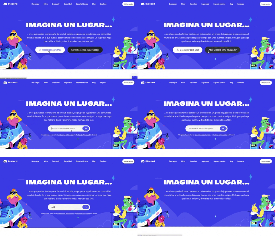
359. Discord - Button to Input Transition
This pattern allows users to seamlessly transition from a clear call-to-action button to an input field, streamlining the path to engagement.
Uink Digital Agency
Specilist on building and launching digital products. Let's talk!
354. Figma - Floating Form with Steps
Desktop, Feedback, Consent, Awareness, Web, English, Text Input, Side Panel
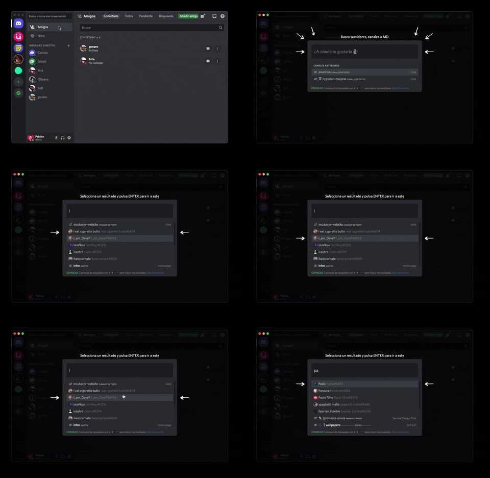
362. Modal Blackout w/ Form & Animations
A modal with a blackout overlay and animated transitions provides a focused input form, ensuring users can quickly add friends without distraction.
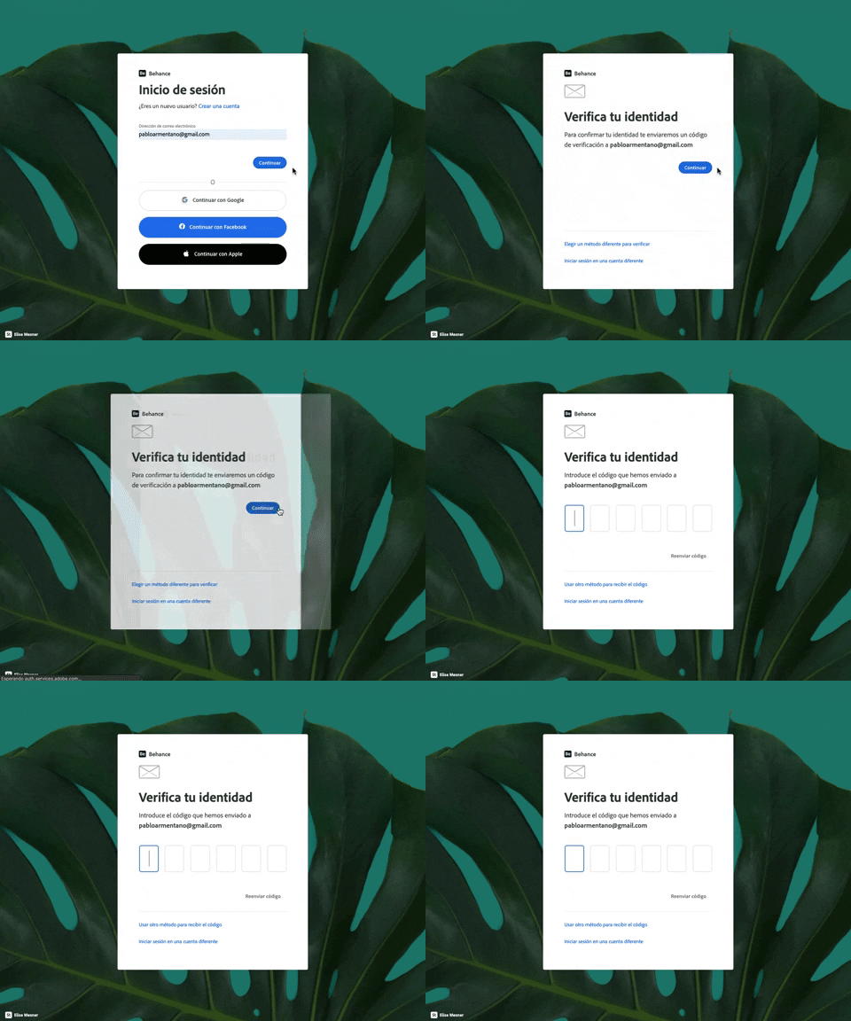
343. Behance - Login with Code Validation
Users input their email for login, then receive and enter a validation code to securely access their account.
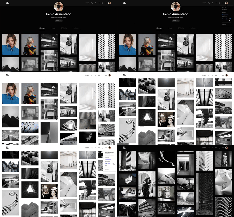
342. Savee - Light/Dark Mode Switcher
Users can instantly toggle between light and dark display modes, enhancing visual comfort and accessibility based on their preference or environment.
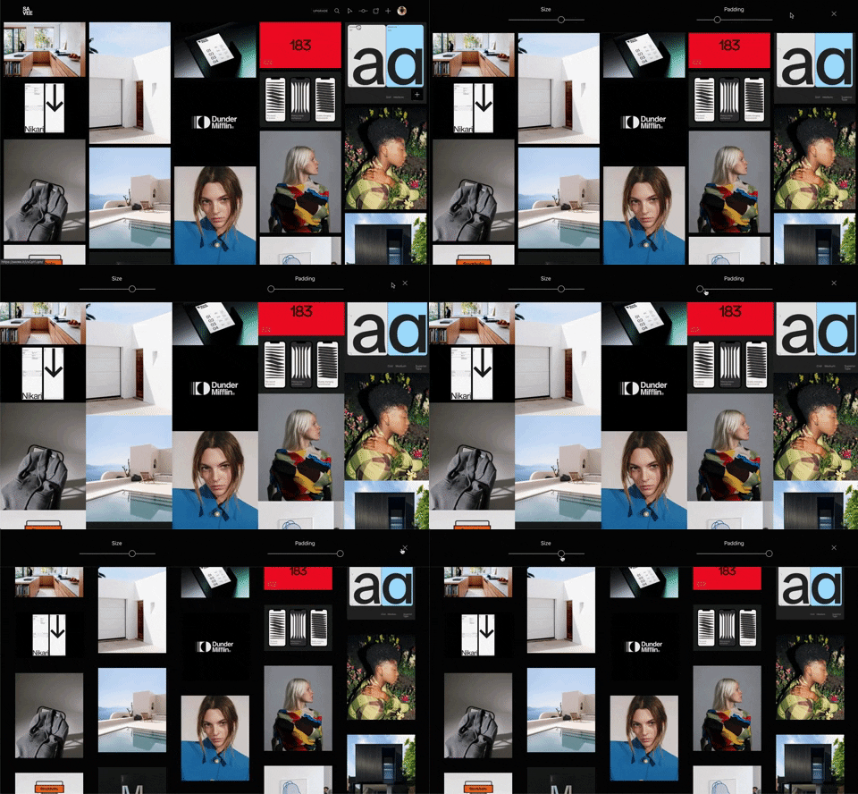
341. Image Grid Customization Sliders
Users can dynamically adjust the number of columns and spacing in an image grid using intuitive sliders, enhancing visual organization and content exploration.
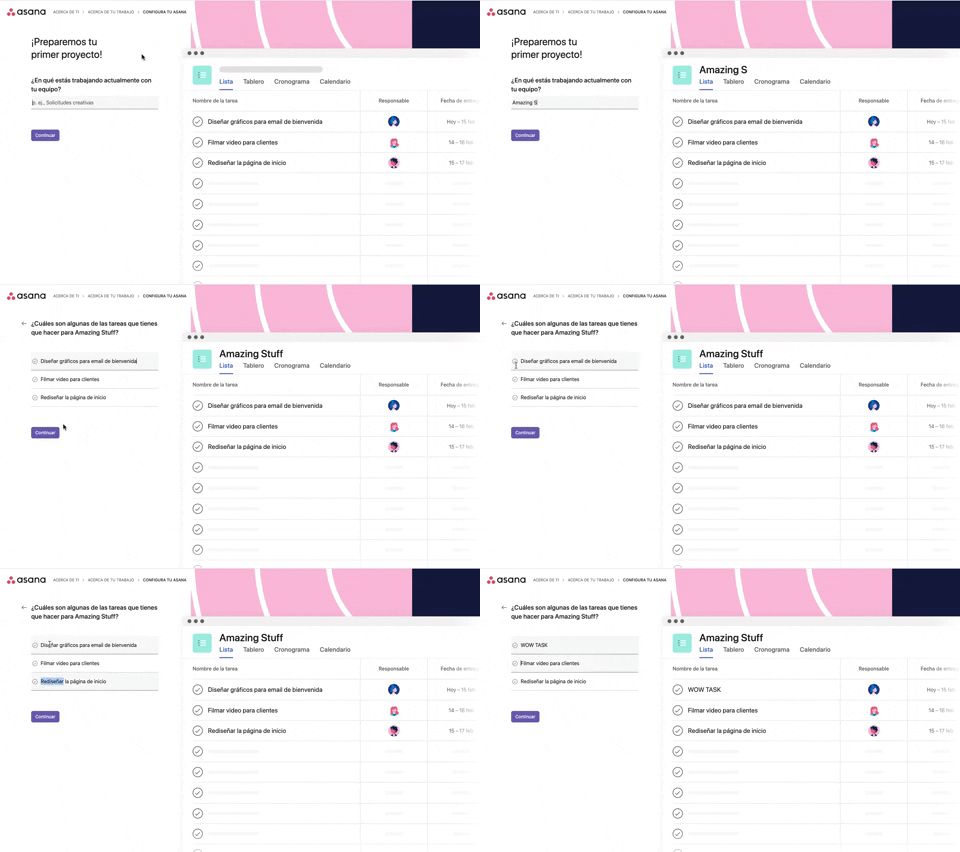
339. Asana - Platform Onboarding Simulator
This pattern guides users through initial setup by simulating product features, allowing them to visualize outcomes and make informed decisions before committing.
336. Floating Popover on Click
A UI pattern where a floating popover element appears adjacent to a trigger element upon a click interaction, providing additional context or actions without navigating away.

322. Search on Menu Items
This pattern integrates a search input directly within a menu, typically a dropdown, enabling users to quickly filter and locate specific menu items. It enhances pathfinding and awareness, commonly found in desktop applications with navigation bars. Notable behavior: Typing; Filtering; Filtered Menu Items.
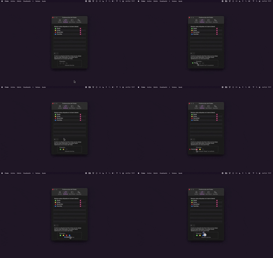
325. Drag & Drop Tag Colors to Slots
Users can intuitively assign color-coded tags to designated slots via drag-and-drop, enhancing organization and quick visual identification of items.
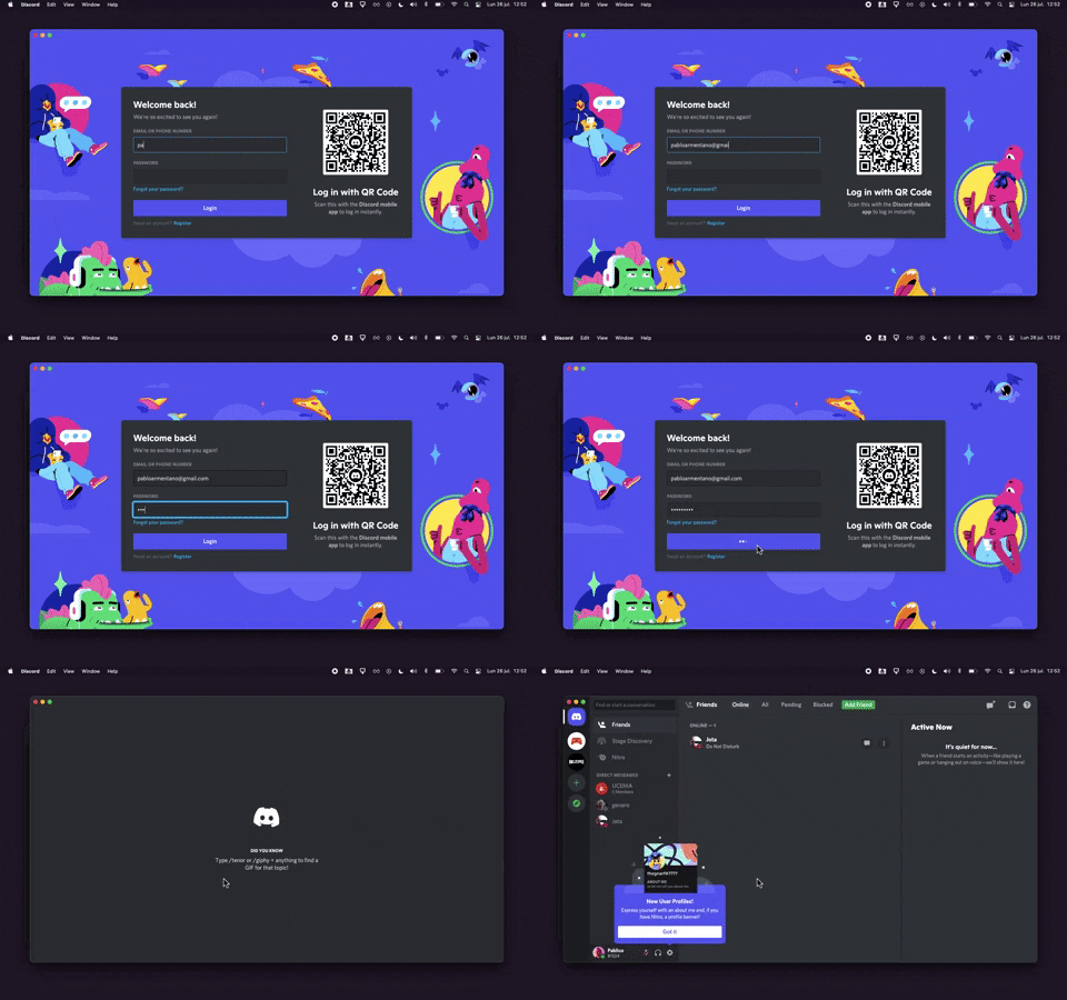
320. Discord - Sign In with Loading Tips
This sign-in pattern offers both traditional email/password input and a convenient QR code scan, enhancing user flexibility and reducing login friction with engaging loading tips.

315. Signal - PIN Reminder
This pattern uses a persistent banner to remind users to verify their PIN, enhancing security and recall without interrupting core app functionality.
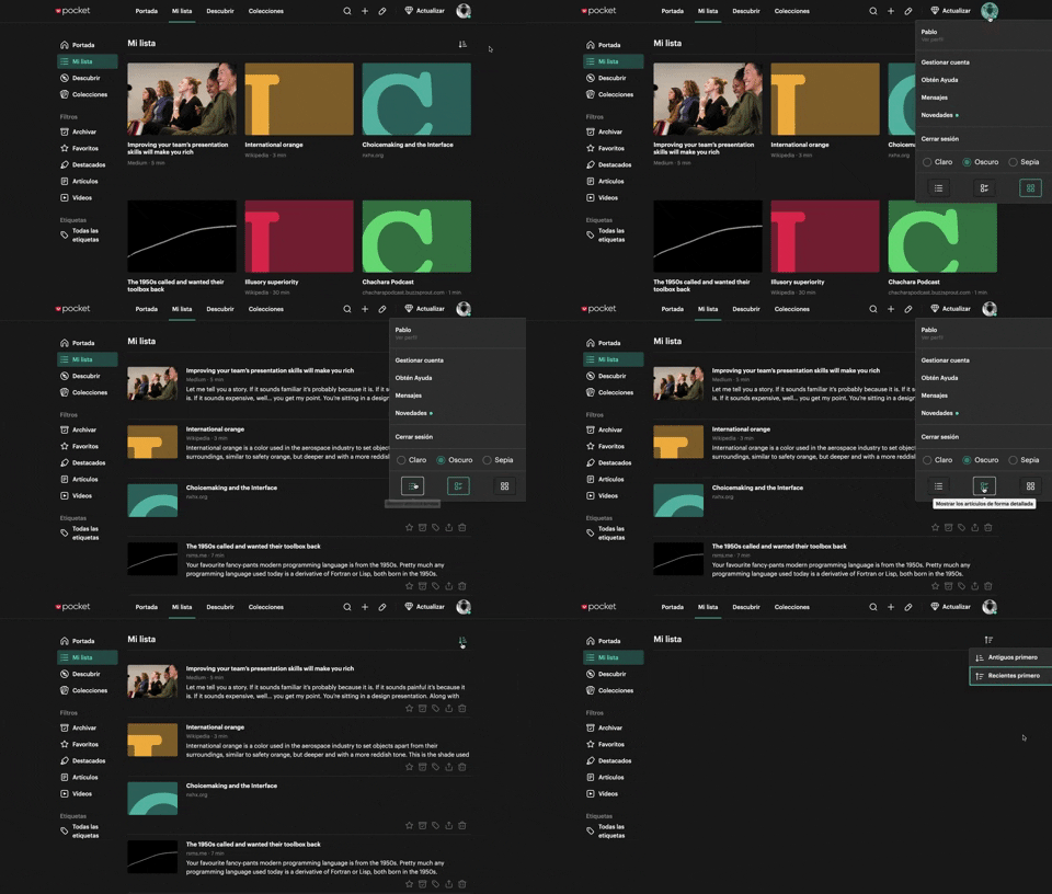
312. Pocket - View Switcher
Users can effortlessly switch between grid and list views of content, enhancing readability and personalizing their browsing experience.
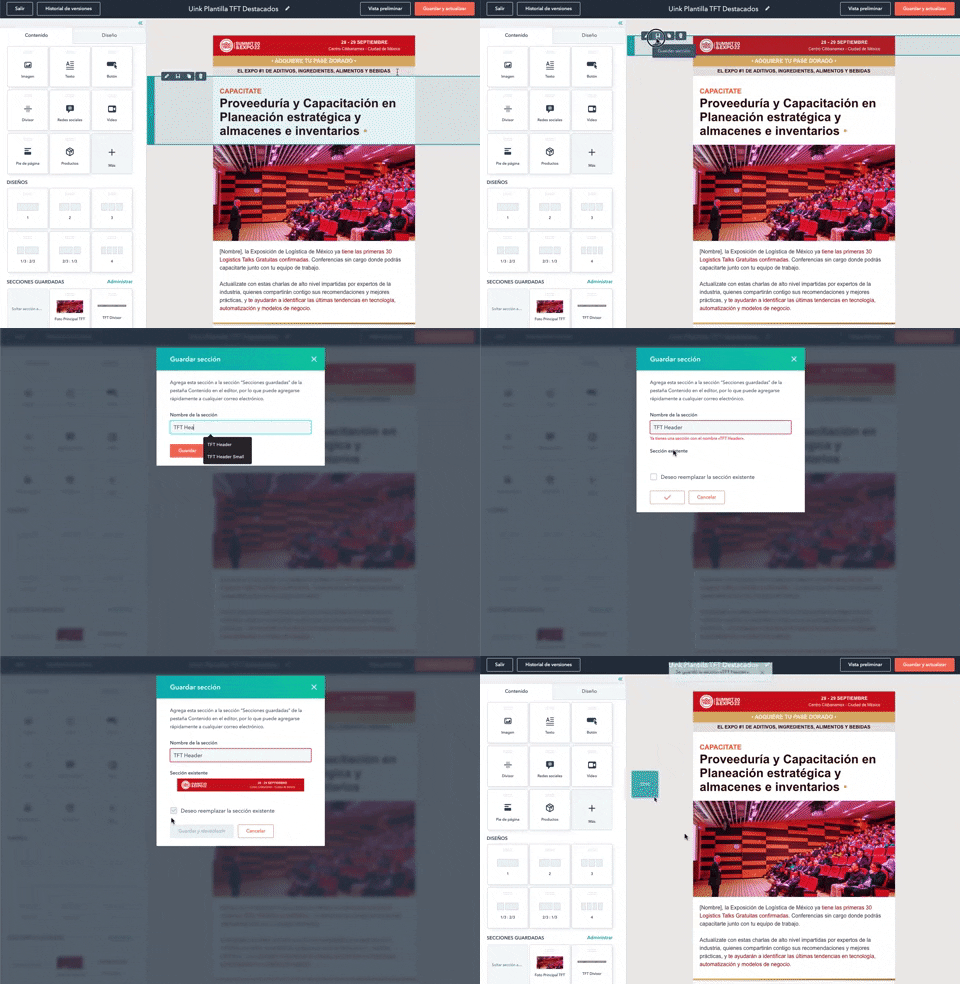
316. Modal Blackout for Delete Confirmation
This pattern uses a modal blackout to confirm a delete action, ensuring users are fully aware and can prevent accidental data loss.
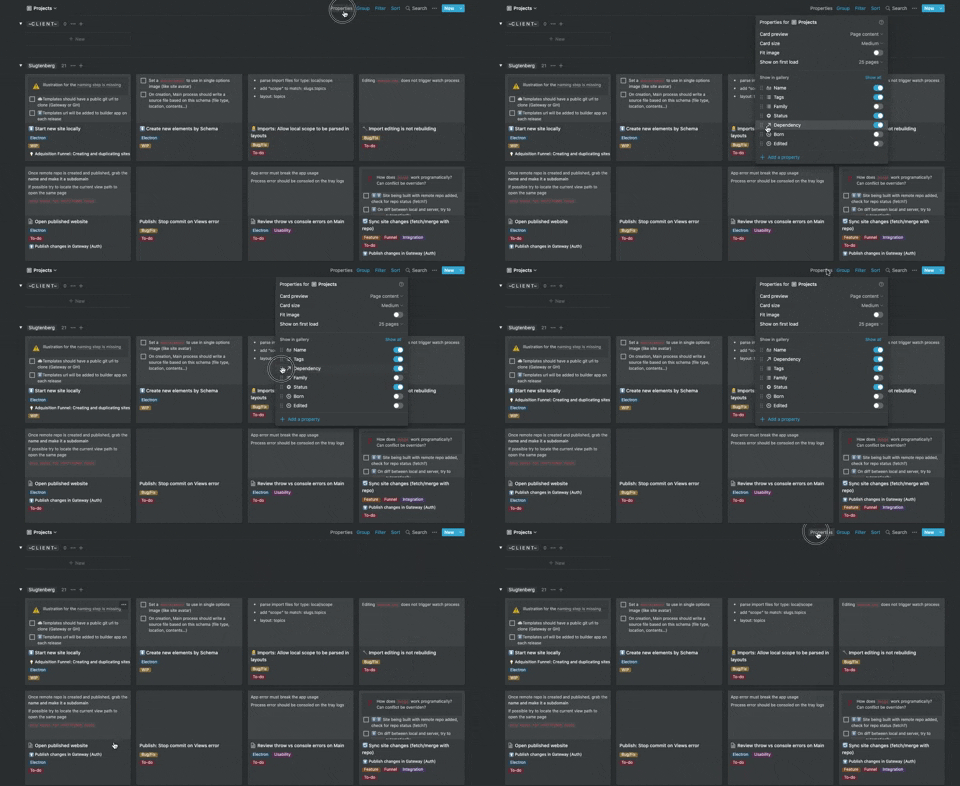
306. Drag & Drop for Reordering List Items (Mouse)
Users can intuitively reorder list items by dragging and dropping them, providing a direct and efficient way to customize their view.
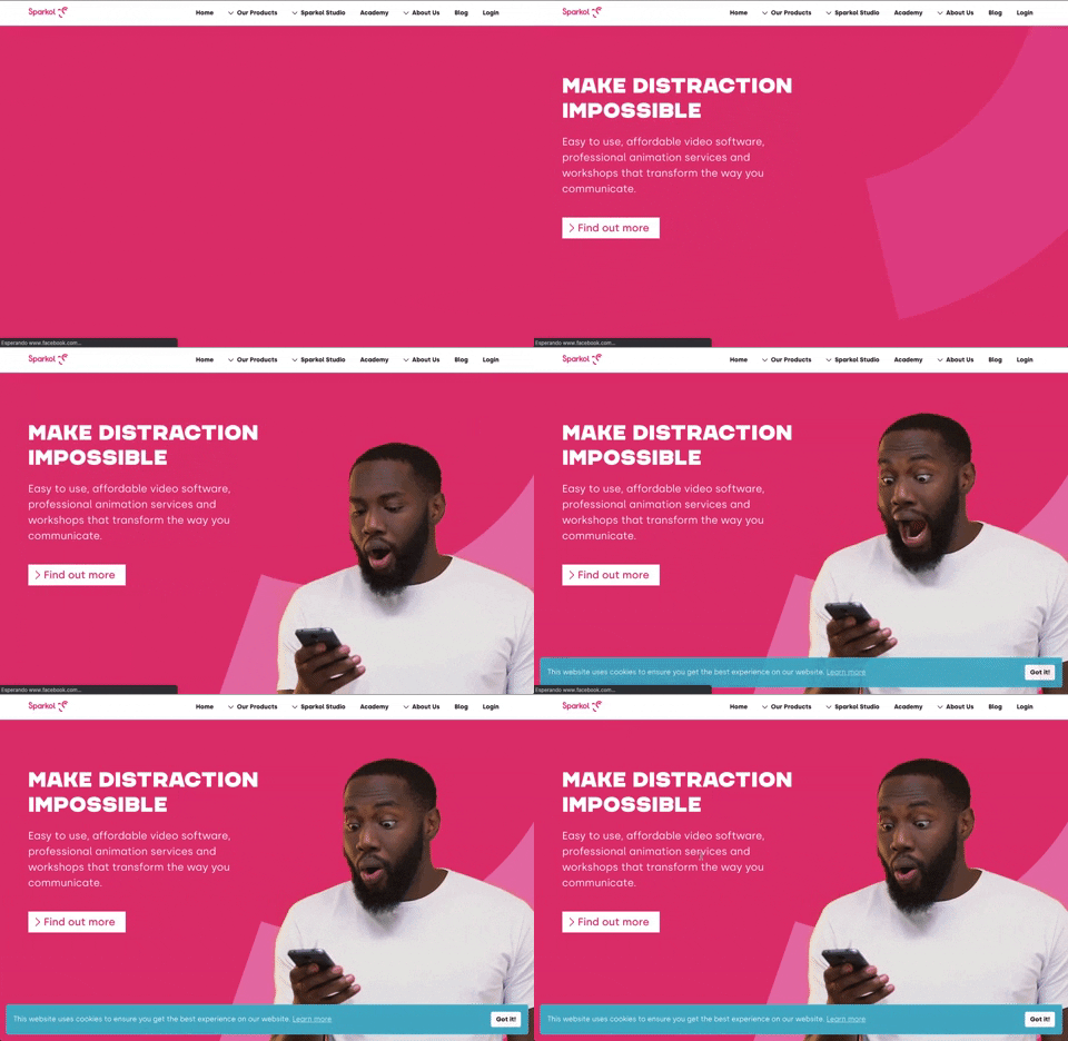
303. Background Animation (on Load)
A dynamic background animation on page load engages users immediately, providing visual interest and a sense of activity while content renders.
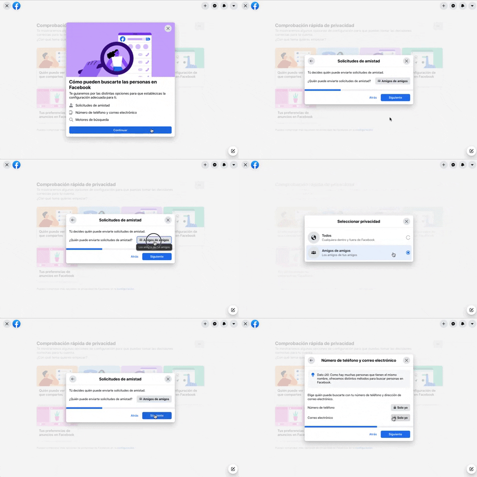
256. Modal Blackout w/ Forms & Steps
This modal blackout pattern guides users through multi-step forms, ensuring focused input and clear progression for critical decisions.

254. Toggle/Hide Sidebar Menu (Mouse)
Users can toggle the sidebar menu to hide or reveal navigation, optimizing screen space for content focus or quick pathfinding.
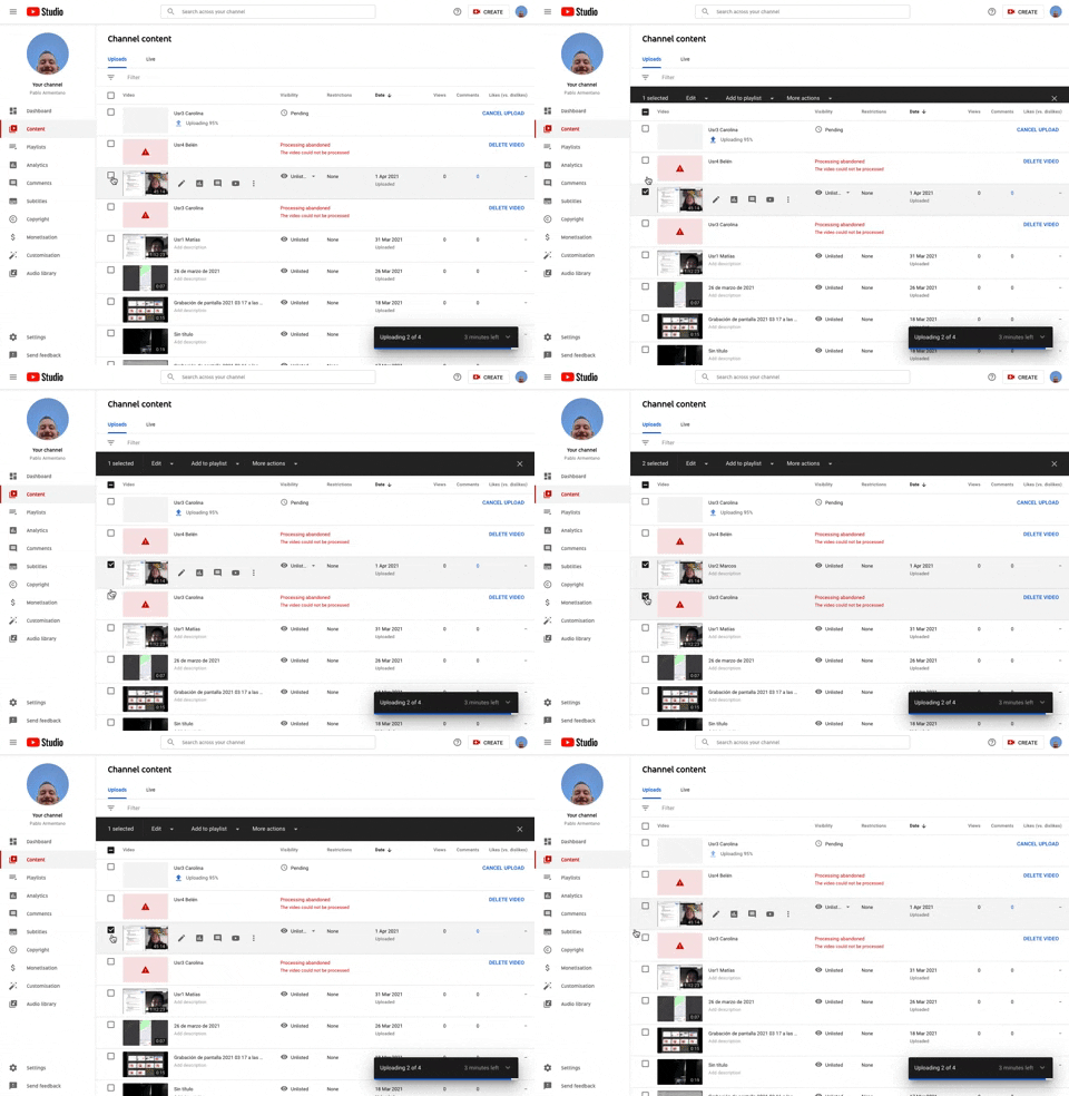
253. Youtube - Table Row Selector
Users can efficiently select multiple table rows by clicking checkboxes, enabling bulk actions and streamlining content management workflows.
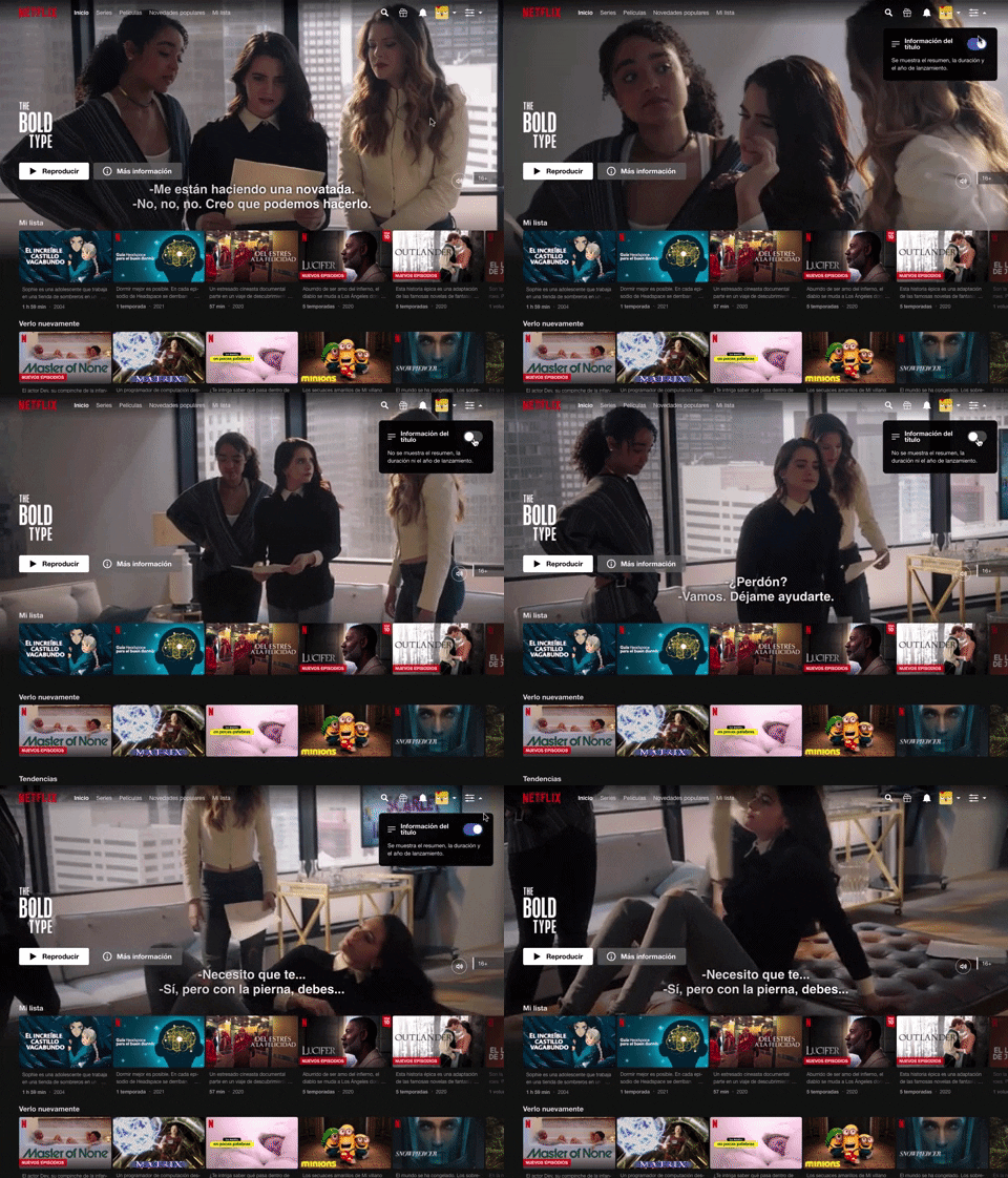
214. Netflix - Information Toggle
A UI pattern, exemplified by Netflix, that allows users to toggle the visibility of additional information, often within a navigation or content browsing context, such as revealing details about a video thumbnail via a dropdown or button interaction. Notable behavior: Click; Toggle; Expanded.
190. Delete Confirmation w/ Name (moved)
A modal dialog pattern requiring the user to explicitly type the name of an item to confirm its deletion, enhancing user awareness and preventing accidental data loss. Notable behavior: Text input; Button click (confirm/cancel); Modal open.

81. MercadoLibre - Saving Favourites as Guest
Users can easily save items to a favorites list by clicking a heart icon, even as a guest, promoting future engagement and purchases.

145. Communication Preferences on Sign Up Flow
This pattern gathers essential user contact information, including first name, surname, and email address, to facilitate account creation and future communication.

171. Slack - Multi-browser Sign In
This pattern streamlines desktop app sign-in by redirecting users to a web browser for authentication, then seamlessly returning them to the application.

77. Sign Up Flow with Pricing Step
This pattern guides users through a multi-step signup process, including a clear pricing selection, to onboard them efficiently and transparently.

21. Advanced Color Picking
This pattern allows users to precisely select colors from a spectrum, adjust saturation and brightness, and save custom swatches for efficient reuse.

29. General Form Errors Banner
This banner provides a clear, concise message to users, offering an alternative action to streamline the process of adding multiple subscribers.
16. Incremental pricing
Incremental pricing presents cost adjustments based on user selections or progression through steps. Users make decisions via toggle fields and buttons, influencing the final price.

188. Trello - Color shapes for Colour-blind
This pattern allows users to toggle a colorblind-friendly mode, enhancing accessibility by adding distinct shapes to color labels for improved differentiation.
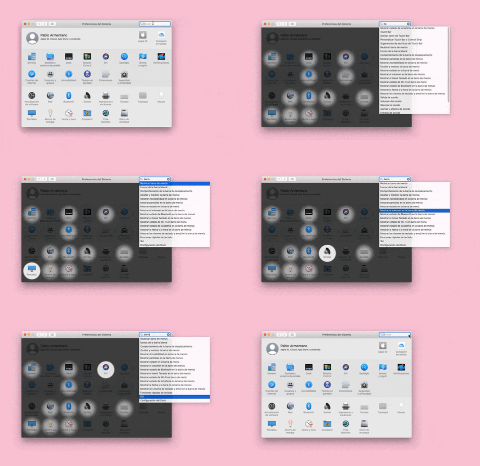
155. Menu Search Highlighting
This pattern highlights matching items within a dropdown menu as a user types into an associated search input, aiding in quick pathfinding and user selection.