Patterns for Images & Illustrations
- Desktop (29)
- Tablet (1)
- Mobile (8)

409. Customize Toolbar (2-pane interaction)
Users can personalize their toolbar by toggling specific buttons on or off, enhancing workflow efficiency and tailoring the interface to their needs.

405. Ferrari Luce Website (by LoveFrom)
This pattern describes a desktop web landing page, featuring a fixed navigation bar, footer, and interactive elements such as carousels, buttons, and hypertext links. It integrates animations, video, and anchor scrolling to create an engaging user experience. Notable behavior: Animation; Carrousel; Fixed on Scroll.

404. Sidebar Backdrop Menu
This pattern provides a full-height, animated sidebar menu that slides in from the left, offering clear navigation options while dimming the main content for focused interaction.

403. File Upload and Background Loader
Users can easily upload files or paste URLs, receiving clear visual feedback and background loading indicators for a seamless experience.

393. Colored Checkboxes
Users can easily select multiple communication preferences with visually distinct, colored checkboxes that provide immediate feedback on their choices.

392. SaaS for Construction Workers
This pattern uses a dynamic carousel of images and text to showcase product features, engaging users with interactive content and clear calls to action.
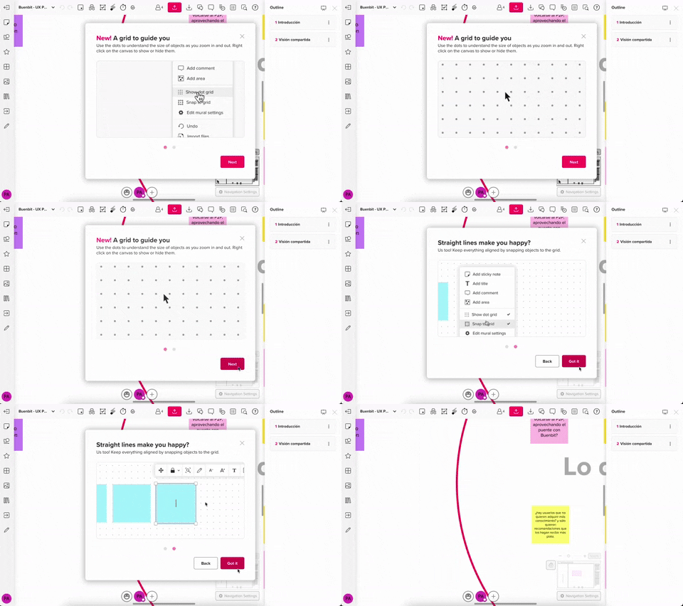
357. Modal w/ Steps & Animation (No blackout)
This modal guides users through multi-step processes with clear instructions and animated transitions, enhancing awareness without obscuring the underlying content.
Uink Digital Agency
Specilist on building and launching digital products. Let's talk!
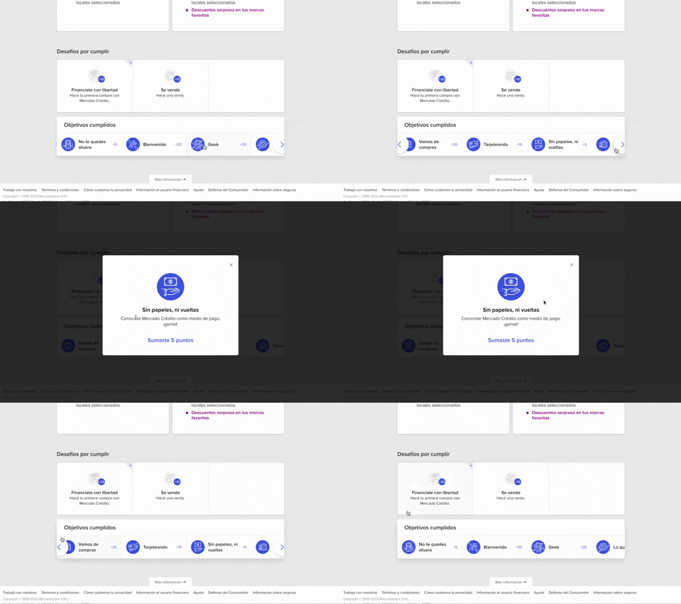
344. MercadoLibre - Horizontal Item Slider
This horizontal item slider allows users to effortlessly browse a curated selection of items, enhancing discoverability and engagement with minimal scrolling.
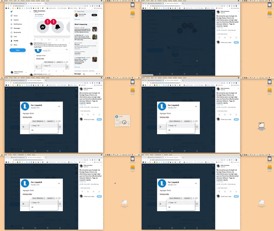
332. Drag & Drop to Create File from Web Image
Users can effortlessly create a new file on their desktop by dragging and dropping an image directly from a web browser.
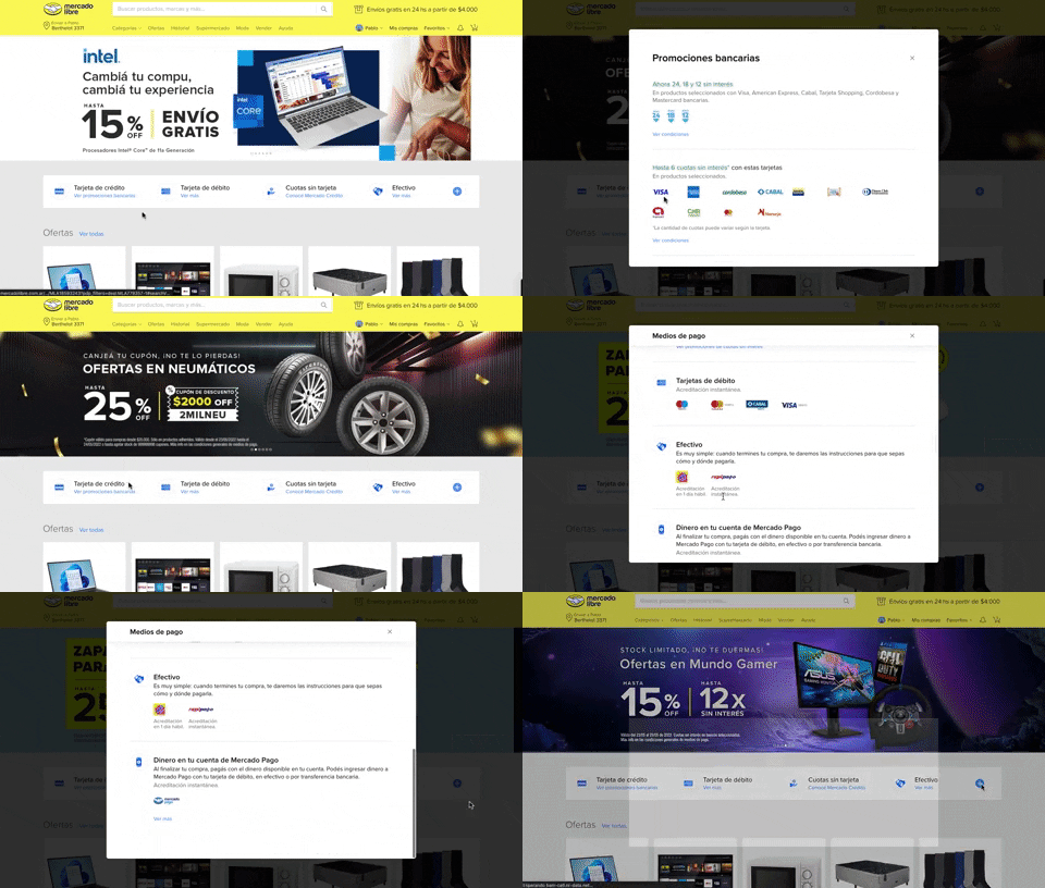
313. Modal Blackout w/ Scroll
This pattern displays a scrollable modal over a darkened background, allowing users to focus on its content while retaining context of the underlying page.
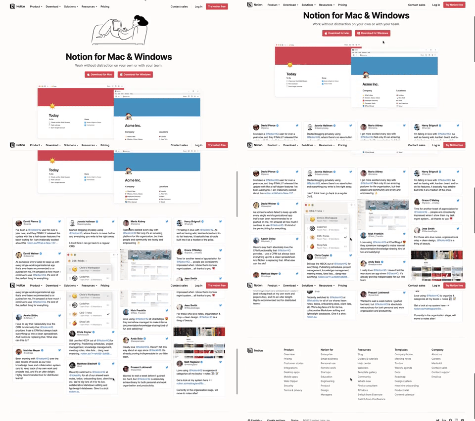
311. Landing Page for App Download
This landing page guides users to download the application for their specific operating system, simplifying the installation process.
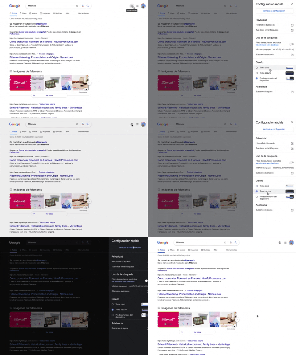
302. Theme Switcher in Side-drawer
Users can quickly toggle between light and dark themes via a side-drawer, enhancing visual comfort and accessibility without leaving the current page.
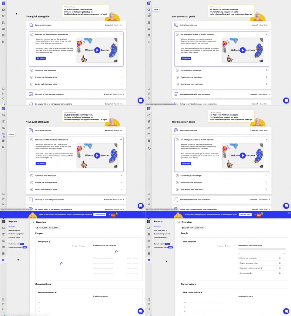
292. Vertical Icon Menu
This vertical icon menu provides quick access to key sections, revealing descriptive tooltips on hover to aid navigation and improve user pathfinding.

286. Background Animation on Scroll
This pattern uses a fixed background image that animates and shifts as the user scrolls, creating a dynamic and engaging visual experience.

268. Drag & Drop to Upload File
Users can effortlessly upload files by dragging them from their desktop directly into a designated drop zone within the application.
264. Interactive Background Animation
Desktop, Pathfinding, Apple OS, English, Animation, Click Event, Image / Illustration, Vectors, Figma
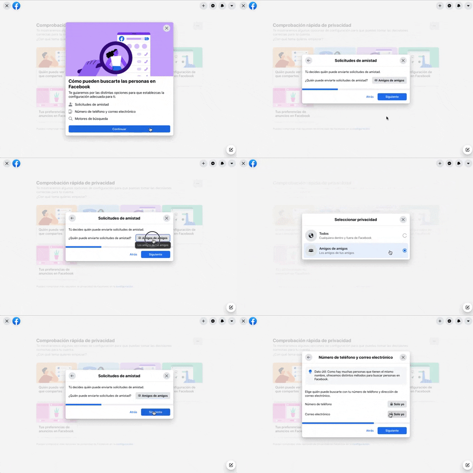
256. Modal Blackout w/ Forms & Steps
This modal blackout pattern guides users through multi-step forms, ensuring focused input and clear progression for critical decisions.
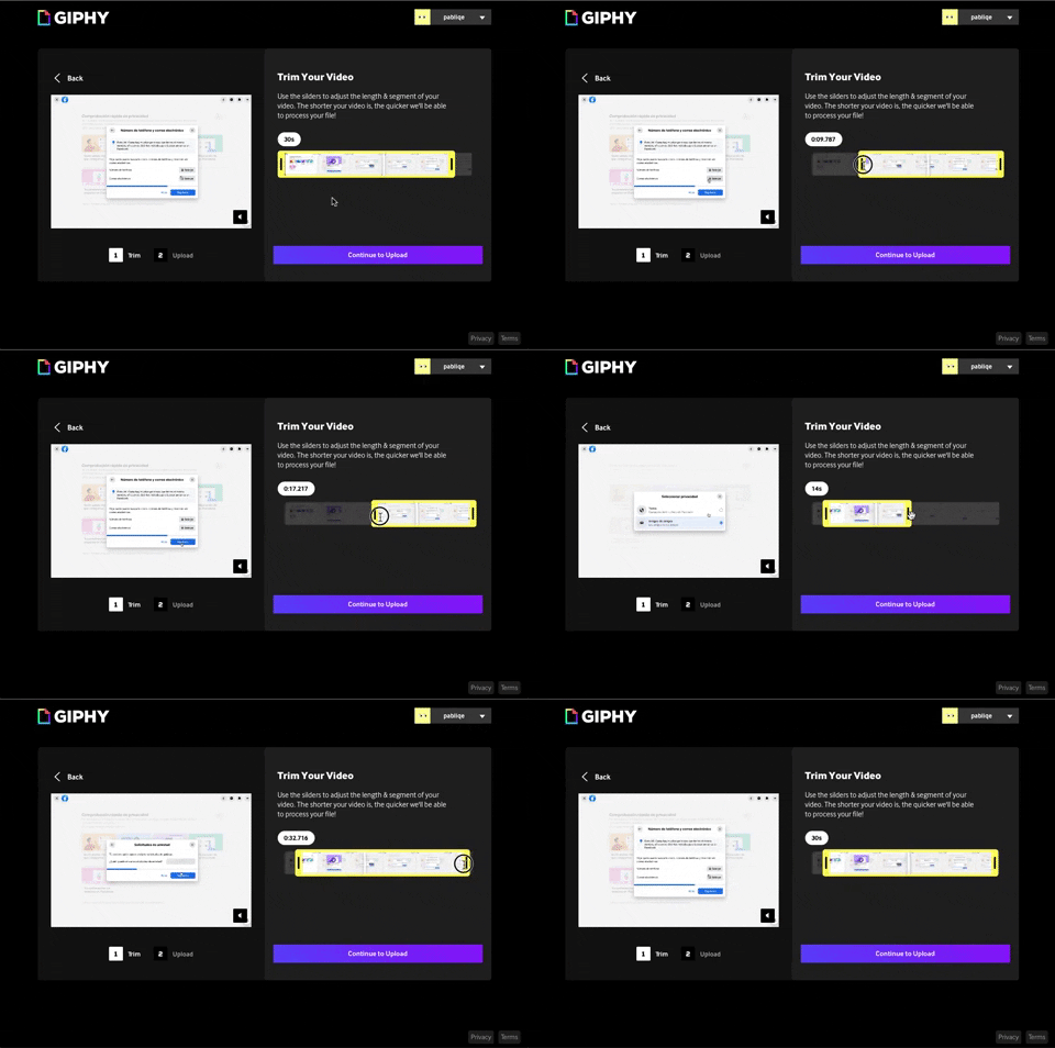
243. Trim Video Slicer
Users can precisely trim video segments using a draggable timeline with visual thumbnails, enabling efficient content selection and faster processing.
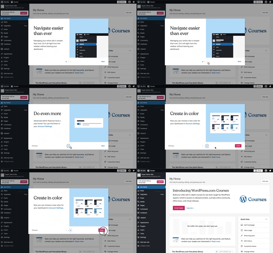
241. Modal Blackout w/ Steps
This multi-step modal guides users through key features with clear explanations and visual cues, ensuring a smooth onboarding experience.
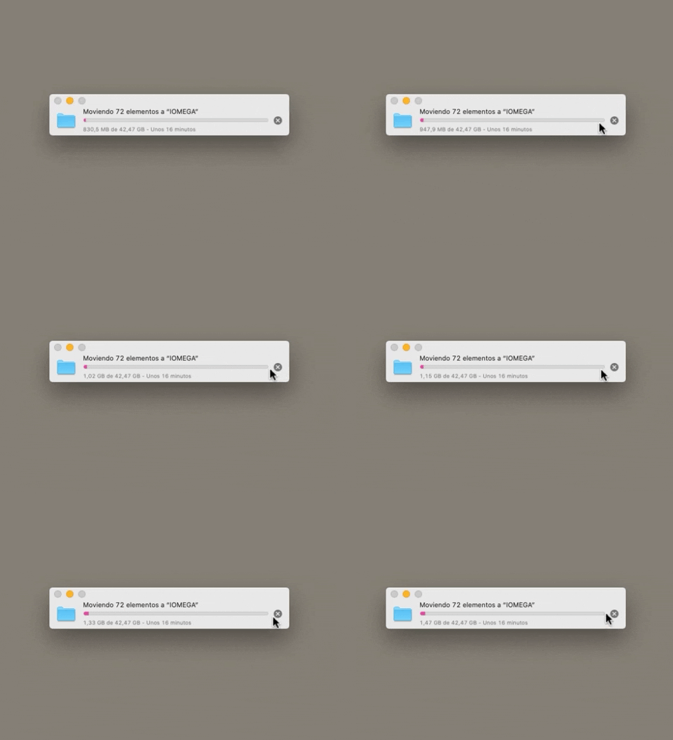
223. Stop Operation Progress
This pattern allows users to cancel an ongoing operation, like a file transfer, by clicking a clear "X" icon, providing immediate control over system processes.
217. Vertical Icon Menu (duplicated)
Desktop, Pathfinding, Web, English, Side Panel, Transition, Image / Illustration, Tooltip, Hover Event, Intercom

199. Sidebar Emptystate
This sidebar empty state introduces new features with a clear illustration and call to action, guiding users to discover and adopt new functionalities.

189. Illustration (Meme) on Empty State
This empty state uses a humorous meme and a guiding text to playfully direct users toward the primary action button, encouraging engagement.

81. MercadoLibre - Saving Favourites as Guest
Users can easily save items to a favorites list by clicking a heart icon, even as a guest, promoting future engagement and purchases.

149. Security Top-banner
This top-banner informs users about security risks and prompts them to take action, enhancing account safety and providing clear options to "Get Started" or "Dismiss".

63. Window Maximize Options (on Right Click)
Users can right-click the maximize button to access a dropdown menu, enabling quick window arrangement options like full screen or tiling to the left or right.
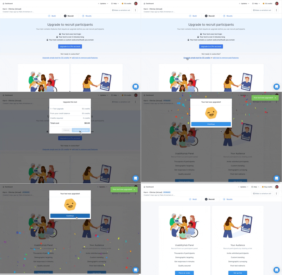
166. Generated Effect: Confetti Explosion
A celebratory confetti explosion visually confirms successful user actions, enhancing positive reinforcement and delight.
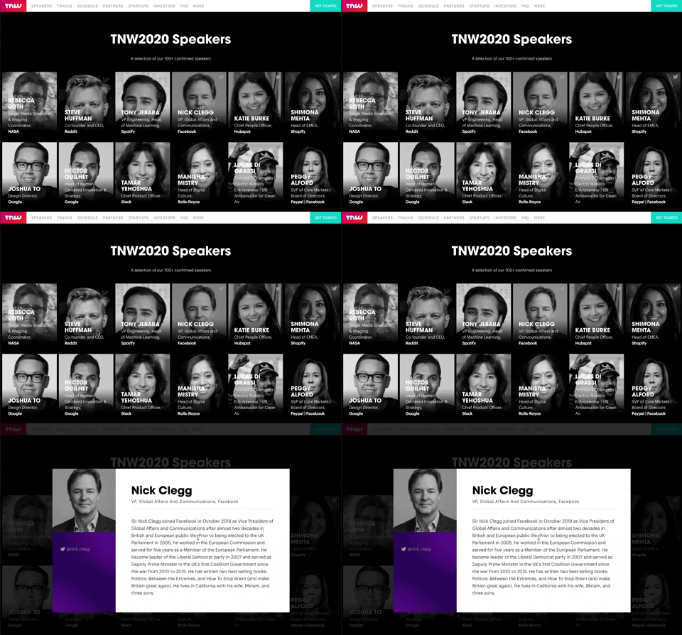
139. Transition: Zoom-Out on Hover
This transition subtly scales down an image on hover, providing visual feedback and highlighting interactive elements without obscuring content.

10. Dedicated Screen for Action Confirmation
This dedicated screen ensures users explicitly confirm or deny third-party access to their LinkedIn data, promoting transparency and control over personal information.