Patterns for Links & Buttons
- Desktop (48)
- Tablet (0)
- Mobile (6)
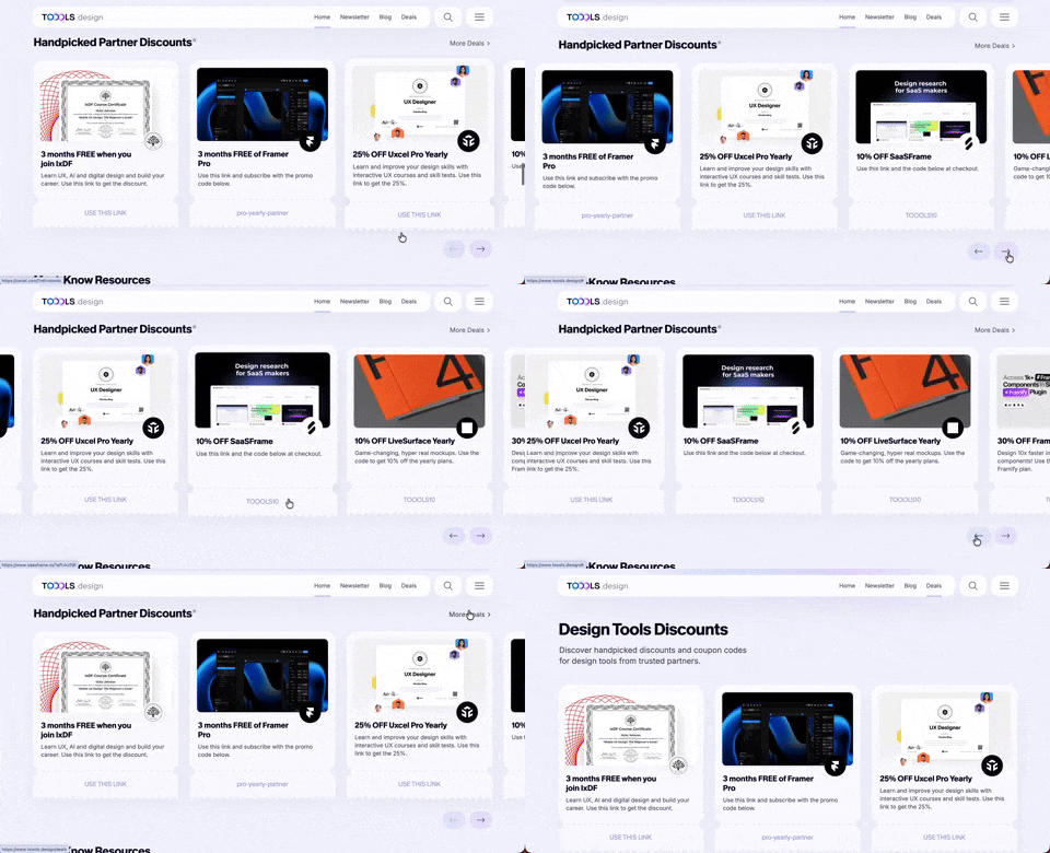
411. Ticket Carrousel (TOOOLS.design)
Users can browse a curated selection of offers by clicking pagination arrows, enabling efficient discovery and decision-making.

405. Ferrari Luce Website (by LoveFrom)
This pattern describes a desktop web landing page, featuring a fixed navigation bar, footer, and interactive elements such as carousels, buttons, and hypertext links. It integrates animations, video, and anchor scrolling to create an engaging user experience. Notable behavior: Animation; Carrousel; Fixed on Scroll.

401. In-App News Notification
This pattern provides timely, relevant news and updates within the application, enhancing user awareness and engagement without interrupting core workflows.

392. SaaS for Construction Workers
This pattern uses a dynamic carousel of images and text to showcase product features, engaging users with interactive content and clear calls to action.

390. Icon Software Landing Page
This landing page effectively guides users to download icon management software by showcasing its intuitive interface and customization features.

389. Text Edit Inline Input
Users can directly edit text content in place, providing a seamless and efficient way to update information without navigating away.

378. Modal Blackout w/ Animation
This pattern uses an animated blackout modal to focus user attention on critical information or actions, ensuring clear decision-making.
Uink Digital Agency
Specilist on building and launching digital products. Let's talk!
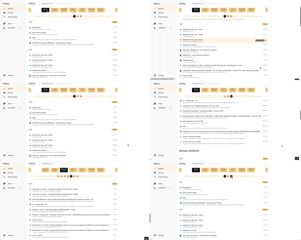
363. Better History - Back to Top on scroll
This pattern allows users to quickly navigate to the top of a long list by clicking a fixed "Back to Top" button that appears on scroll.
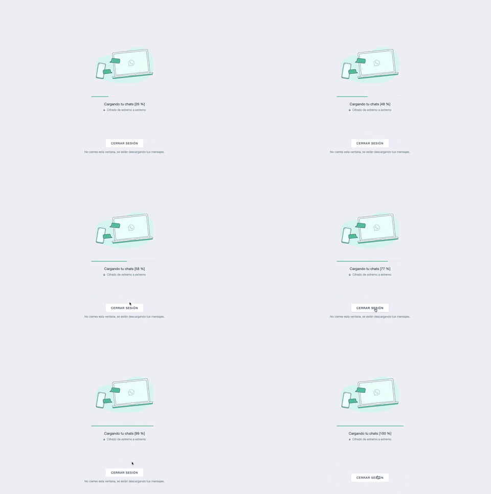
361. WhatsApp - Progress Bar Loading
This progress bar visually informs users about the loading status of their chats, providing a clear percentage to manage expectations during data synchronization.
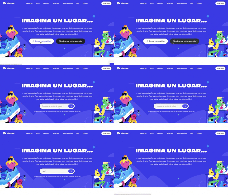
359. Discord - Button to Input Transition
This pattern allows users to seamlessly transition from a clear call-to-action button to an input field, streamlining the path to engagement.
355. Jira - Feature Presentation Tooltip
A feature presentation tooltip, as seen in Jira, guides users through new functionalities or important updates. It often appears during onboarding or to raise awareness, utilizing tooltips with hypertext links and pagination for multi-step tours on both desktop and web interfaces.
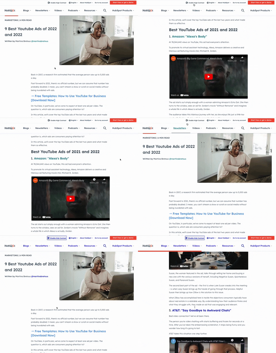
349. HubSpot - Toggle High Contrast
Users can toggle high contrast mode to improve readability and accessibility, enhancing the visual experience for those with low vision.

359. Toggle List/Grid View
Users can switch between list and grid views to optimize content display for their preference, enhancing readability and navigation.
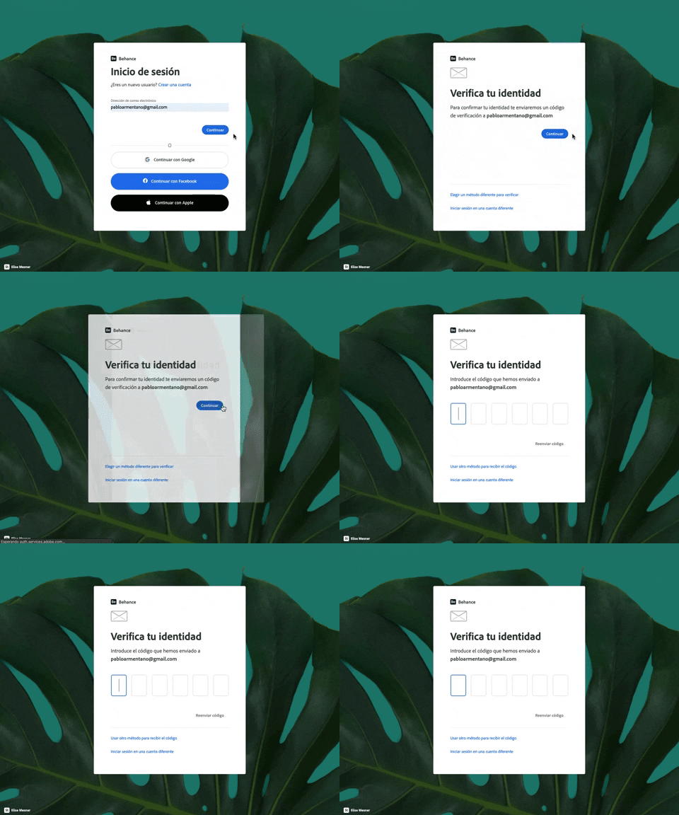
343. Behance - Login with Code Validation
Users input their email for login, then receive and enter a validation code to securely access their account.
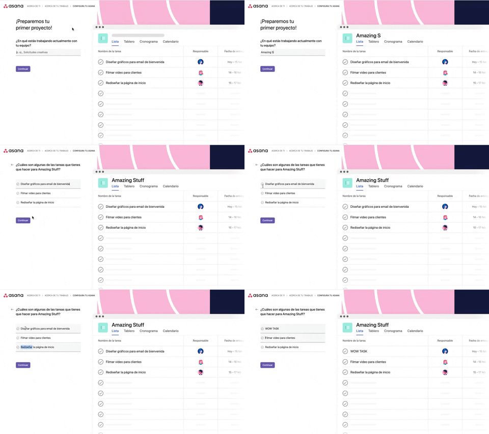
339. Asana - Platform Onboarding Simulator
This pattern guides users through initial setup by simulating product features, allowing them to visualize outcomes and make informed decisions before committing.

345. Vertical Accordion for FAQs
This vertical accordion allows users to efficiently reveal or hide detailed content sections, optimizing screen space and improving navigation for FAQs or contact information.
336. Floating Popover on Click
A UI pattern where a floating popover element appears adjacent to a trigger element upon a click interaction, providing additional context or actions without navigating away.
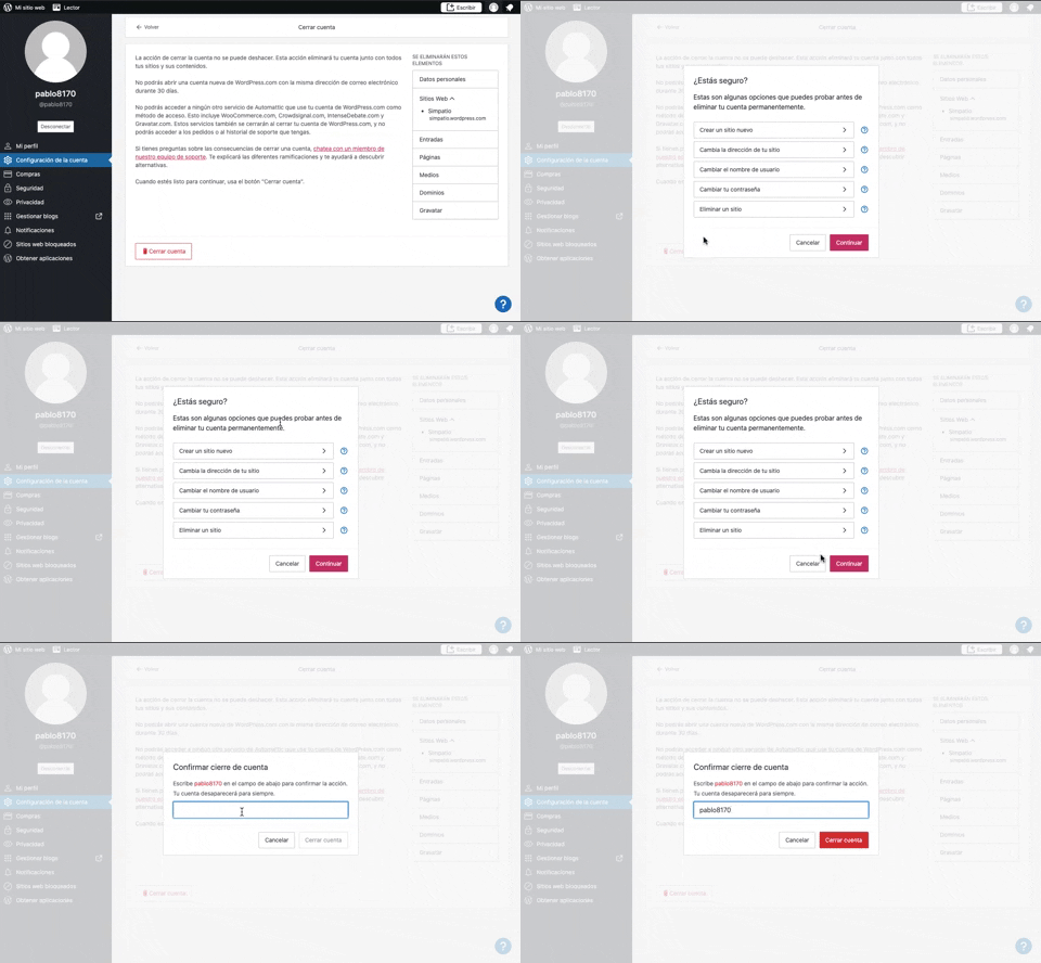
319. Modal Blackout w/ Multiple Choice
This pattern uses a modal blackout to confirm a user's intent to close an account, ensuring they understand the irreversible consequences before proceeding.

315. Signal - PIN Reminder
This pattern uses a persistent banner to remind users to verify their PIN, enhancing security and recall without interrupting core app functionality.

268. Drag & Drop to Upload File
Users can effortlessly upload files by dragging them from their desktop directly into a designated drop zone within the application.
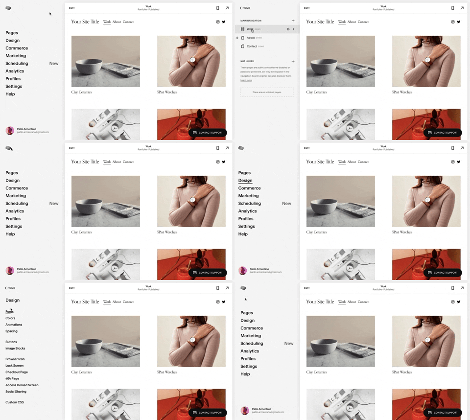
259. Multi-depth Sidebar Navigation
This multi-depth sidebar navigation allows users to quickly traverse complex information hierarchies, improving discoverability and reducing cognitive load.
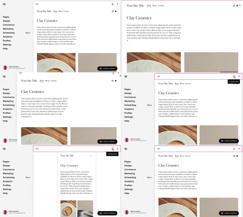
258. Squarespace - Adaptable Viewport Size
Users can dynamically adjust the content preview area, allowing them to visualize their website across various screen sizes for optimal responsiveness and design fidelity.
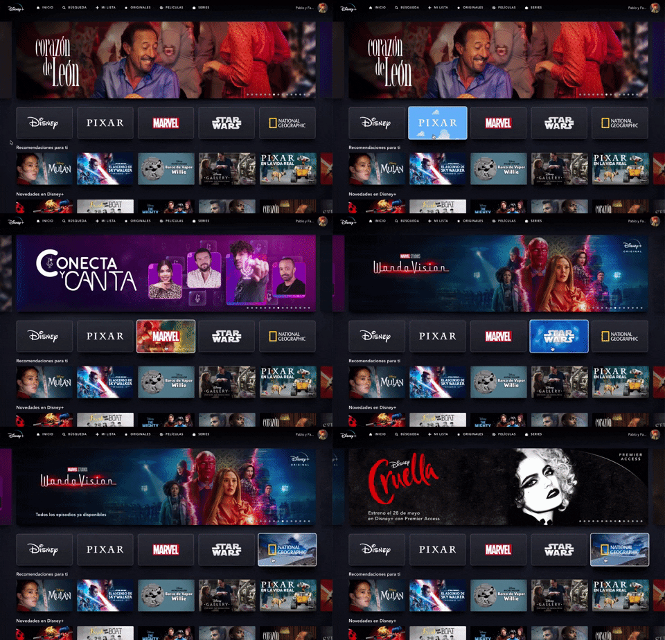
235. Background Animation (on Mouse Hover)
This pattern uses a subtle background animation on hover to provide visual feedback, guiding users to interactive elements and enhancing discoverability.
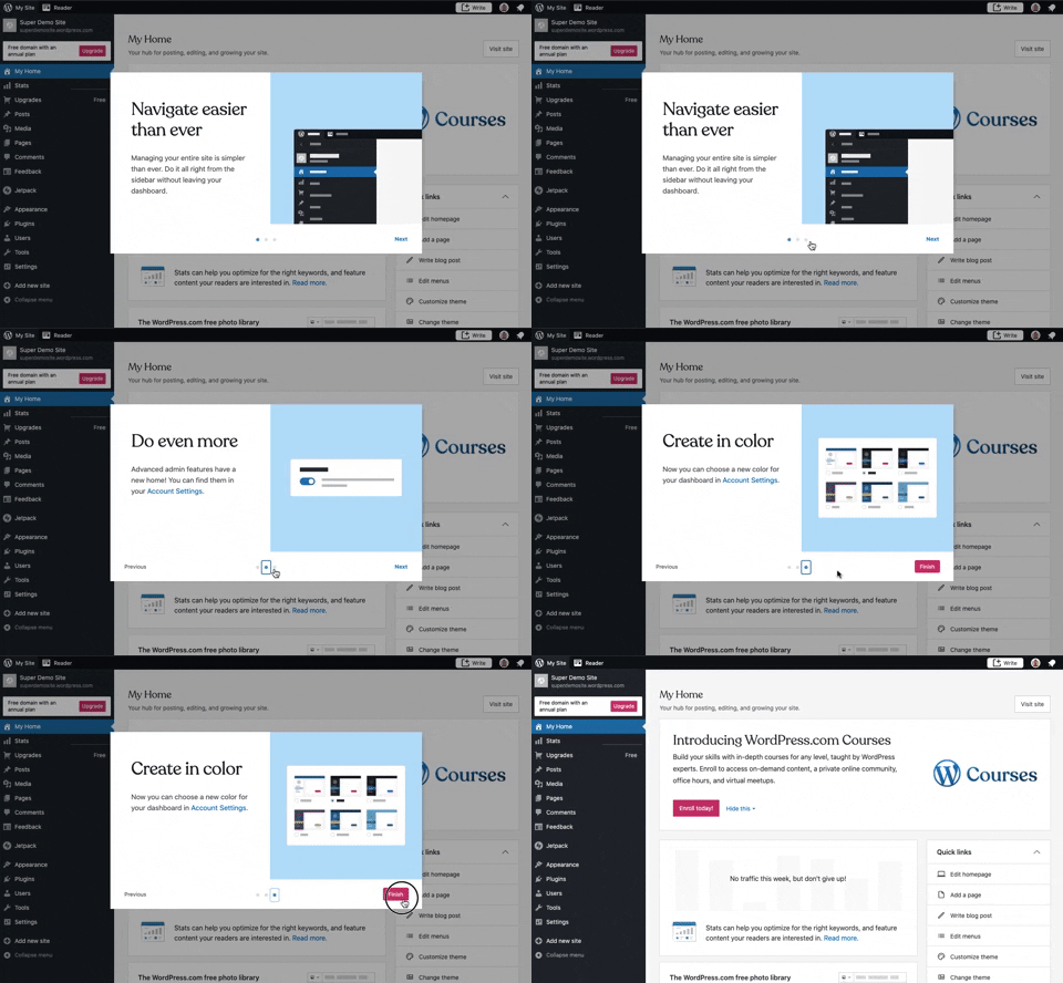
241. Modal Blackout w/ Steps
This multi-step modal guides users through key features with clear explanations and visual cues, ensuring a smooth onboarding experience.
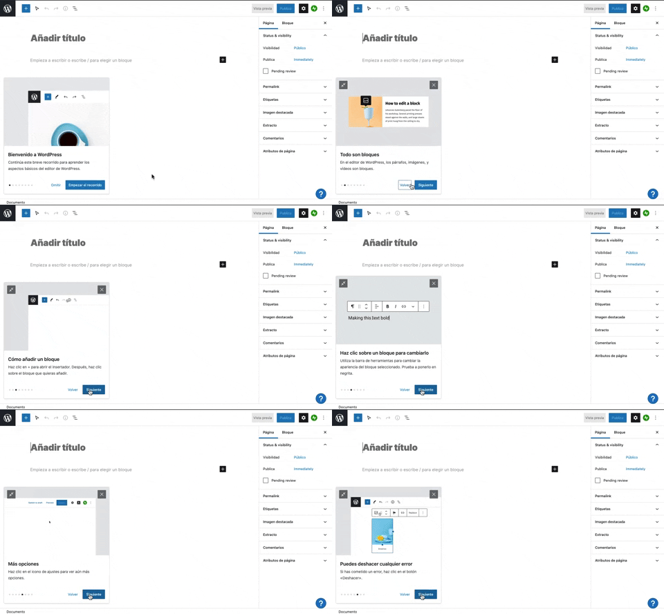
231. Floating Dialog Popover w/ Steps
This pattern guides users through a multi-step onboarding or feature tour with a dismissible, paginated floating dialog, enhancing discoverability and adoption.

229. Top Banner for Design Changes
A top banner informs users about new design changes, offering a clear link to "Obtener más información" for those seeking further details.
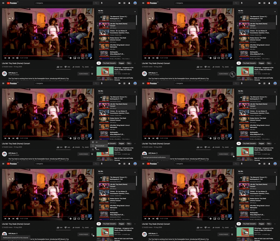
228. Notification Bell Status
Users can quickly check and manage their notifications by clicking the bell icon, revealing a dropdown with recent alerts and an option to clear them.
212. Automatic Background Animation (on Load)
Desktop, Decision Making, Awareness, Web, English, Animation, Loader, Hypertext Links

203. Two-step Download Flow
This pattern offers users a clear, two-step download process, first presenting a prominent "Download" button and then a secondary, fixed-on-scroll button for consistent access.

207. Downloading Desktop App
This pattern informs users that a desktop application is downloading, providing clear instructions and a progress indicator to manage expectations and guide the next steps.

5. Website Promotional Top Banners
A prominent top banner informs users about new features or promotions, encouraging engagement with a clear call to action.
190. Delete Confirmation w/ Name (moved)
A modal dialog pattern requiring the user to explicitly type the name of an item to confirm its deletion, enhancing user awareness and preventing accidental data loss. Notable behavior: Text input; Button click (confirm/cancel); Modal open.

199. Sidebar Emptystate
This sidebar empty state introduces new features with a clear illustration and call to action, guiding users to discover and adopt new functionalities.

201. Modal Blackout w/ Actions
This modal blackout pattern informs users about enhanced ad privacy, offering clear choices to manage settings or accept changes with distinct action buttons.

189. Illustration (Meme) on Empty State
This empty state uses a humorous meme and a guiding text to playfully direct users toward the primary action button, encouraging engagement.
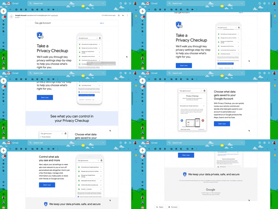
130. Animated Email Page
This pattern uses subtle animations within an email to guide users through a privacy checkup, enhancing engagement and clarity for important account actions.
132. Amazon - Store Tooltip Reminders
This pattern uses tooltips to provide reminders or onboarding information within a store context, often including hypertext links for further action or navigation. It is primarily designed for desktop web environments to enhance user awareness.
164. Static Tooltip on Menu
A static tooltip on a menu provides immediate, contextual information for menu items. It typically appears on hover or focus, enhancing user understanding of an item's function or details without requiring an explicit click.

81. MercadoLibre - Saving Favourites as Guest
Users can easily save items to a favorites list by clicking a heart icon, even as a guest, promoting future engagement and purchases.
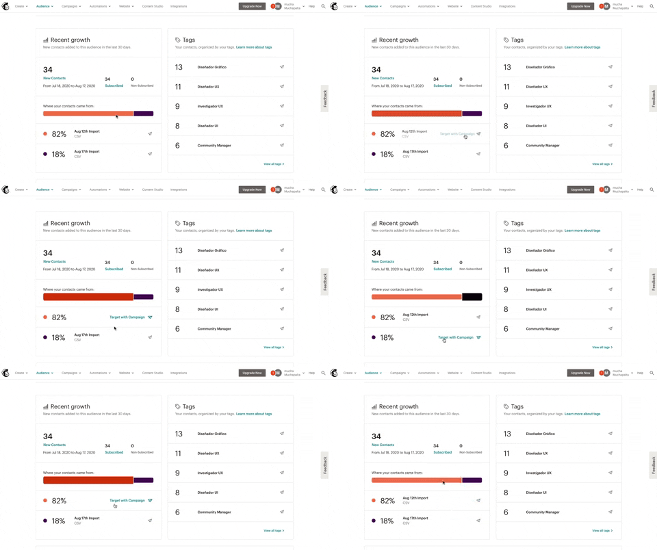
139. Synced Hover Animations
This pattern uses synchronized hover animations to highlight related data points across different UI elements, enhancing user awareness and decision-making.

145. Communication Preferences on Sign Up Flow
This pattern gathers essential user contact information, including first name, surname, and email address, to facilitate account creation and future communication.

171. Slack - Multi-browser Sign In
This pattern streamlines desktop app sign-in by redirecting users to a web browser for authentication, then seamlessly returning them to the application.

173. Share Invitation to Live Movie
Users can invite up to six friends to a synchronized viewing experience, fostering shared enjoyment and social interaction around media content.

94. Top Primary Banner
A top primary banner provides crucial, timely information and calls to action, ensuring users are immediately aware of important updates or opportunities.

105. Floating Tooltip Blackout
This pattern presents a floating tooltip with a dim overlay, guiding users to initiate or schedule a meeting with clear options and keyboard shortcuts for efficiency.
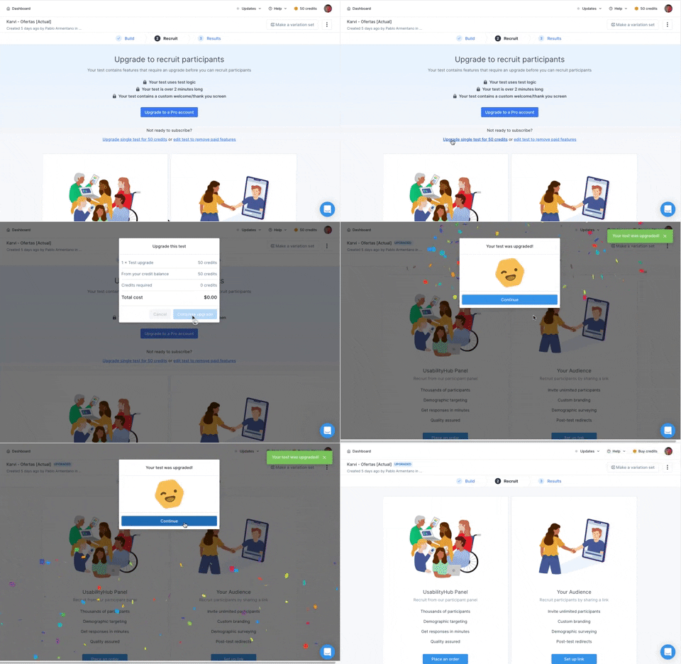
166. Generated Effect: Confetti Explosion
A celebratory confetti explosion visually confirms successful user actions, enhancing positive reinforcement and delight.

188. Trello - Color shapes for Colour-blind
This pattern allows users to toggle a colorblind-friendly mode, enhancing accessibility by adding distinct shapes to color labels for improved differentiation.

10. Dedicated Screen for Action Confirmation
This dedicated screen ensures users explicitly confirm or deny third-party access to their LinkedIn data, promoting transparency and control over personal information.