Patterns for Status Bars & Chips
- Desktop (25)
- Tablet (0)
- Mobile (4)
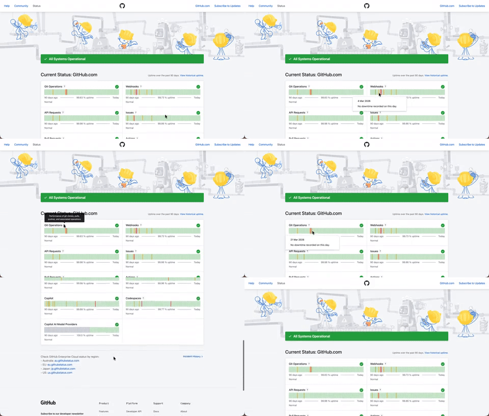
408. Status Page per Hour Indicators
Users can quickly assess system health over time via color-coded hourly indicators, revealing operational status and outage events at a glance.

406. Fixed Bottom-Right Chat Bubble
Offers always-available, AI-powered guidance and support through a fixed bottom-right chat

403. File Upload and Background Loader
Users can easily upload files or paste URLs, receiving clear visual feedback and background loading indicators for a seamless experience.

401. In-App News Notification
This pattern provides timely, relevant news and updates within the application, enhancing user awareness and engagement without interrupting core workflows.

386. Skeleton Loader
This pattern uses skeleton screens to progressively load content, providing immediate visual feedback and reducing perceived wait times for users.
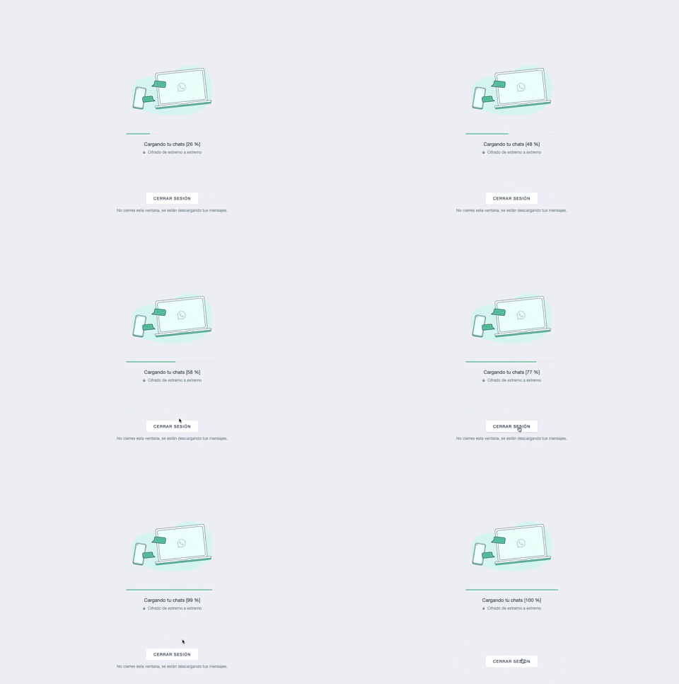
361. WhatsApp - Progress Bar Loading
This progress bar visually informs users about the loading status of their chats, providing a clear percentage to manage expectations during data synchronization.
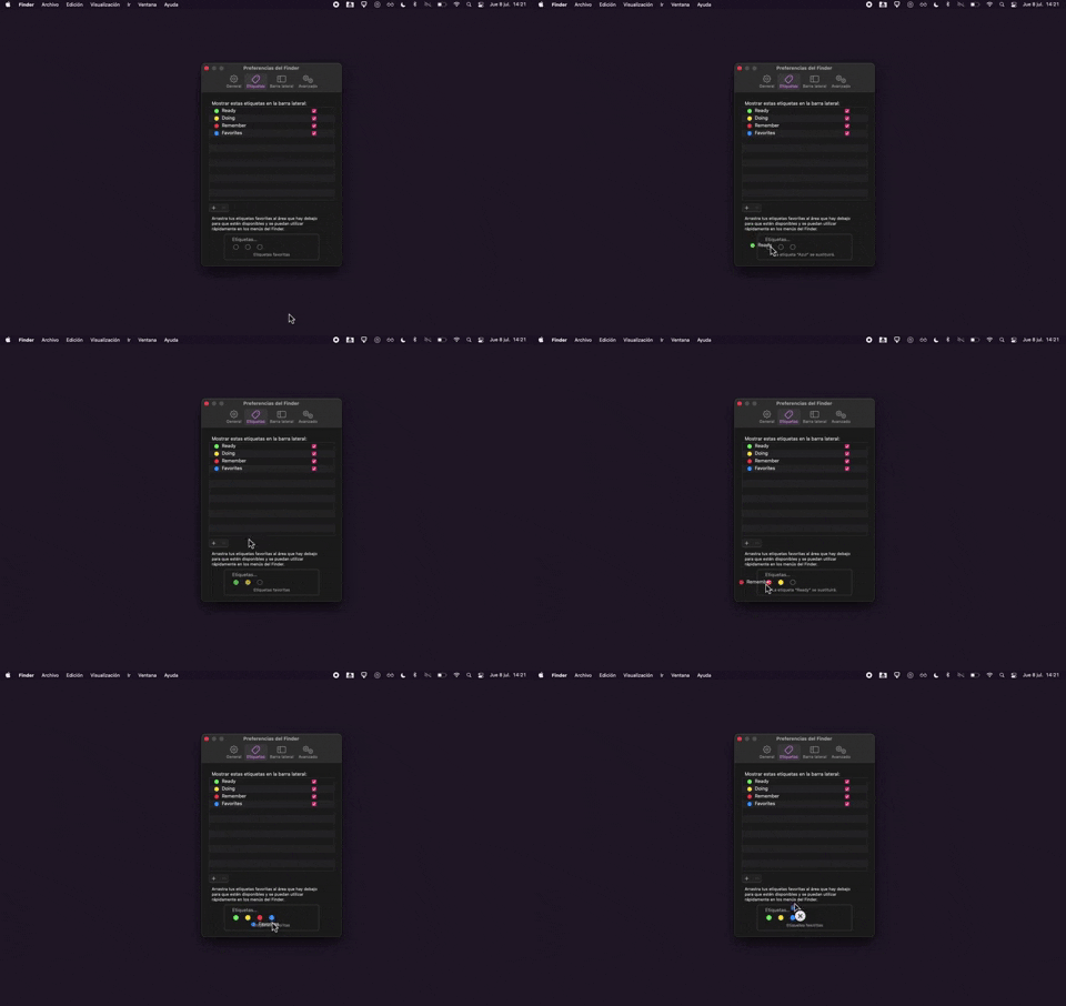
325. Drag & Drop Tag Colors to Slots
Users can intuitively assign color-coded tags to designated slots via drag-and-drop, enhancing organization and quick visual identification of items.
Uink Digital Agency
Specilist on building and launching digital products. Let's talk!

308. Spinners for Module Loading
This spinner provides visual feedback during module loading, reassuring users that the system is actively processing and preventing perceived delays.
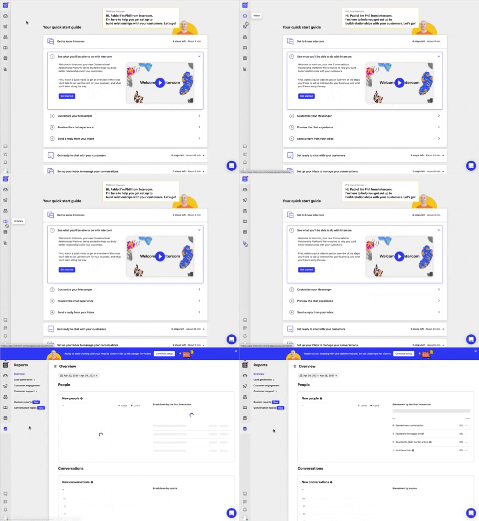
292. Vertical Icon Menu
This vertical icon menu provides quick access to key sections, revealing descriptive tooltips on hover to aid navigation and improve user pathfinding.

274. Interactive Background Animation
This pattern uses an interactive background animation to engage users and provide visual feedback as they navigate or interact with elements on the page.
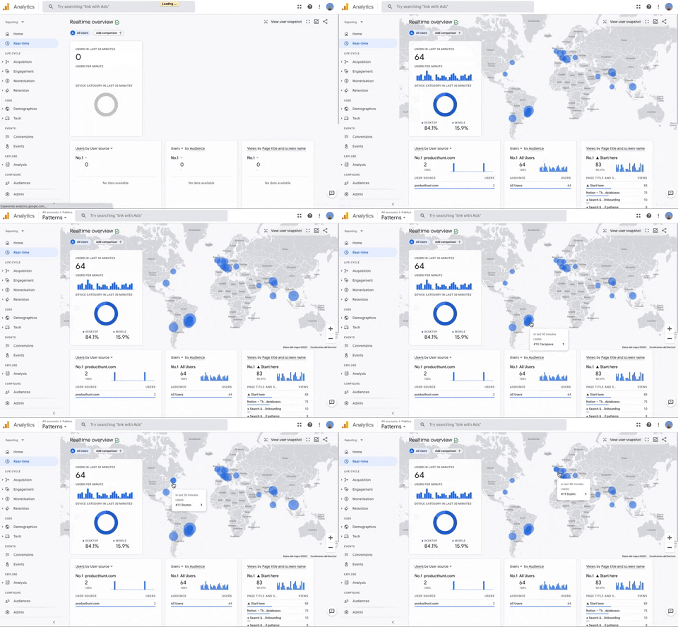
251. Progressive Layout Loader
This pattern provides immediate visual feedback during page loads, progressively revealing content to reassure users that the system is actively processing their request.
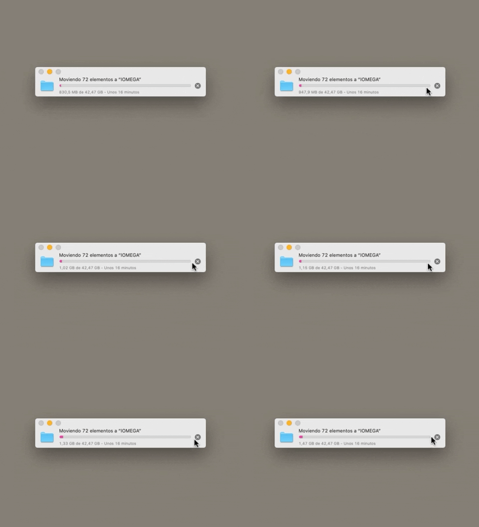
223. Stop Operation Progress
This pattern allows users to cancel an ongoing operation, like a file transfer, by clicking a clear "X" icon, providing immediate control over system processes.
212. Automatic Background Animation (on Load)
Desktop, Decision Making, Awareness, Web, English, Animation, Loader, Hypertext Links

45. Webapp Video Loader
This loader provides visual feedback to users that content is loading, maintaining engagement and reducing perceived wait times by showing the layout structure.

189. Feature Preview on Menu
This pattern highlights new or experimental features within a dropdown menu, allowing users to discover and opt-in to upcoming functionalities.

43. File Upload Status
This pattern provides real-time feedback on file upload progress and status, allowing users to monitor, manage, and resolve potential issues efficiently.

150. Split OS Screens
Users can efficiently manage multiple tasks by splitting their operating system screen into distinct, resizable windows, enhancing productivity and multitasking capabilities.
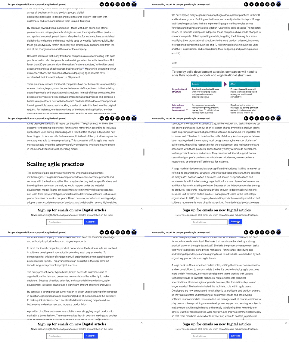
158. Bar Reading Status
A UI element, typically a bar, that visually indicates the user's reading progress or status within a document or page. Often integrated into a fixed navigation bar, it enhances awareness and helps users track their position. Notable behavior: Progress State; Fixed on Scroll.

173. Share Invitation to Live Movie
Users can invite up to six friends to a synchronized viewing experience, fostering shared enjoyment and social interaction around media content.
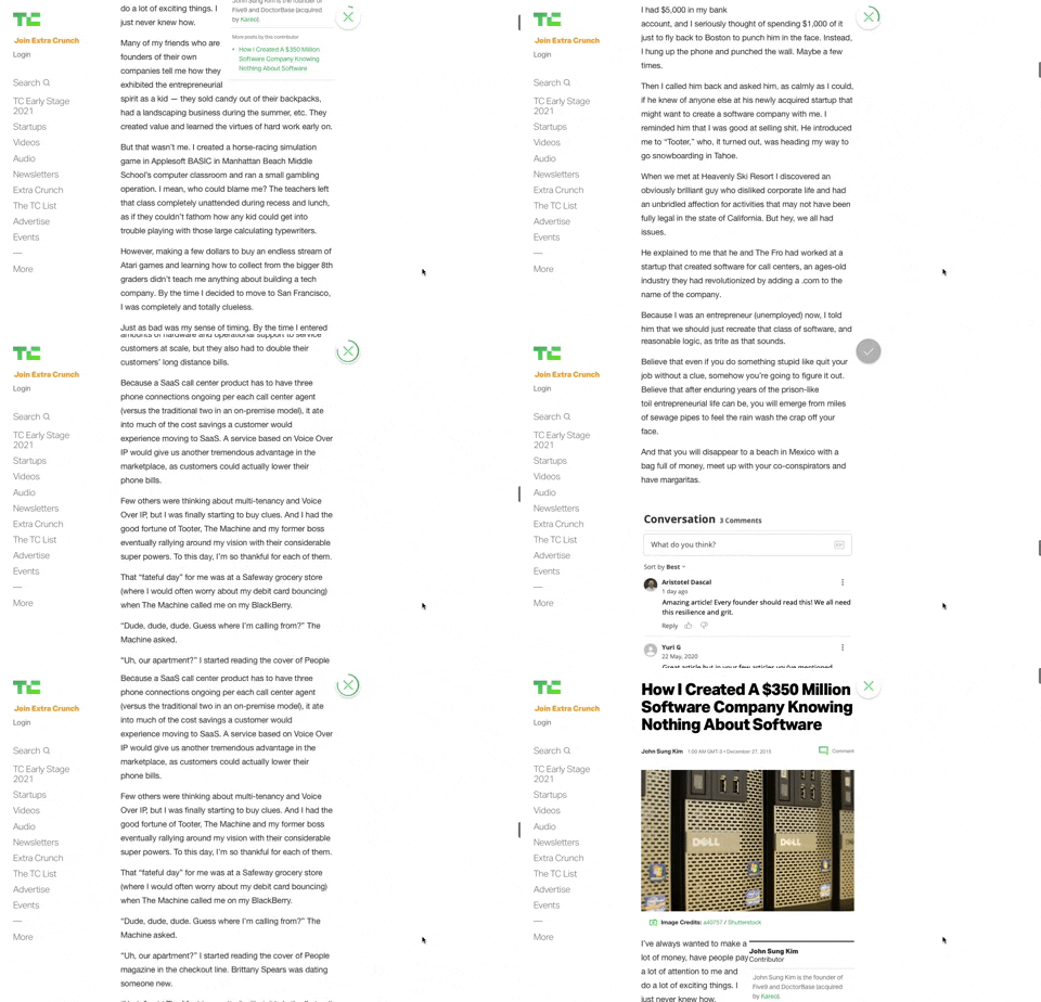
91. Bubble Status Reading
This pattern provides a fixed, animated bubble that indicates reading progress, helping users understand their position within long articles and enhancing content appreciation.

83. Rewards Notification on Topbar
This pattern uses a notification badge on the top bar to alert users to new rewards, which can be viewed in a dropdown menu for easy access and appreciation.

66. Actionable Empty State
This empty state provides a clear call to action, guiding users to initiate content creation and overcome initial blank canvas paralysis.

21. Advanced Color Picking
This pattern allows users to precisely select colors from a spectrum, adjust saturation and brightness, and save custom swatches for efficient reuse.

29. General Form Errors Banner
This banner provides a clear, concise message to users, offering an alternative action to streamline the process of adding multiple subscribers.

112. Share on Social Networks
This pattern enables users to effortlessly share content across popular social networks and via email, boosting content reach and engagement.