Patterns for Tabs & Pagination
- Desktop (19)
- Tablet (1)
- Mobile (2)
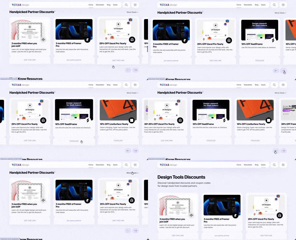
411. Ticket Carrousel (TOOOLS.design)
Users can browse a curated selection of offers by clicking pagination arrows, enabling efficient discovery and decision-making.
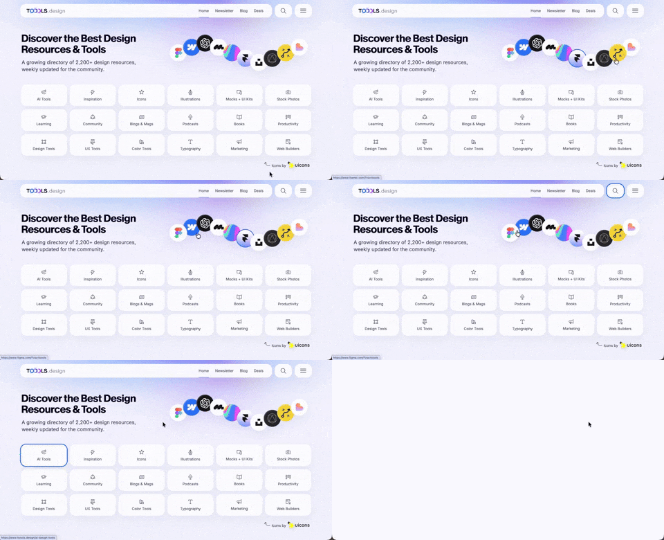
410. Hero Interactive Background (TOOOLS.design)
This pattern uses an animated, interactive background to engage users and visually highlight featured content, enhancing initial appreciation and pathfinding.

402. Transition: Zoom-to-Dock for Minimize
This transition visually guides the user as a window minimizes, smoothly shrinking and moving to its new location in the dock, enhancing spatial awareness and system feedback.
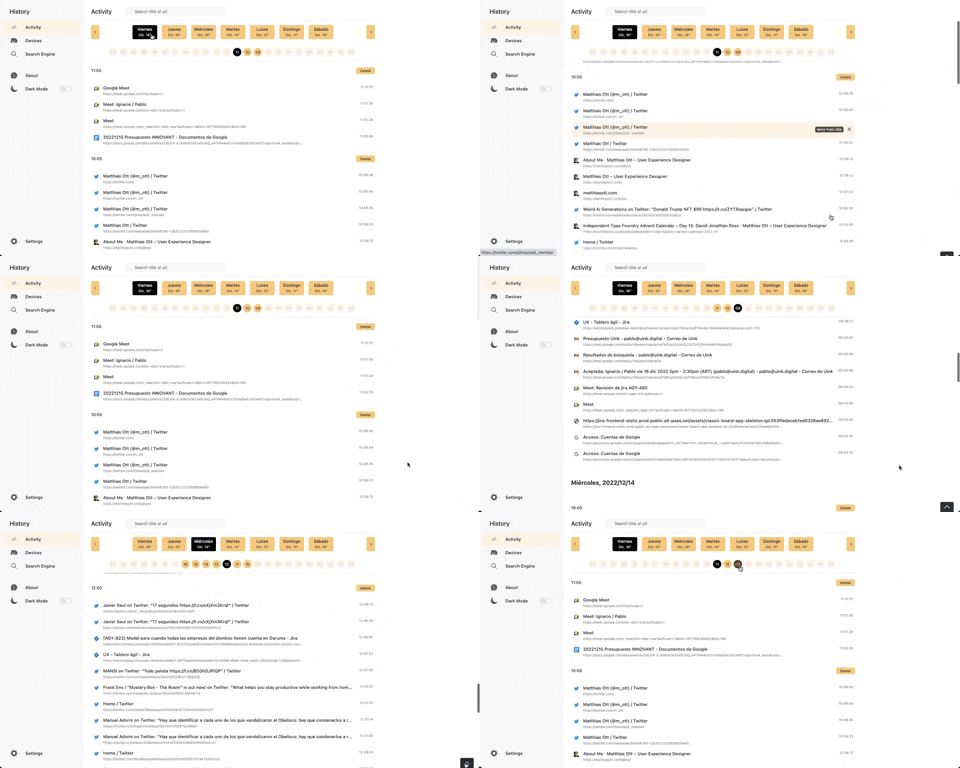
363. Better History - Back to Top on scroll
This pattern allows users to quickly navigate to the top of a long list by clicking a fixed "Back to Top" button that appears on scroll.
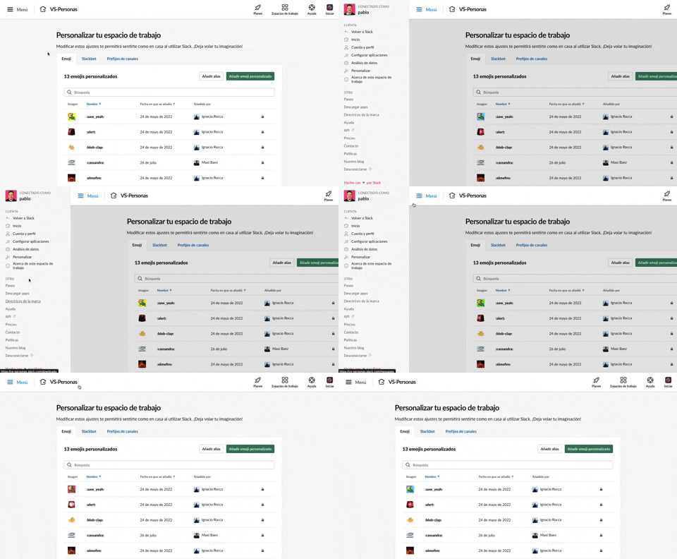
375. Toggle/Show Sidebar Menu
Users can toggle a persistent sidebar menu to reveal or hide navigation options, optimizing screen space while maintaining easy access to key features.
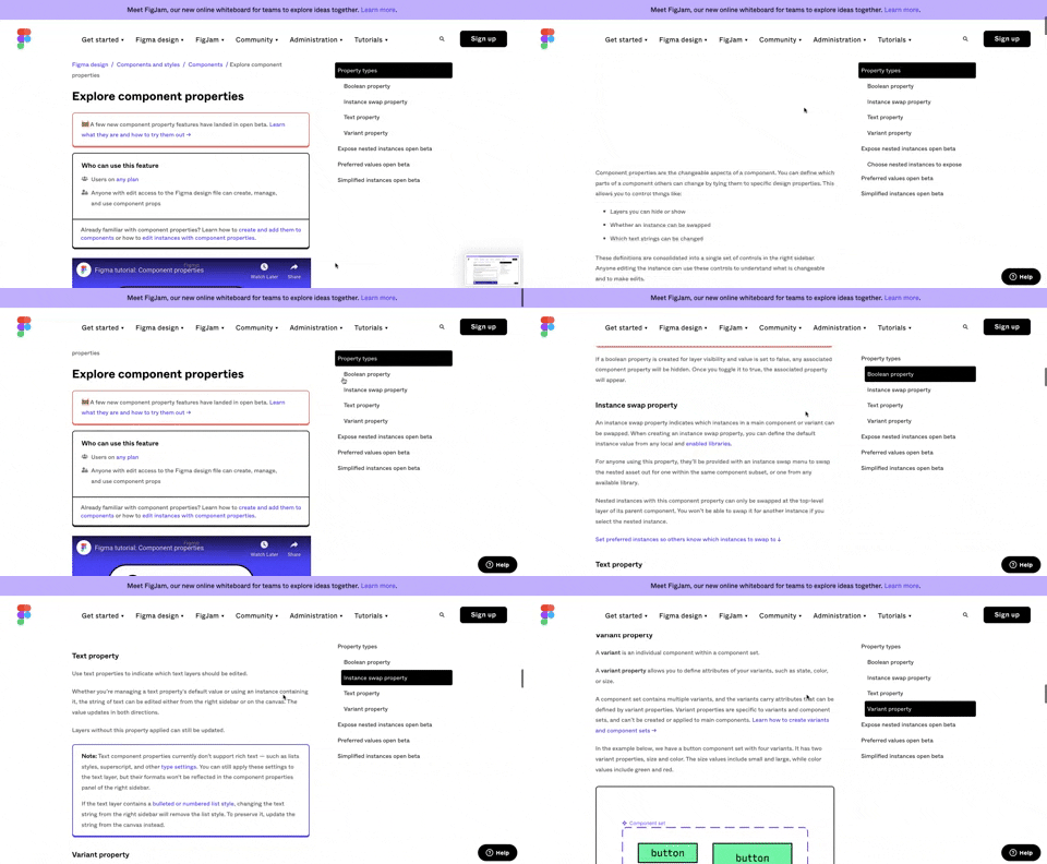
360. Page Outline Menu
This menu provides an interactive outline of page content, allowing users to quickly navigate to specific sections and understand the page structure at a glance.
355. Jira - Feature Presentation Tooltip
A feature presentation tooltip, as seen in Jira, guides users through new functionalities or important updates. It often appears during onboarding or to raise awareness, utilizing tooltips with hypertext links and pagination for multi-step tours on both desktop and web interfaces.
Uink Digital Agency
Specilist on building and launching digital products. Let's talk!
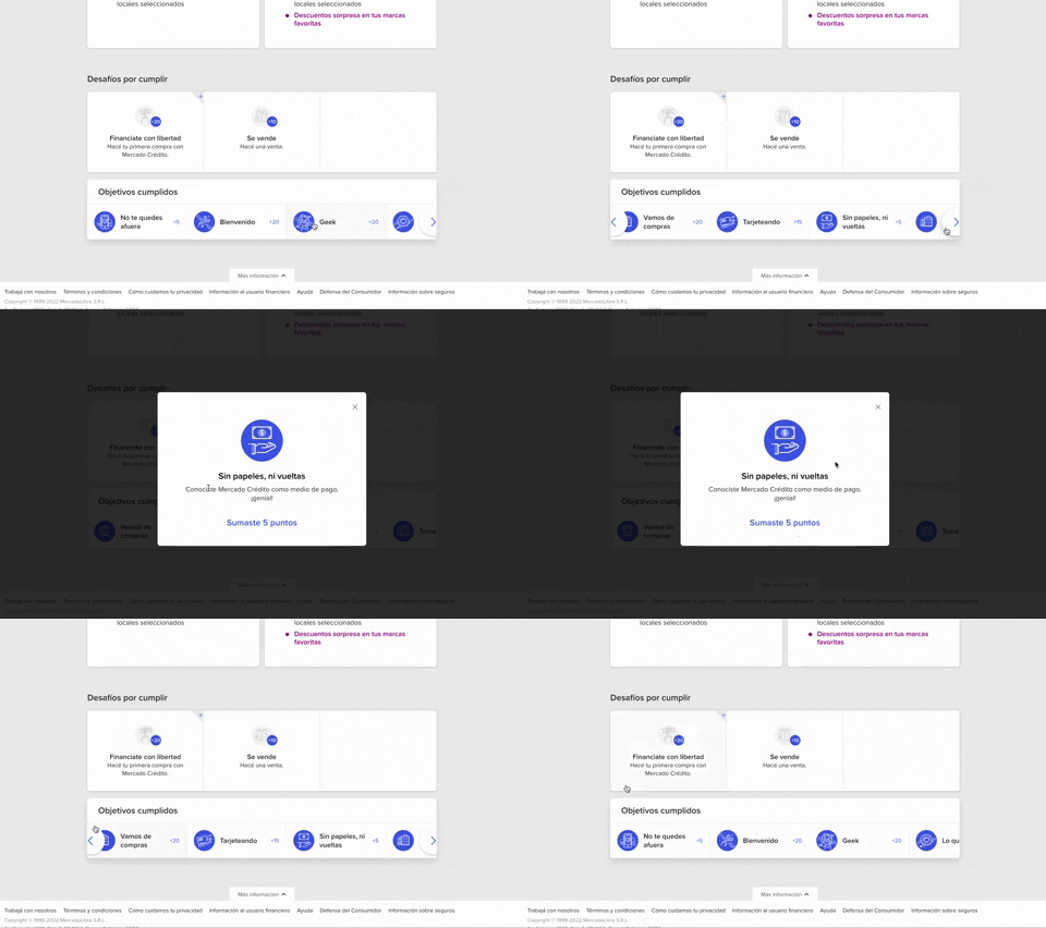
344. MercadoLibre - Horizontal Item Slider
This horizontal item slider allows users to effortlessly browse a curated selection of items, enhancing discoverability and engagement with minimal scrolling.
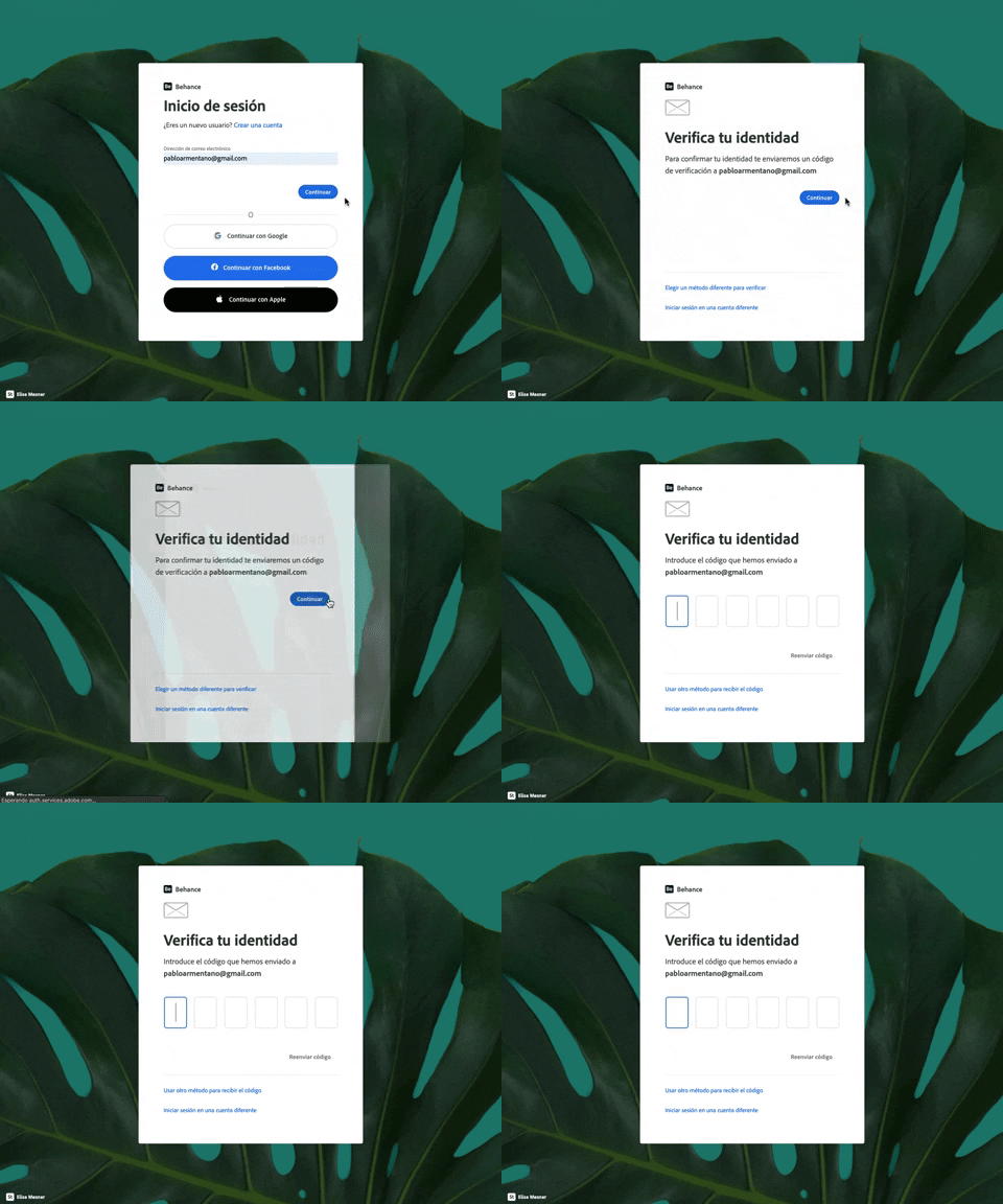
343. Behance - Login with Code Validation
Users input their email for login, then receive and enter a validation code to securely access their account.
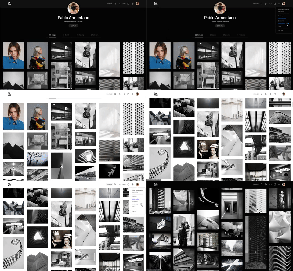
342. Savee - Light/Dark Mode Switcher
Users can instantly toggle between light and dark display modes, enhancing visual comfort and accessibility based on their preference or environment.
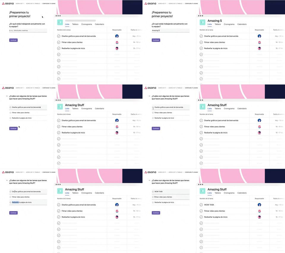
339. Asana - Platform Onboarding Simulator
This pattern guides users through initial setup by simulating product features, allowing them to visualize outcomes and make informed decisions before committing.
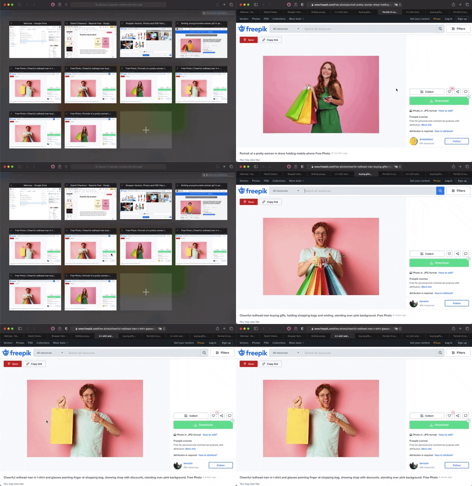
336. Transition: Zoom-In/Out for Browser Windows
This transition allows users to fluidly zoom between a grid of browser tab thumbnails and a full-screen view, enhancing navigation and context switching.
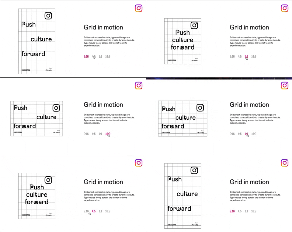
318. Instagram - Animated Illustration with Menu
Users can dynamically adjust content aspect ratios via a clickable menu, providing flexible viewing experiences and enhancing content adaptability.
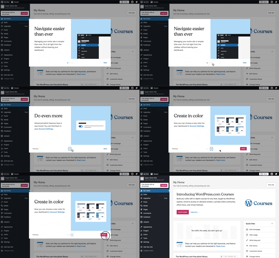
241. Modal Blackout w/ Steps
This multi-step modal guides users through key features with clear explanations and visual cues, ensuring a smooth onboarding experience.
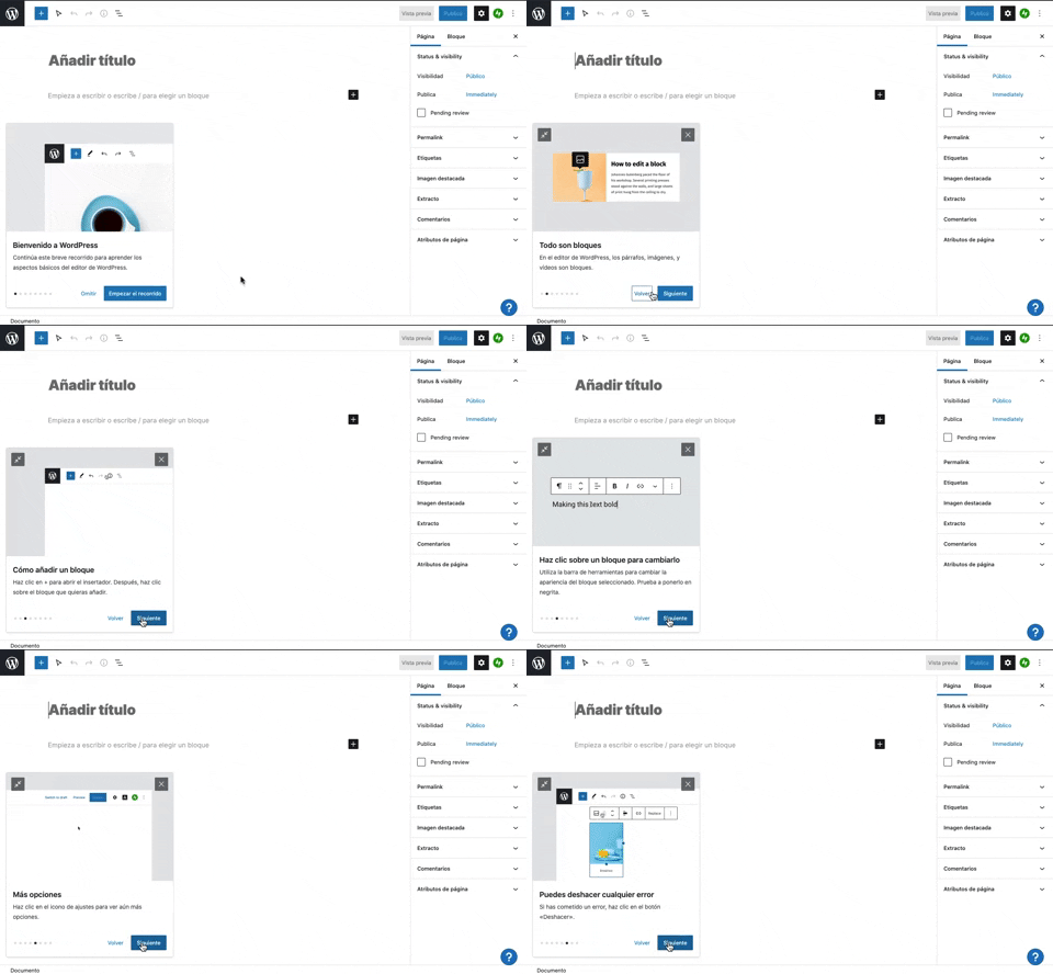
231. Floating Dialog Popover w/ Steps
This pattern guides users through a multi-step onboarding or feature tour with a dismissible, paginated floating dialog, enhancing discoverability and adoption.
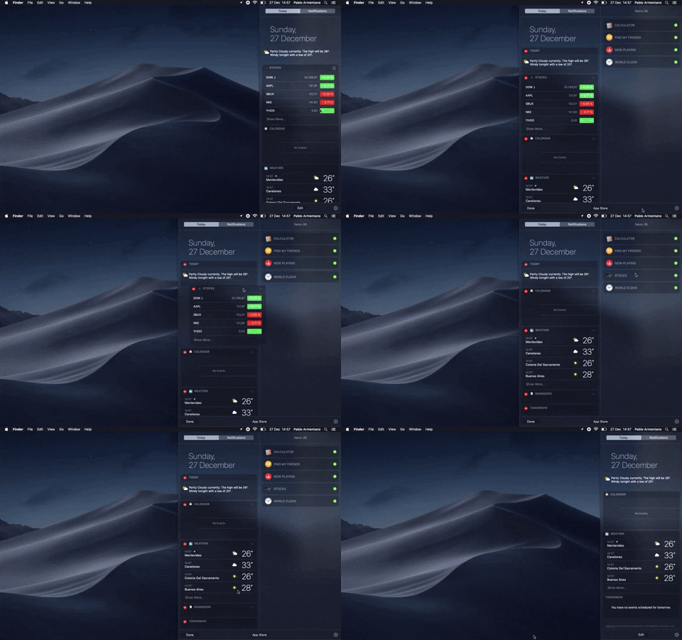
138. Widget Customization Sidebar (2-pane)
Users can quickly access and customize widgets in a two-pane sidebar, enhancing productivity by providing relevant information at a glance.

145. Communication Preferences on Sign Up Flow
This pattern gathers essential user contact information, including first name, surname, and email address, to facilitate account creation and future communication.
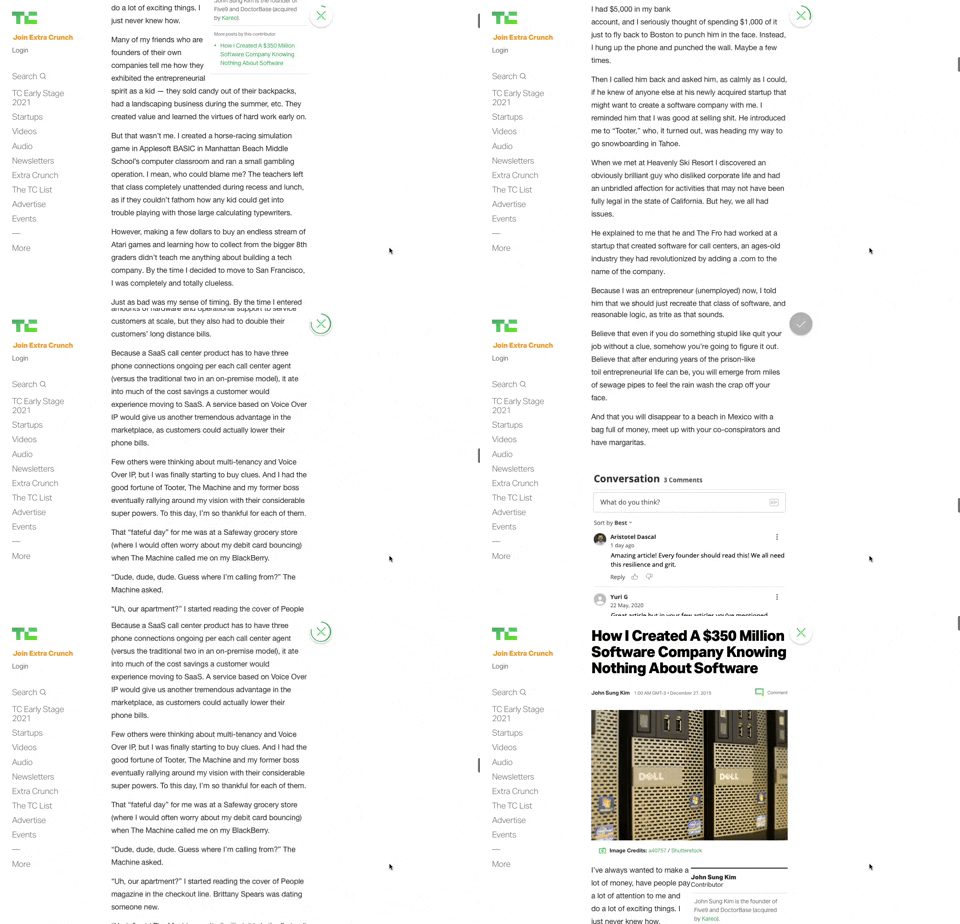
91. Bubble Status Reading
This pattern provides a fixed, animated bubble that indicates reading progress, helping users understand their position within long articles and enhancing content appreciation.

21. Advanced Color Picking
This pattern allows users to precisely select colors from a spectrum, adjust saturation and brightness, and save custom swatches for efficient reuse.