Patterns for Awareness & Status
- Desktop (117)
- Tablet (3)
- Mobile (19)

268. Drag & Drop to Upload File
Users can effortlessly upload files by dragging them from their desktop directly into a designated drop zone within the application.
_07.10.33_p._m..png?table=block&id=1b4e4bae-3d76-8055-baf9-d28c23cd351f&cache=v2&width=1104&quality=80)
275. Popover on Hover
A popover on hover reveals contextual information or actions in a temporary overlay, enhancing user awareness without disrupting the main workflow.

274. Interactive Background Animation
This pattern uses an interactive background animation to engage users and provide visual feedback as they navigate or interact with elements on the page.
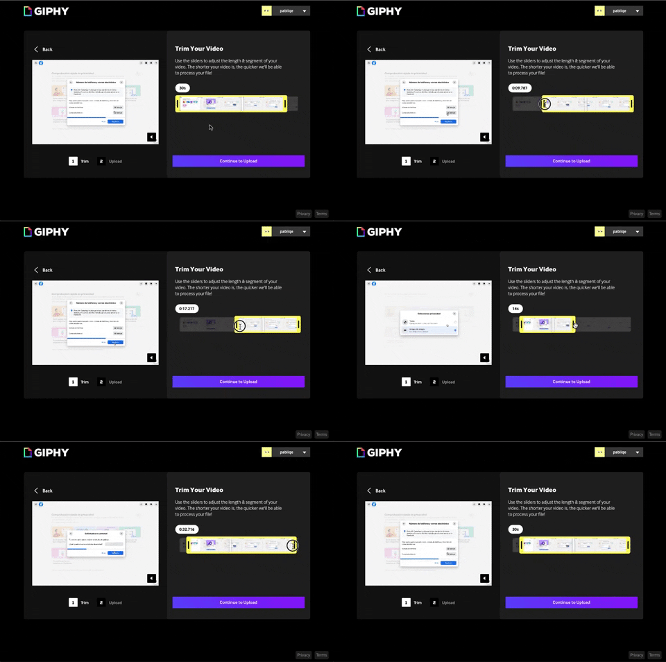
243. Trim Video Slicer
Users can precisely trim video segments using a draggable timeline with visual thumbnails, enabling efficient content selection and faster processing.
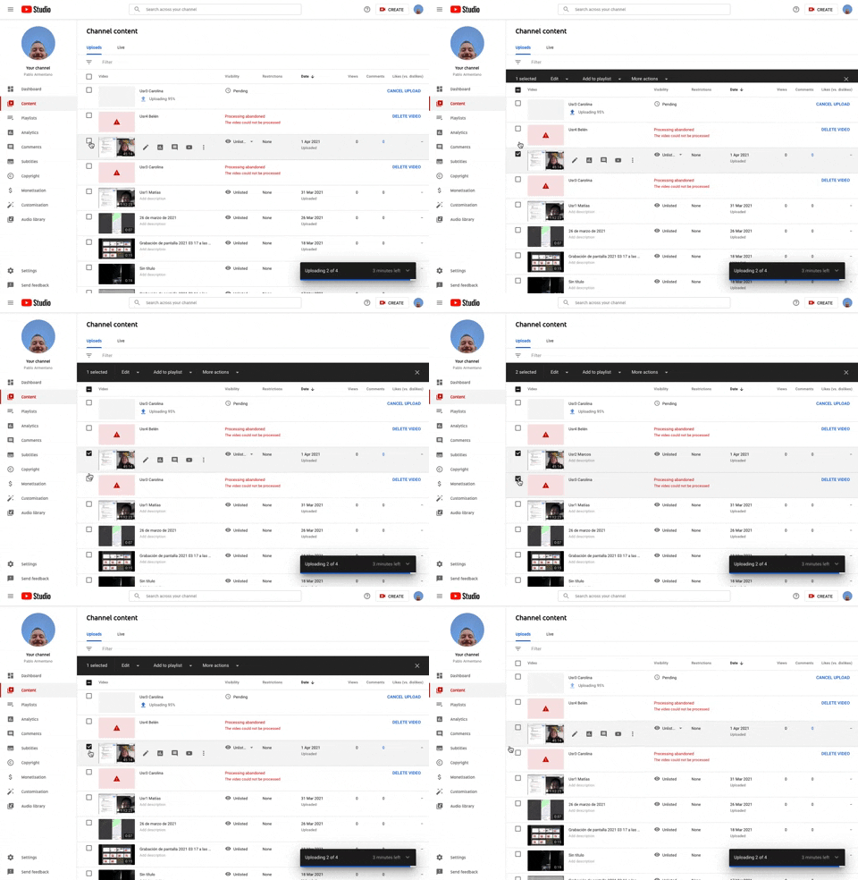
253. Youtube - Table Row Selector
Users can efficiently select multiple table rows by clicking checkboxes, enabling bulk actions and streamlining content management workflows.
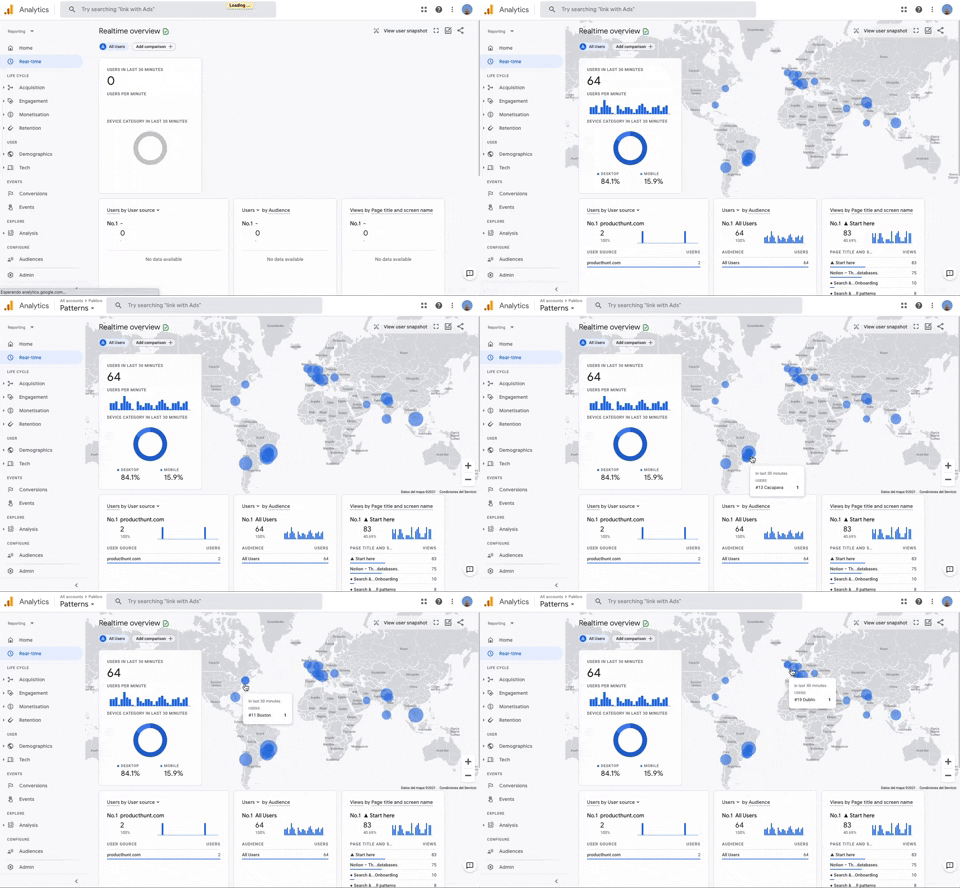
251. Progressive Layout Loader
This pattern provides immediate visual feedback during page loads, progressively revealing content to reassure users that the system is actively processing their request.
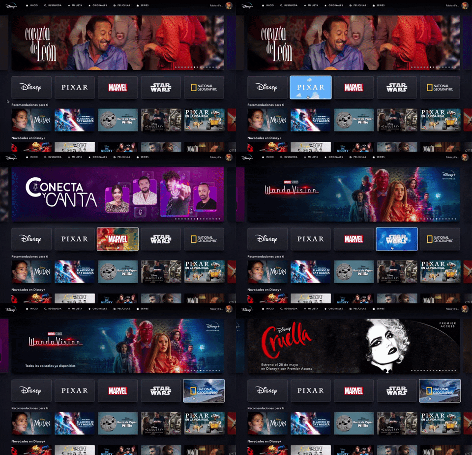
235. Background Animation (on Mouse Hover)
This pattern uses a subtle background animation on hover to provide visual feedback, guiding users to interactive elements and enhancing discoverability.
Uink Digital Agency
Specilist on building and launching digital products. Let's talk!
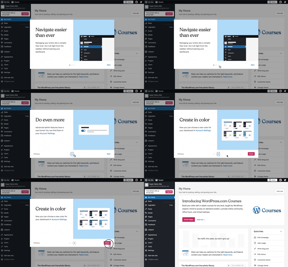
241. Modal Blackout w/ Steps
This multi-step modal guides users through key features with clear explanations and visual cues, ensuring a smooth onboarding experience.
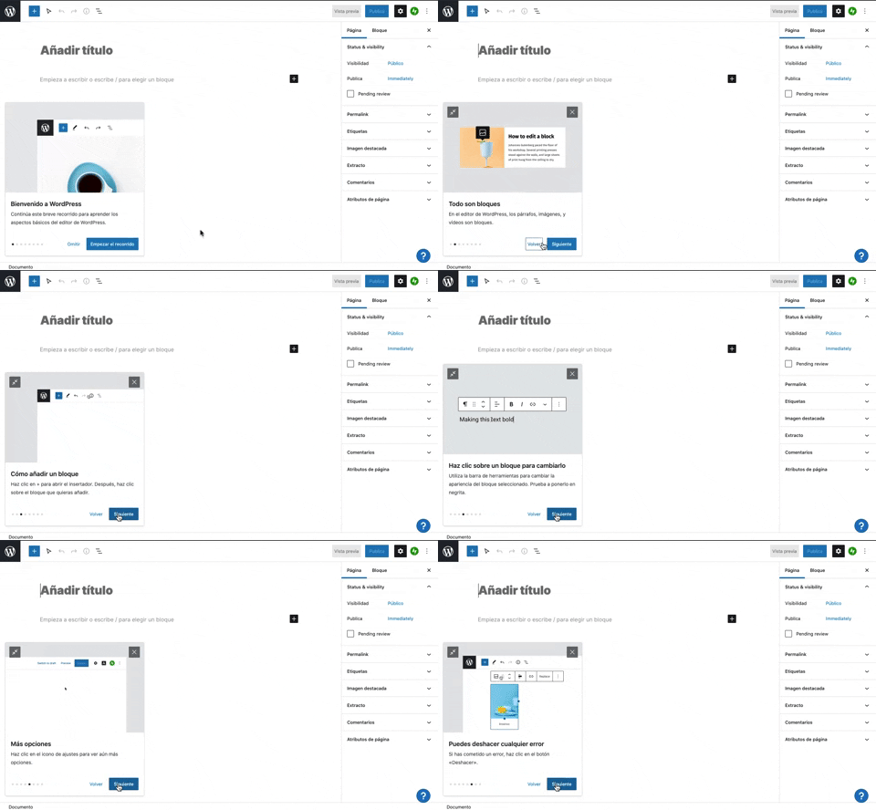
231. Floating Dialog Popover w/ Steps
This pattern guides users through a multi-step onboarding or feature tour with a dismissible, paginated floating dialog, enhancing discoverability and adoption.
_15.13.40.png?table=block&id=1afe487c-9060-4656-bab2-1545d8a9131e&cache=v2&width=960&quality=80)
229. Top Banner for Design Changes
A top banner informs users about new design changes, offering a clear link to "Obtener más información" for those seeking further details.
_16.00.46.png?table=block&id=64a4f84d-2f69-4a08-86e4-8fa4fe9dcdf7&cache=v2&width=960&quality=80)
222. Floating Banner on User Input
This pattern displays a floating banner over existing content, allowing users to compose new input without losing context of the underlying page.
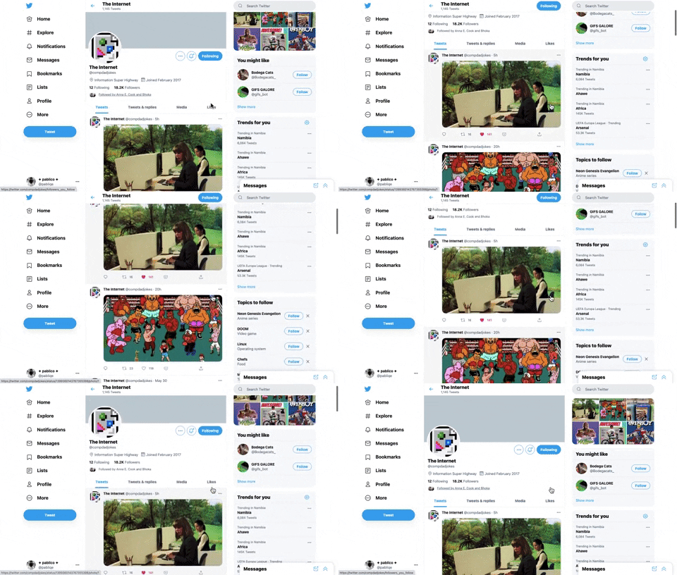
221. Stacked Action Button
This pattern keeps primary actions readily accessible by stacking them vertically, ensuring users can quickly initiate key tasks without scrolling.
212. Automatic Background Animation (on Load)
Desktop, Decision Making, Awareness, Web, English, Animation, Loader, Hypertext Links
_11.42.04_p._m..png?table=block&id=d98eb8a6-5b4b-424b-9a5b-65dbede004ee&cache=v2&width=960&quality=80)
45. Webapp Video Loader
This loader provides visual feedback to users that content is loading, maintaining engagement and reducing perceived wait times by showing the layout structure.
_11.28.04_a._m..png?table=block&id=9ed7b18a-e2c4-459c-89d2-022135be31eb&cache=v2&width=960&quality=80)
207. Downloading Desktop App
This pattern informs users that a desktop application is downloading, providing clear instructions and a progress indicator to manage expectations and guide the next steps.
_00.32.31.png?table=block&id=99d40e79-c293-4cc7-a954-2f94c0c543a9&cache=v2&width=960&quality=80)
172. PedidosYa - Search Results Recommendation
This pattern uses a tooltip to highlight "Top Recommended Restaurants," informing users that the displayed selection is personalized based on proximity, order history, and ratings.
_09.47.02_p._m..png?table=block&id=fe5cf013-944c-4937-88fd-36f64cfb47c7&cache=v2&width=960&quality=80)
31. Page Blocker Edition Warning
This pattern warns users about potential data loss when editing an active test, offering options to proceed cautiously or duplicate the test to preserve existing responses.

5. Website Promotional Top Banners
A prominent top banner informs users about new features or promotions, encouraging engagement with a clear call to action.
_09.05.58_p._m..png?table=block&id=0661a925-a354-4f4d-bf55-7d96d9ba0b6f&cache=v2&width=960&quality=80)
189. Feature Preview on Menu
This pattern highlights new or experimental features within a dropdown menu, allowing users to discover and opt-in to upcoming functionalities.
190. Delete Confirmation w/ Name (moved)
A modal dialog pattern requiring the user to explicitly type the name of an item to confirm its deletion, enhancing user awareness and preventing accidental data loss. Notable behavior: Text input; Button click (confirm/cancel); Modal open.
_13.52.38.png?table=block&id=d897f247-1e88-4d89-a9d1-20bef4084553&cache=v2&width=960&quality=80)
43. File Upload Status
This pattern provides real-time feedback on file upload progress and status, allowing users to monitor, manage, and resolve potential issues efficiently.
_12.03.02.png?table=block&id=308eebf9-c4aa-4879-a6b9-62970b2cc7d2&cache=v2&width=960&quality=80)
199. Sidebar Emptystate
This sidebar empty state introduces new features with a clear illustration and call to action, guiding users to discover and adopt new functionalities.
_10.03.52.png?table=block&id=ad3ab3c8-6c9a-4429-9994-30afeb682d3f&cache=v2&width=960&quality=80)
189. Illustration (Meme) on Empty State
This empty state uses a humorous meme and a guiding text to playfully direct users toward the primary action button, encouraging engagement.
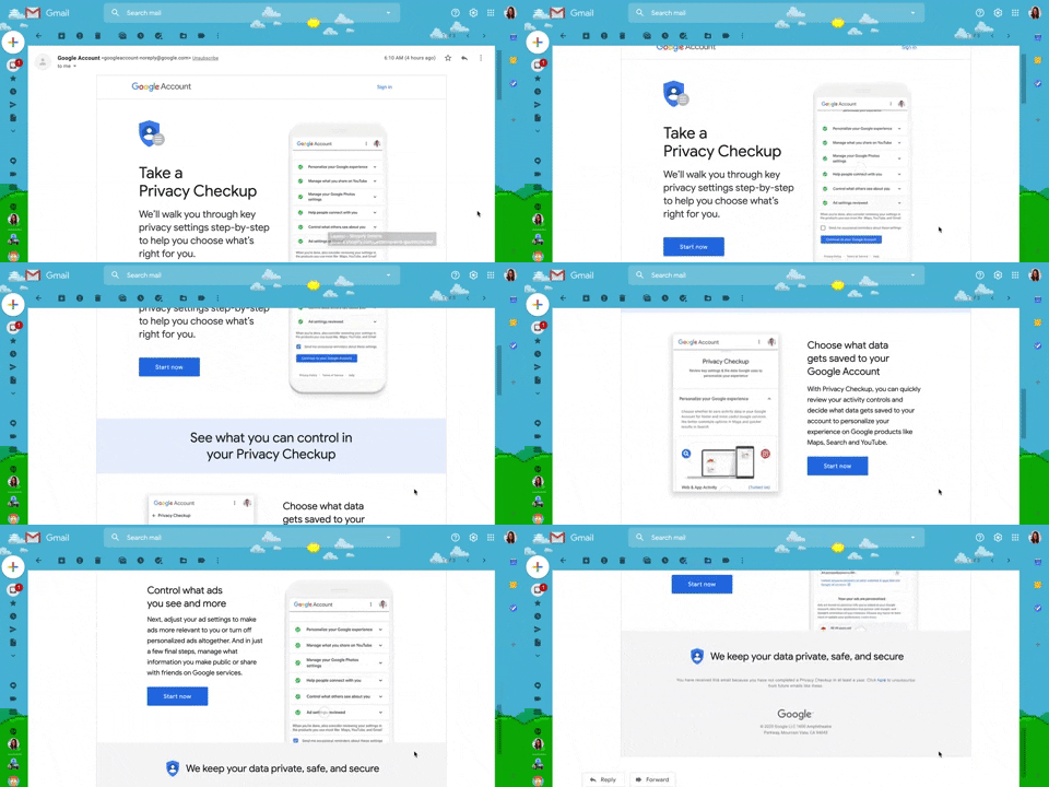
130. Animated Email Page
This pattern uses subtle animations within an email to guide users through a privacy checkup, enhancing engagement and clarity for important account actions.
132. Amazon - Store Tooltip Reminders
This pattern uses tooltips to provide reminders or onboarding information within a store context, often including hypertext links for further action or navigation. It is primarily designed for desktop web environments to enhance user awareness.
164. Static Tooltip on Menu
A static tooltip on a menu provides immediate, contextual information for menu items. It typically appears on hover or focus, enhancing user understanding of an item's function or details without requiring an explicit click.

179. Stylized Feature Highlighting
This pattern uses an overlay with a stylized, partially transparent shape to draw attention to a new feature, offering options to engage or dismiss.
_23.24.56.png?table=block&id=06f060c5-b44d-4082-9d62-b7c0189bcb6b&cache=v2&width=960&quality=80)
203. Password Expiration on Login
This pattern prompts users to re-enter their password when a session expires, ensuring security while allowing them to quickly resume their work.
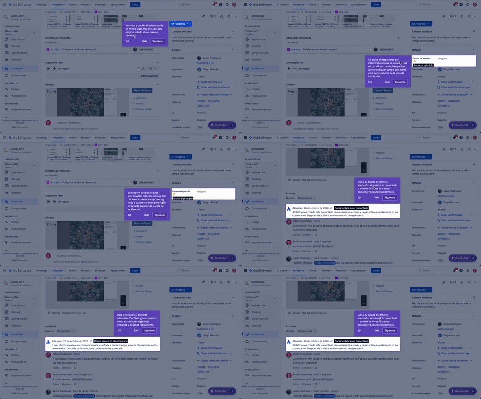
56. Floating Tooltip with Steps and Blackout
This pattern guides users through multi-step onboarding or feature discovery with a focused, sequential tooltip and a dimmed background.
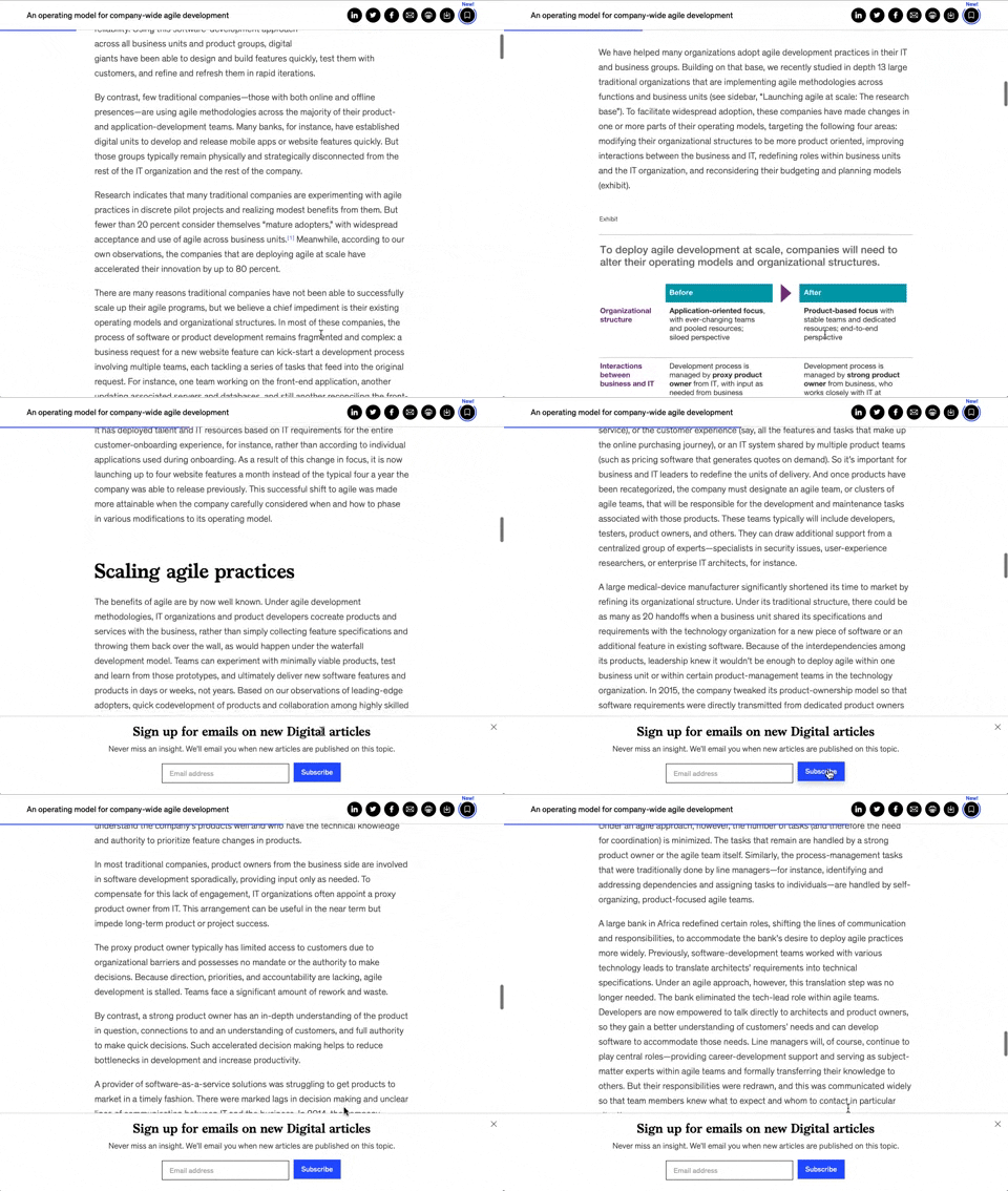
158. Bar Reading Status
A UI element, typically a bar, that visually indicates the user's reading progress or status within a document or page. Often integrated into a fixed navigation bar, it enhances awareness and helps users track their position. Notable behavior: Progress State; Fixed on Scroll.
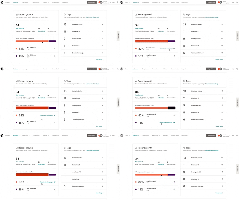
139. Synced Hover Animations
This pattern uses synchronized hover animations to highlight related data points across different UI elements, enhancing user awareness and decision-making.
_23.29.09.png?table=block&id=ad1d4038-7dbf-406c-8fd5-eafa71de482b&cache=v2&width=960&quality=80)
100. Floating Tooltip/Dialog
A floating tooltip or dialog provides contextual information or prompts user action without disrupting the main workflow, enhancing discoverability and engagement.
_11.56.38_a._m..png?table=block&id=6da484d8-6890-4226-a606-6a20416b7eca&cache=v2&width=960&quality=80)
124. Critical Changes Warning
This pattern provides clear warnings and explanations for critical actions, ensuring users understand the irreversible consequences of their choices before proceeding.
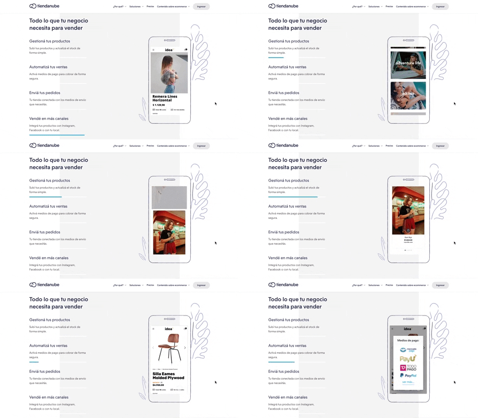
116. 2-pane Automatic Slider
This pattern automatically cycles through content in a two-pane layout, allowing users to passively discover key features or products without direct interaction.
_21.29.50.png?table=block&id=5a6c8023-5e5e-42d0-b8fc-da78c2f1f777&cache=v2&width=960&quality=80)
63. GitHub - Contextual Back Navigation Bar
This pattern provides a clear, persistent navigation bar at the top of the screen, allowing users to quickly return to previous views or access key sections.

388. Drag & Drop and Checkbox to Select Multiple Item
Users can efficiently organize multiple items by dragging and dropping them into a target category, enhancing content management and task completion.

386. Skeleton Loader
This pattern uses skeleton screens to progressively load content, providing immediate visual feedback and reducing perceived wait times for users.
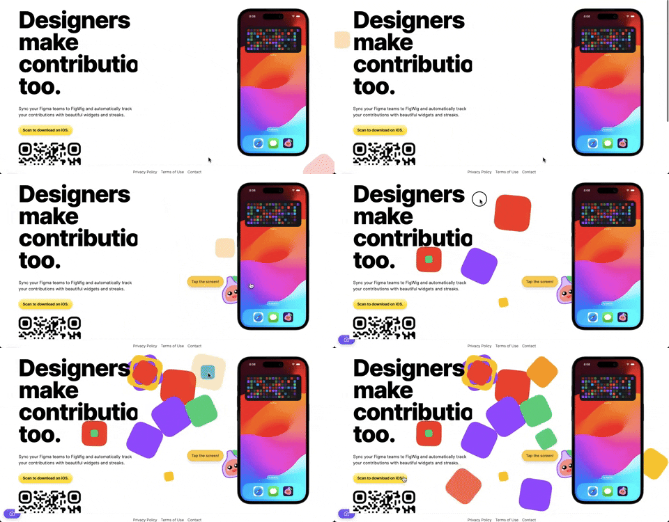
382. Interactive Background Animation
This pattern uses subtle, interactive background animations to engage users and provide dynamic visual feedback as they scroll or interact with the page.

378. Modal Blackout w/ Animation
This pattern uses an animated blackout modal to focus user attention on critical information or actions, ensuring clear decision-making.
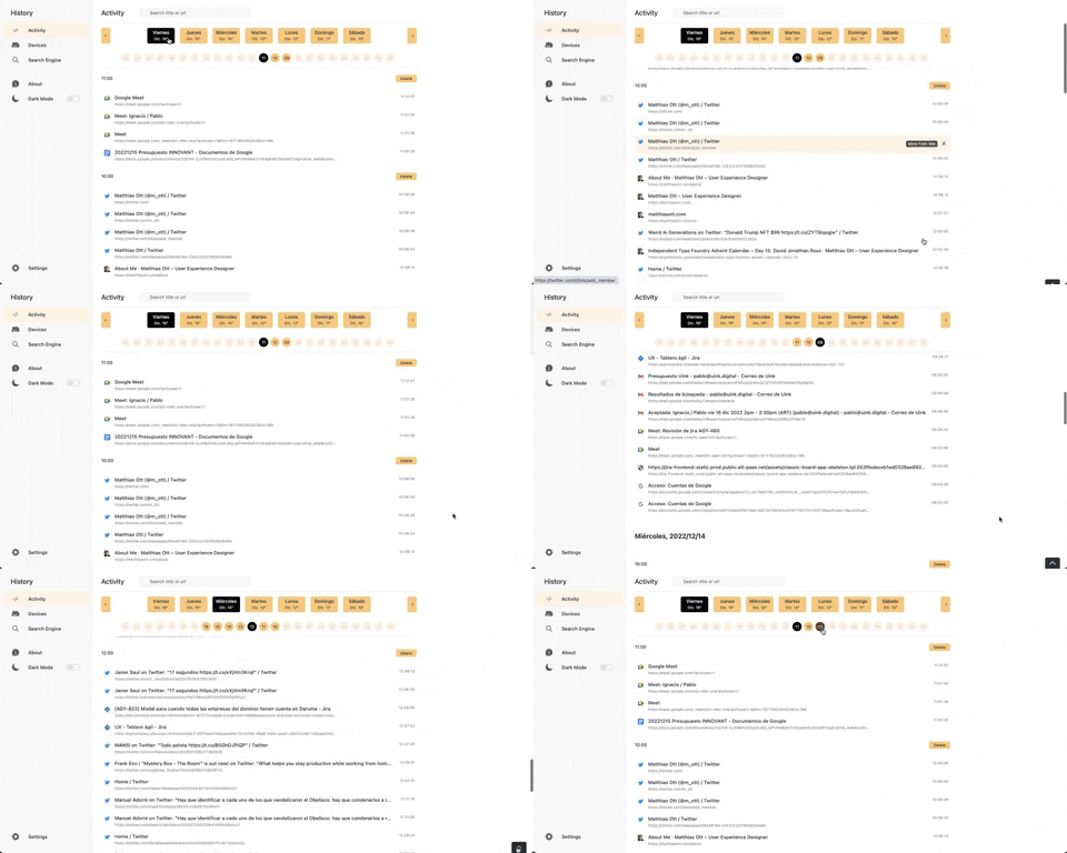
363. Better History - Back to Top on scroll
This pattern allows users to quickly navigate to the top of a long list by clicking a fixed "Back to Top" button that appears on scroll.
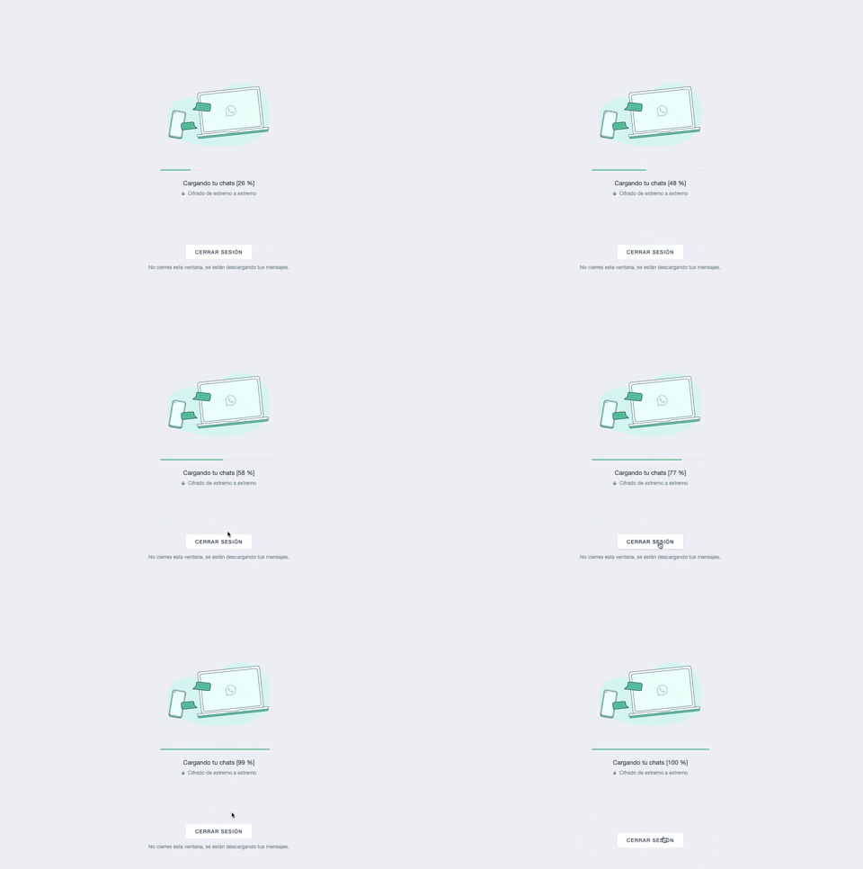
361. WhatsApp - Progress Bar Loading
This progress bar visually informs users about the loading status of their chats, providing a clear percentage to manage expectations during data synchronization.
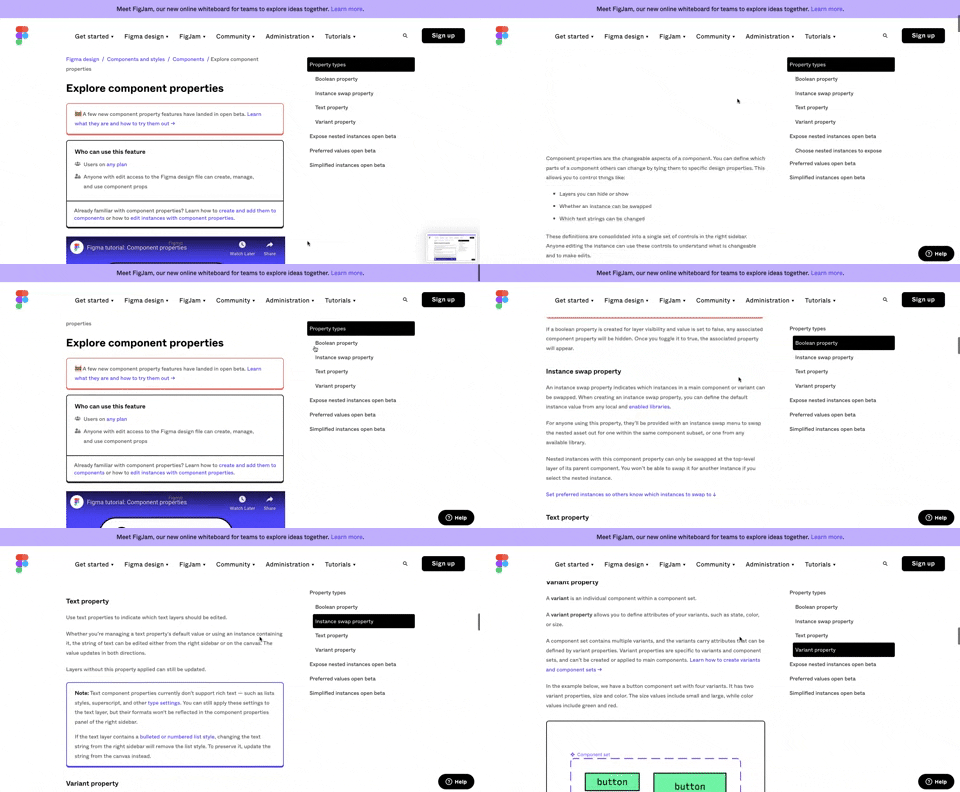
360. Page Outline Menu
This menu provides an interactive outline of page content, allowing users to quickly navigate to specific sections and understand the page structure at a glance.
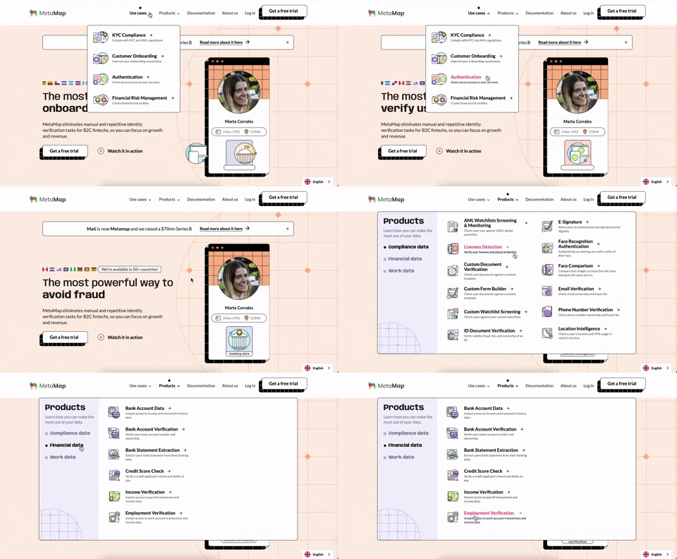
356. MetaMap - Multi-Layout Topbar Menu
This topbar menu uses a dropdown to reveal categorized links, enabling users to quickly navigate to relevant sections and understand the product's diverse offerings.
355. Jira - Feature Presentation Tooltip
A feature presentation tooltip, as seen in Jira, guides users through new functionalities or important updates. It often appears during onboarding or to raise awareness, utilizing tooltips with hypertext links and pagination for multi-step tours on both desktop and web interfaces.
354. Figma - Floating Form with Steps
Desktop, Feedback, Consent, Awareness, Web, English, Text Input, Side Panel
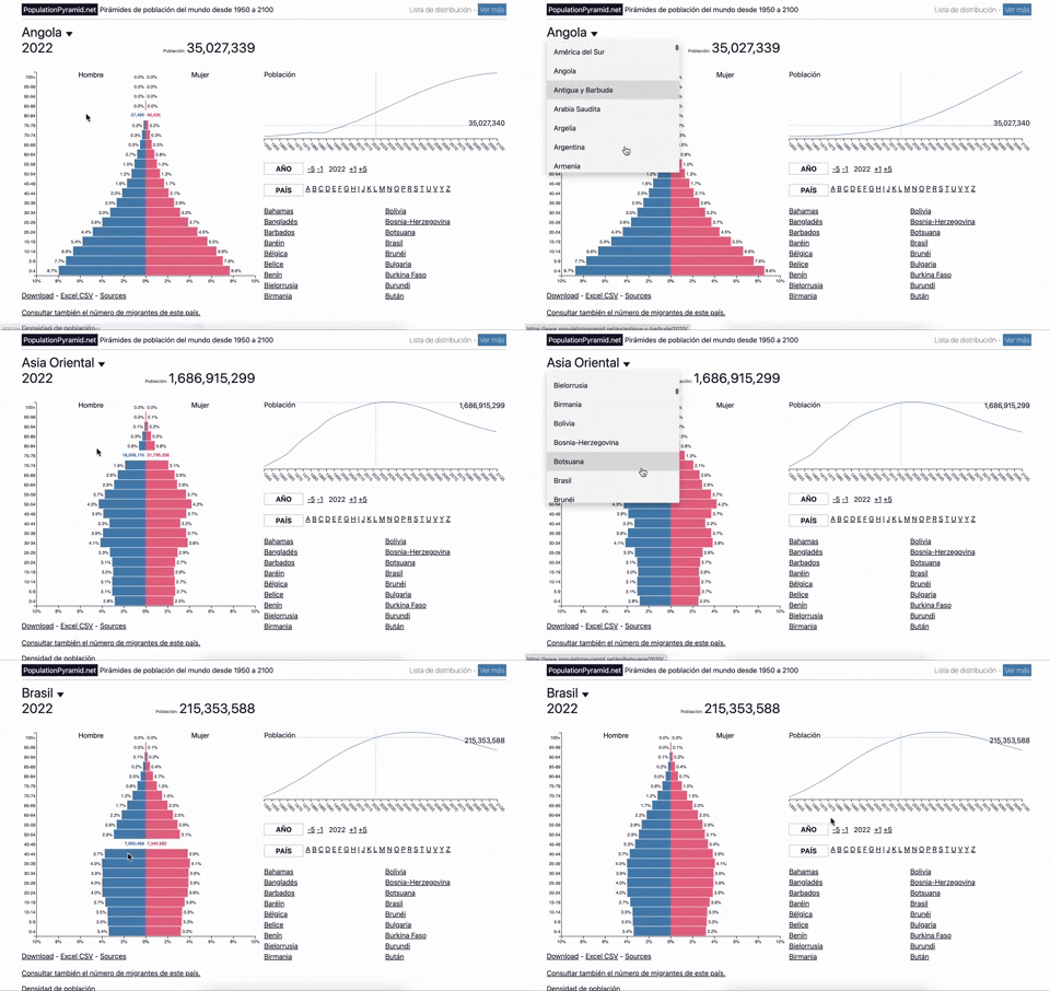
353. Population Pyramid - Visualizations with live filters
Users can dynamically filter population data by country and year, enabling quick comparisons and insights into demographic trends.
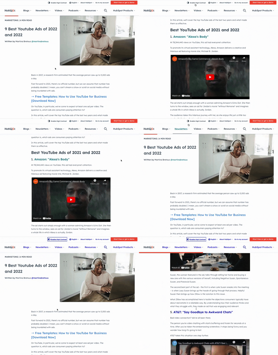
349. HubSpot - Toggle High Contrast
Users can toggle high contrast mode to improve readability and accessibility, enhancing the visual experience for those with low vision.
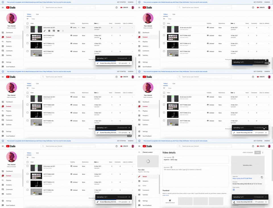
347. YouTube - Floating Progress Bar
This floating progress bar provides persistent, non-intrusive feedback on background tasks, allowing users to monitor progress while continuing other work.
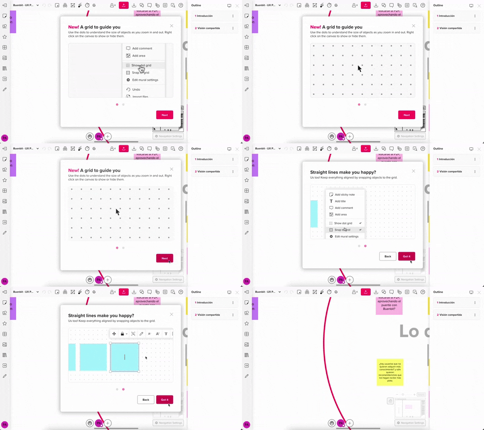
357. Modal w/ Steps & Animation (No blackout)
This modal guides users through multi-step processes with clear instructions and animated transitions, enhancing awareness without obscuring the underlying content.
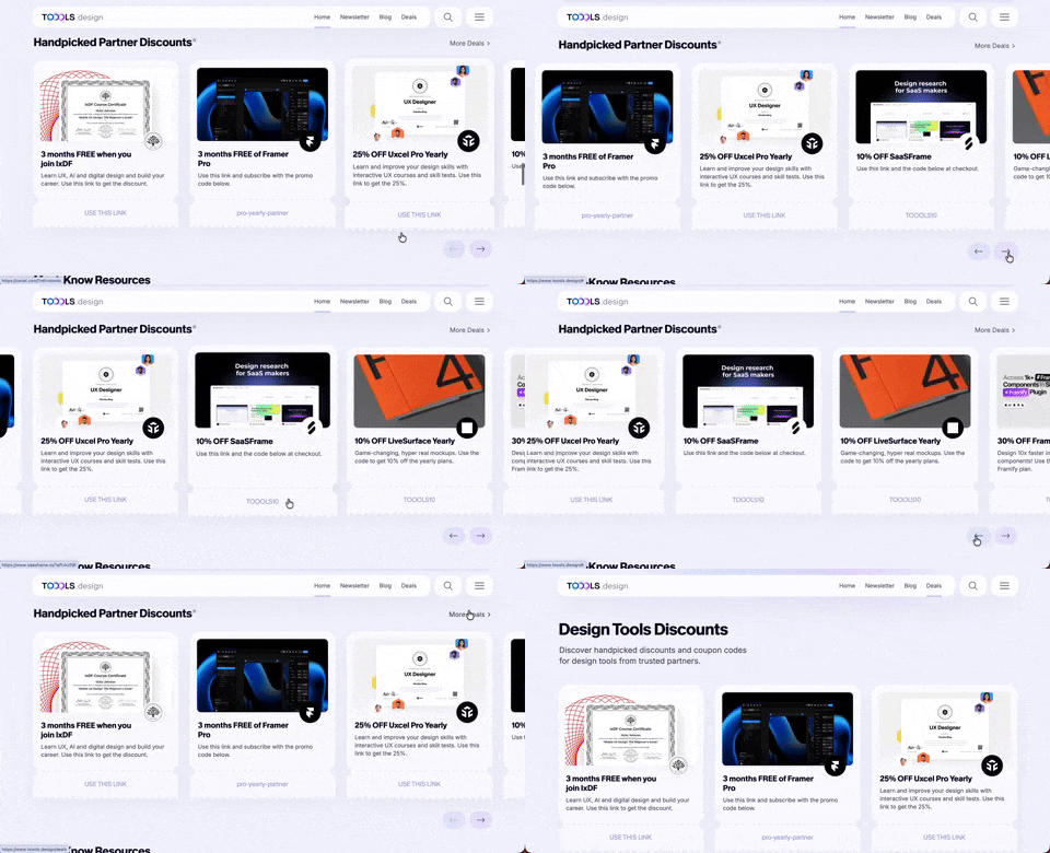
411. Ticket Carrousel (TOOOLS.design)
Users can browse a curated selection of offers by clicking pagination arrows, enabling efficient discovery and decision-making.
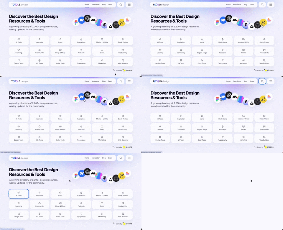
410. Hero Interactive Background (TOOOLS.design)
This pattern uses an animated, interactive background to engage users and visually highlight featured content, enhancing initial appreciation and pathfinding.

409. Customize Toolbar (2-pane interaction)
Users can personalize their toolbar by toggling specific buttons on or off, enhancing workflow efficiency and tailoring the interface to their needs.
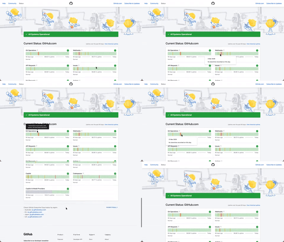
408. Status Page per Hour Indicators
Users can quickly assess system health over time via color-coded hourly indicators, revealing operational status and outage events at a glance.

403. File Upload and Background Loader
Users can easily upload files or paste URLs, receiving clear visual feedback and background loading indicators for a seamless experience.

402. Transition: Zoom-to-Dock for Minimize
This transition visually guides the user as a window minimizes, smoothly shrinking and moving to its new location in the dock, enhancing spatial awareness and system feedback.

401. In-App News Notification
This pattern provides timely, relevant news and updates within the application, enhancing user awareness and engagement without interrupting core workflows.

400. 3D Button Shadow
This pattern uses a subtle 3D shadow animation on hover to provide clear visual feedback, enhancing user awareness and guiding interaction.

397. Modal w/ Card Options
This modal presents users with clear, card-based options to initiate a task, guiding them efficiently through initial decision-making.
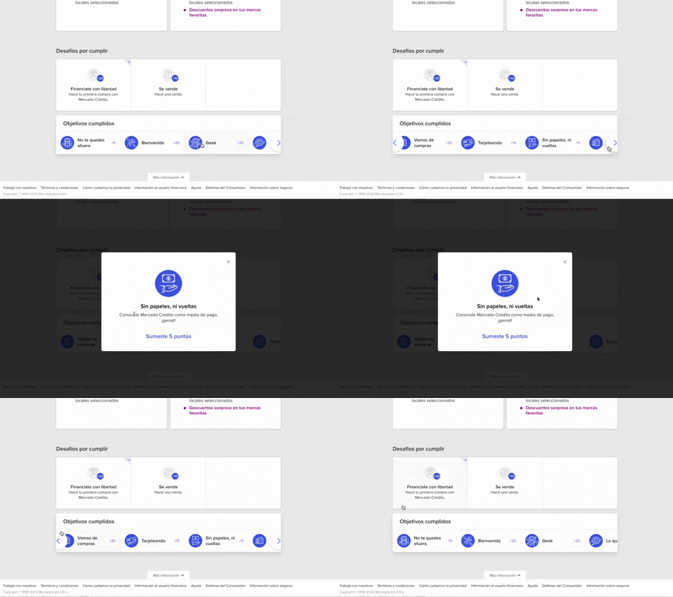
344. MercadoLibre - Horizontal Item Slider
This horizontal item slider allows users to effortlessly browse a curated selection of items, enhancing discoverability and engagement with minimal scrolling.
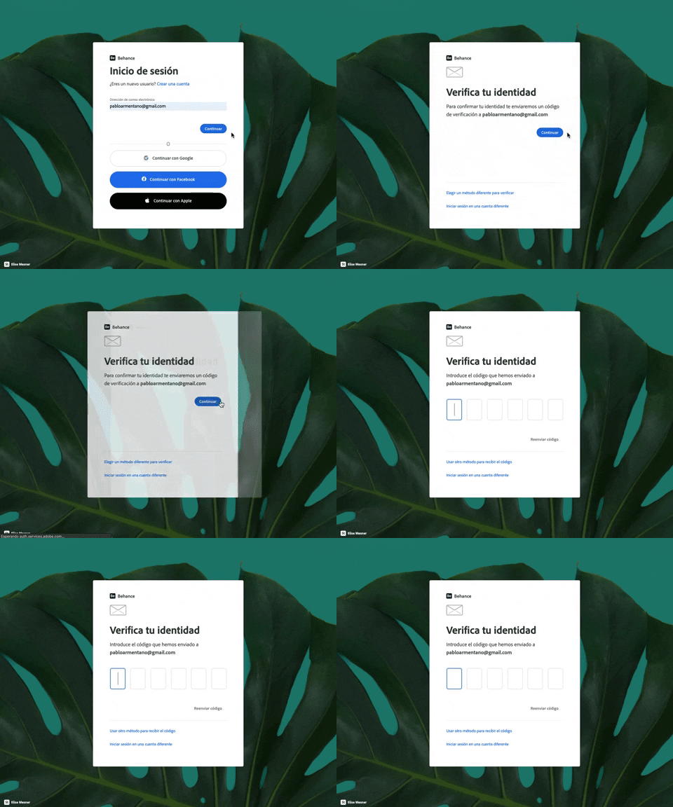
343. Behance - Login with Code Validation
Users input their email for login, then receive and enter a validation code to securely access their account.
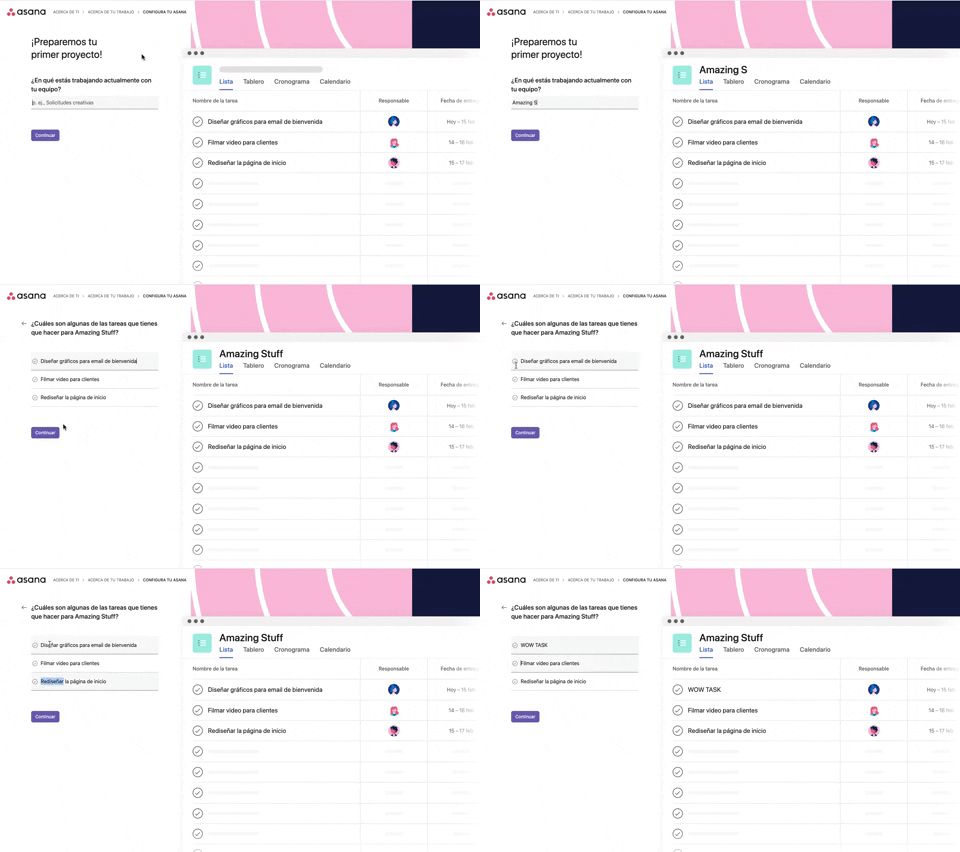
339. Asana - Platform Onboarding Simulator
This pattern guides users through initial setup by simulating product features, allowing them to visualize outcomes and make informed decisions before committing.

346. Sidebar Menu With Collapsable Items (Show More)
This sidebar menu allows users to expand and collapse sections, efficiently managing screen space while providing access to numerous navigation options.

345. Vertical Accordion for FAQs
This vertical accordion allows users to efficiently reveal or hide detailed content sections, optimizing screen space and improving navigation for FAQs or contact information.
336. Floating Popover on Click
A UI pattern where a floating popover element appears adjacent to a trigger element upon a click interaction, providing additional context or actions without navigating away.
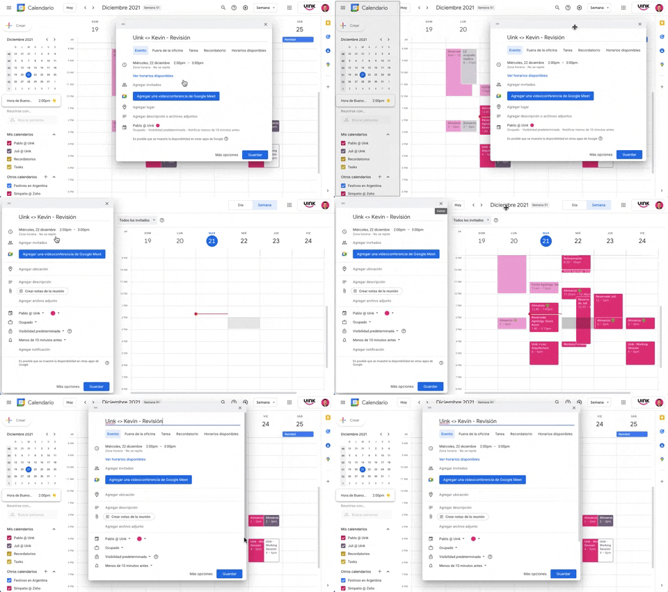
343. Modal/Dialog Drag & Drop to Fixed Position
Users can drag a modal dialog to a fixed side panel, allowing them to view and interact with underlying content without losing context.
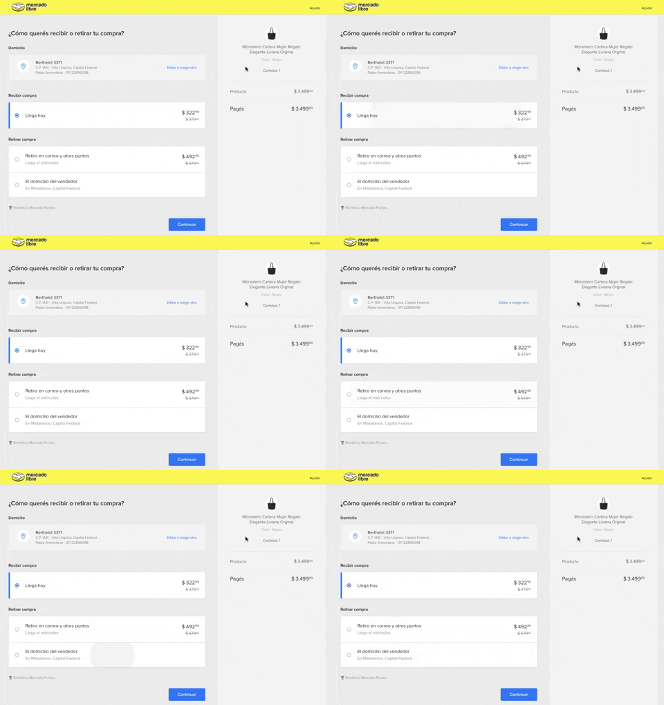
334. MercadoLibre - Call to Action Trigger Effect
This pattern uses a subtle, pulsing animation on the primary call to action to draw user attention and encourage progression through the flow.
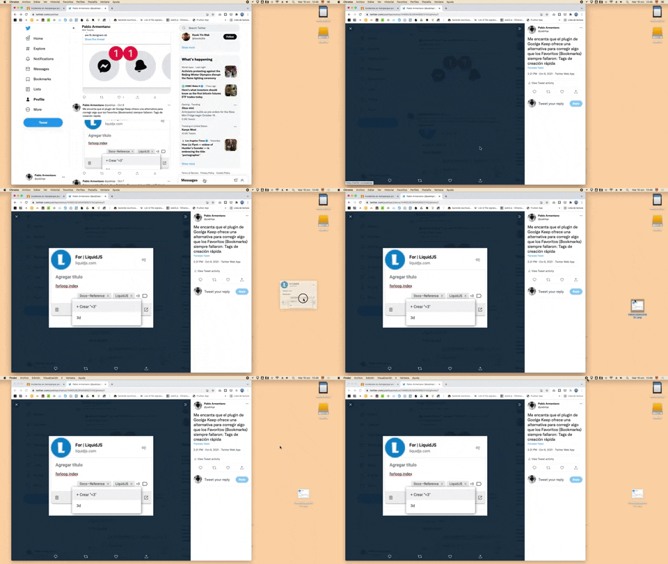
332. Drag & Drop to Create File from Web Image
Users can effortlessly create a new file on their desktop by dragging and dropping an image directly from a web browser.
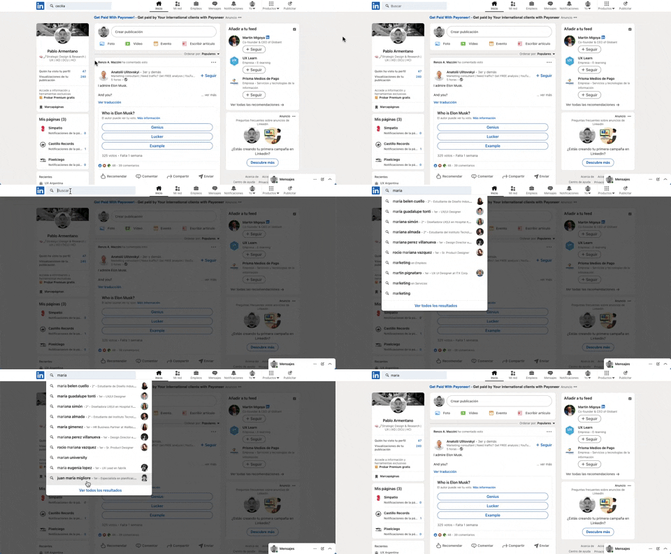
331. Linkedin - Search Bar Blackout
This pattern darkens the background and highlights the search bar, guiding users to focus on search input and results without distraction.

322. Search on Menu Items
This pattern integrates a search input directly within a menu, typically a dropdown, enabling users to quickly filter and locate specific menu items. It enhances pathfinding and awareness, commonly found in desktop applications with navigation bars. Notable behavior: Typing; Filtering; Filtered Menu Items.
333. Static Tooltip with Steps
A non-dismissible tooltip presenting a sequence of steps, commonly employed for user onboarding or guiding through multi-stage workflows, enhancing user awareness and pathfinding.
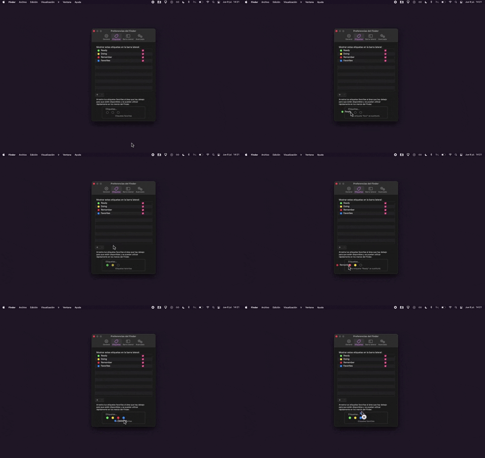
325. Drag & Drop Tag Colors to Slots
Users can intuitively assign color-coded tags to designated slots via drag-and-drop, enhancing organization and quick visual identification of items.
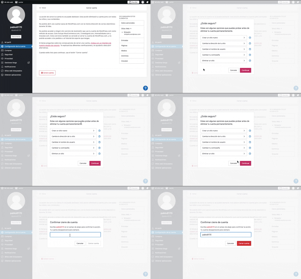
319. Modal Blackout w/ Multiple Choice
This pattern uses a modal blackout to confirm a user's intent to close an account, ensuring they understand the irreversible consequences before proceeding.

315. Signal - PIN Reminder
This pattern uses a persistent banner to remind users to verify their PIN, enhancing security and recall without interrupting core app functionality.
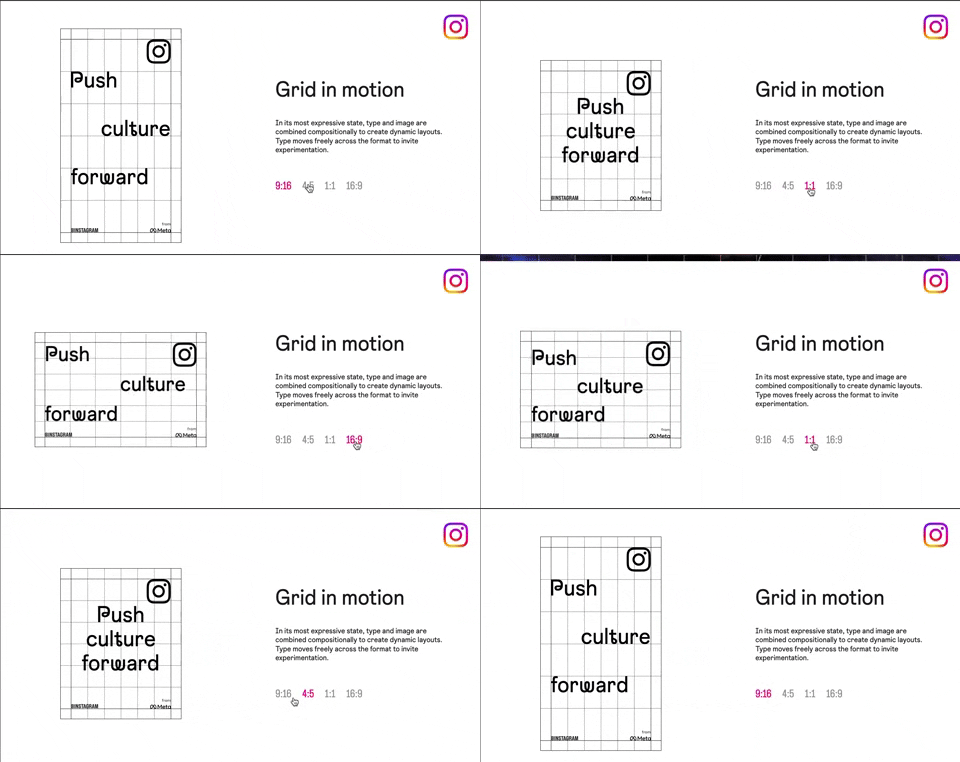
318. Instagram - Animated Illustration with Menu
Users can dynamically adjust content aspect ratios via a clickable menu, providing flexible viewing experiences and enhancing content adaptability.
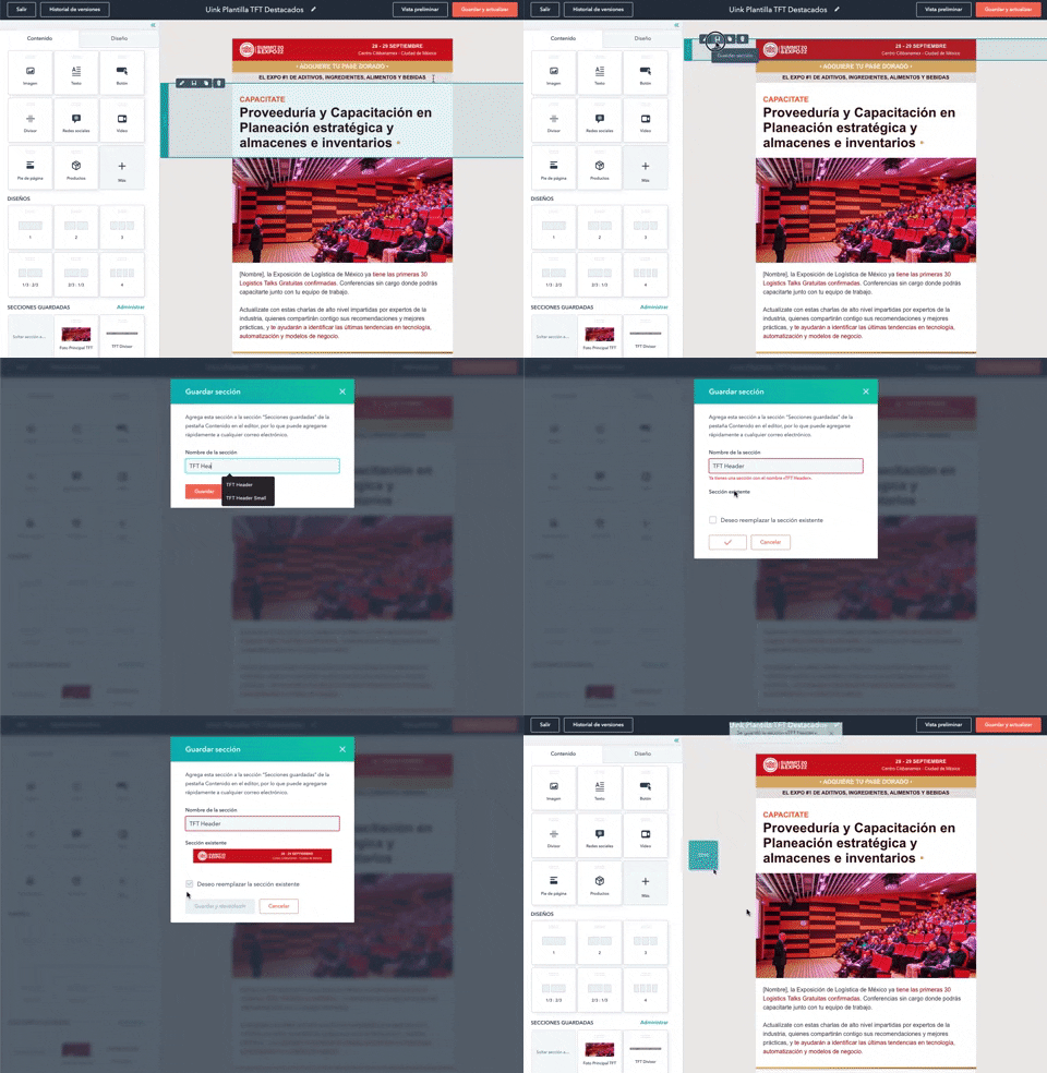
316. Modal Blackout for Delete Confirmation
This pattern uses a modal blackout to confirm a delete action, ensuring users are fully aware and can prevent accidental data loss.
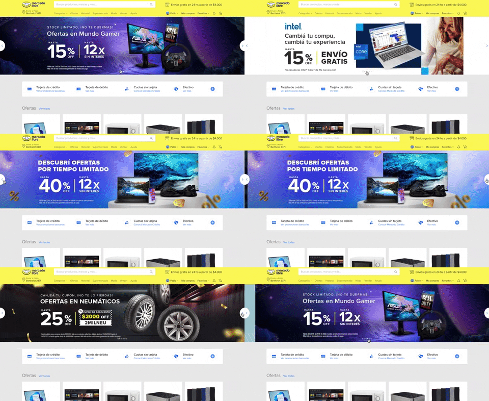
308. MercadoLibre - Hero Slider
Users can effortlessly browse featured promotions and products through a dynamic hero slider, enhancing awareness and guiding their pathfinding.

308. Spinners for Module Loading
This spinner provides visual feedback during module loading, reassuring users that the system is actively processing and preventing perceived delays.

307. Tooltip on Hover
Hovering over a truncated title reveals its full text in a tooltip, providing complete context without cluttering the interface.
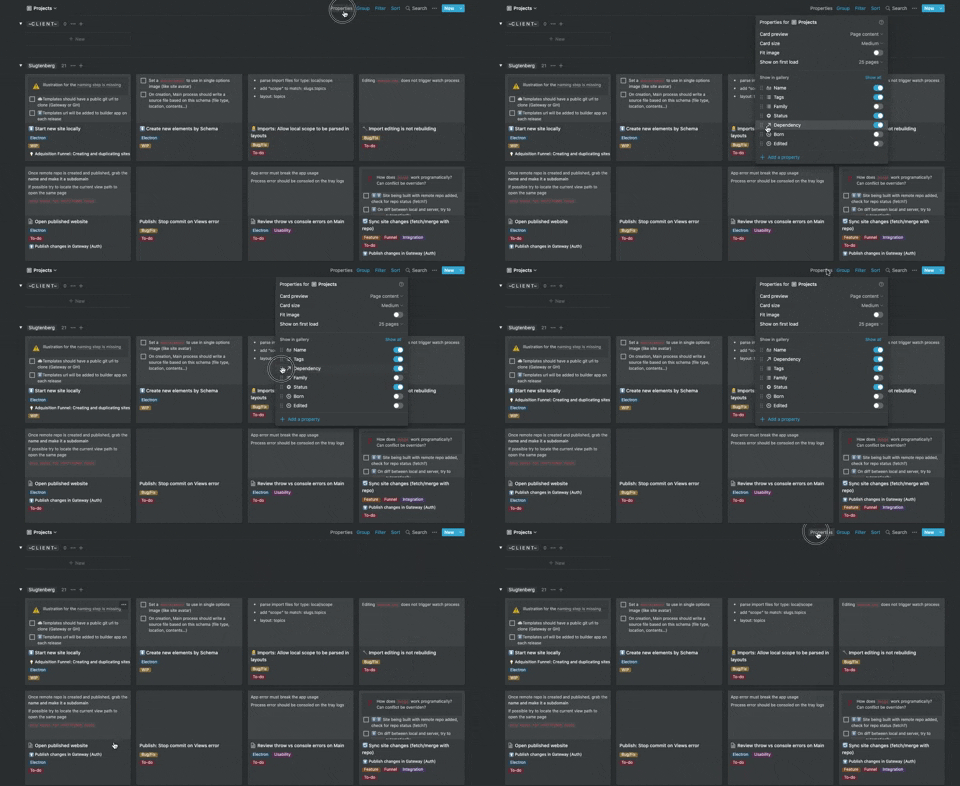
306. Drag & Drop for Reordering List Items (Mouse)
Users can intuitively reorder list items by dragging and dropping them, providing a direct and efficient way to customize their view.
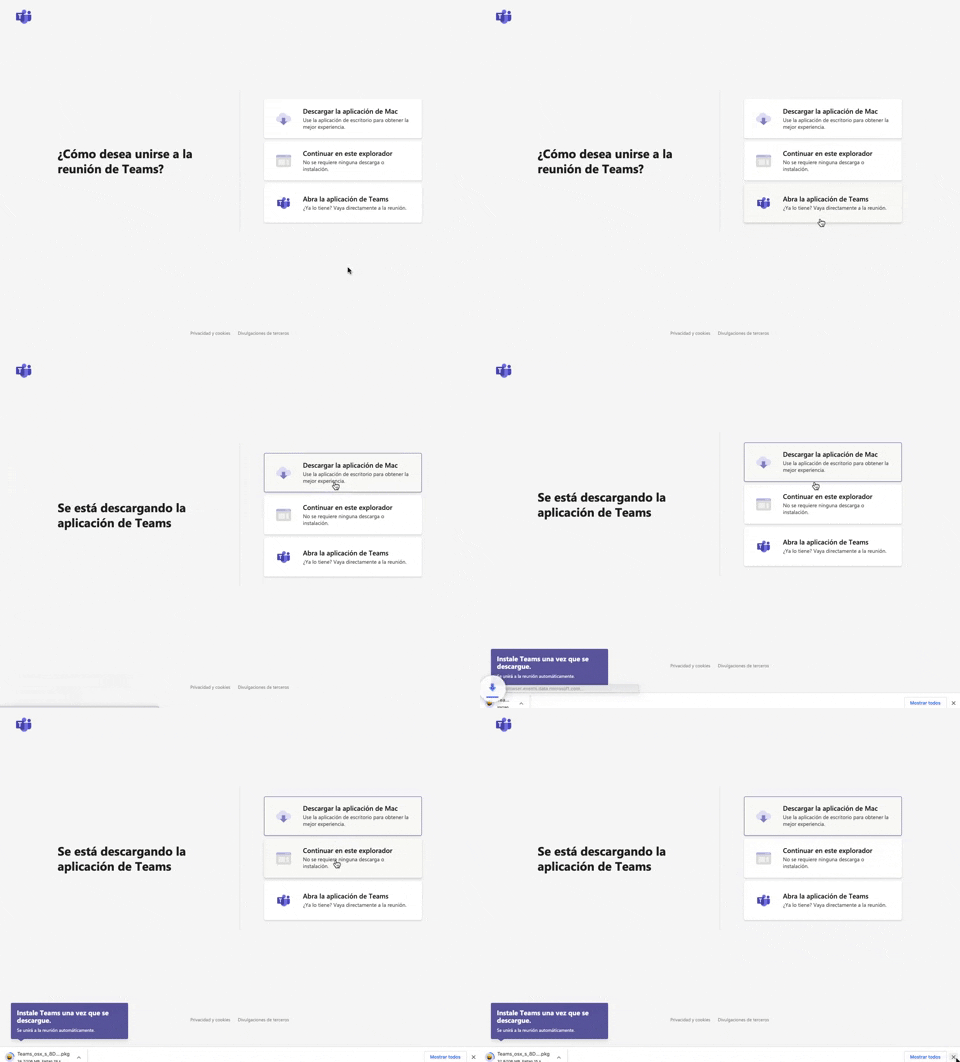
305. Button Combo for App Download
This pattern offers users clear choices to join a meeting, enabling them to download the app, continue in the browser, or open the existing application for optimal experience.
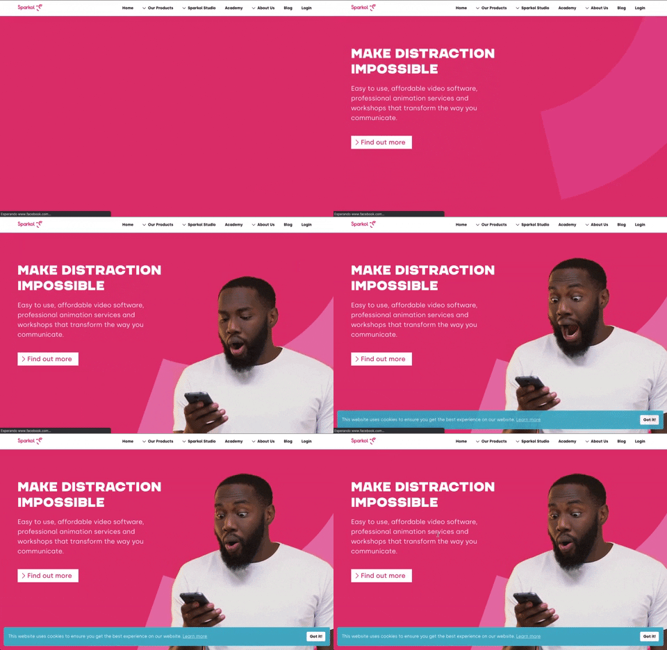
303. Background Animation (on Load)
A dynamic background animation on page load engages users immediately, providing visual interest and a sense of activity while content renders.
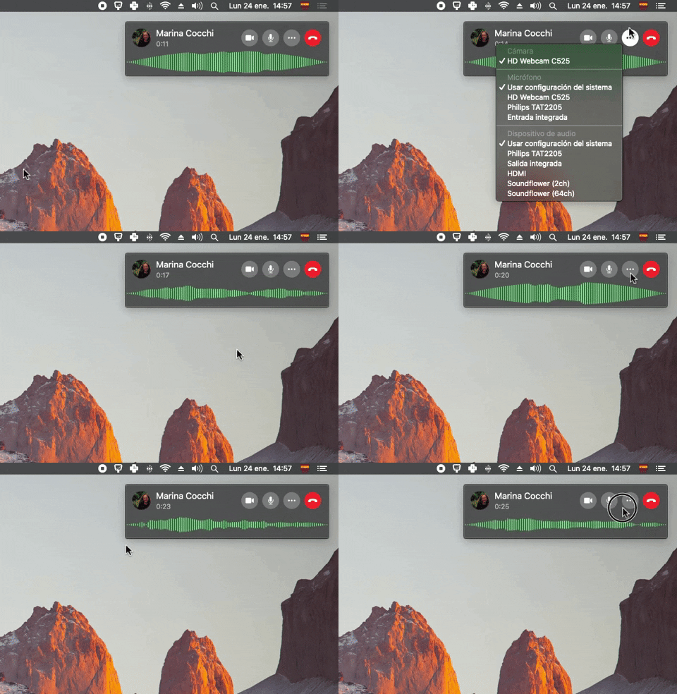
300. Sound Bars Graph
This pattern displays real-time audio levels as a dynamic graph, providing immediate visual feedback on sound input during a call.
299. Fixed Corner Popup with Steps
A multi-step popup positioned in a fixed corner of the screen, typically on desktop web, designed to guide users through a sequence of actions or provide progressive information, often for feedback or awareness purposes. Notable behavior: Step Navigation; Dismissal; Active Step.
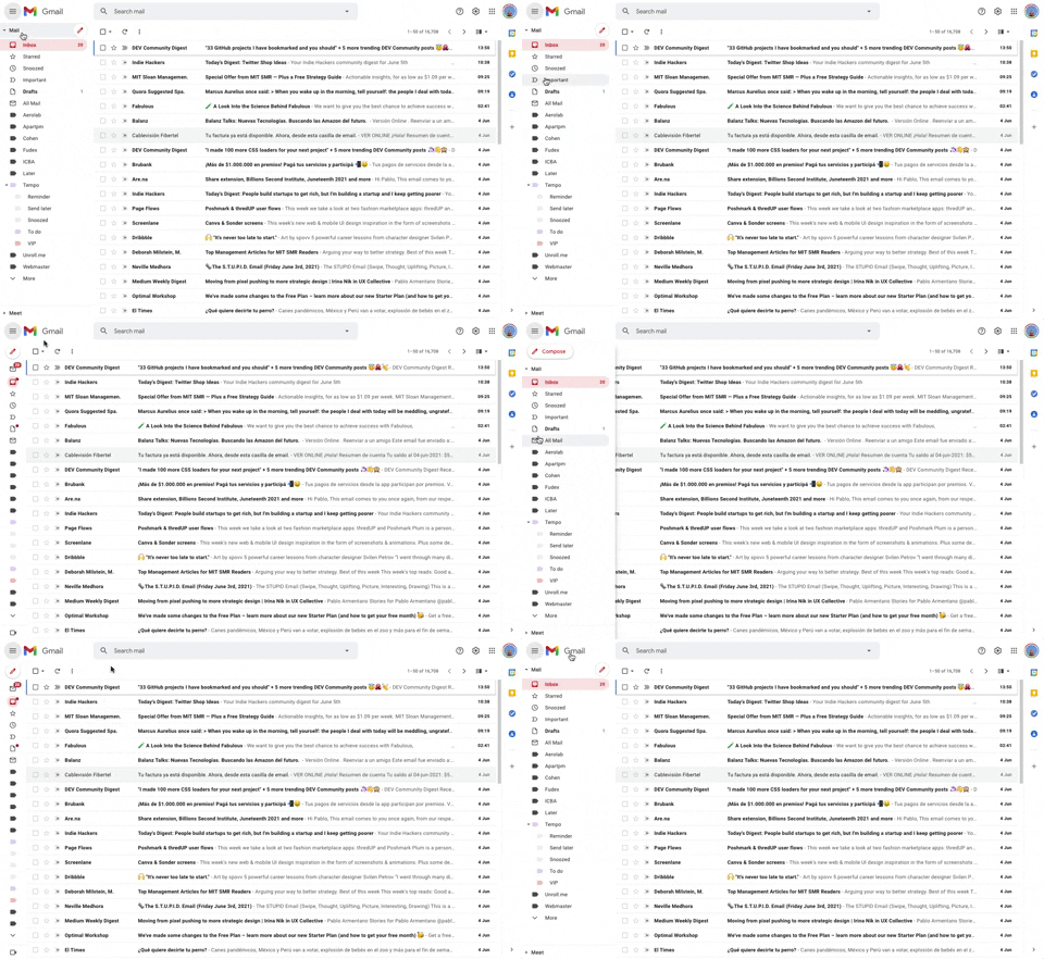
293. Collapsable Sidebar Menu
This collapsible sidebar menu allows users to expand or hide navigation options, optimizing screen real estate while maintaining easy access to key sections.
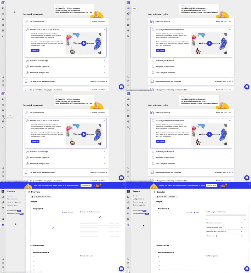
292. Vertical Icon Menu
This vertical icon menu provides quick access to key sections, revealing descriptive tooltips on hover to aid navigation and improve user pathfinding.
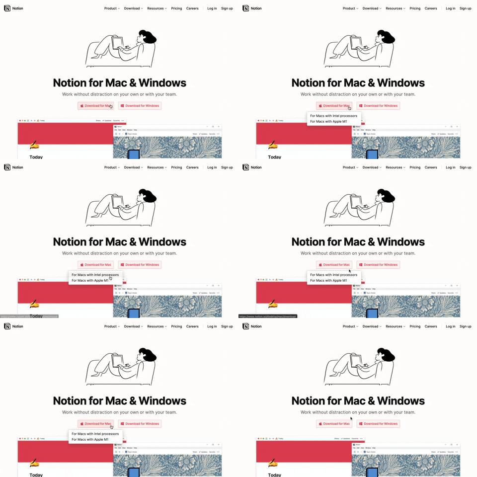
291. Action Menu from Button
Users can click a button to reveal a contextual menu of related actions, streamlining decision-making and guiding them to their desired outcome.
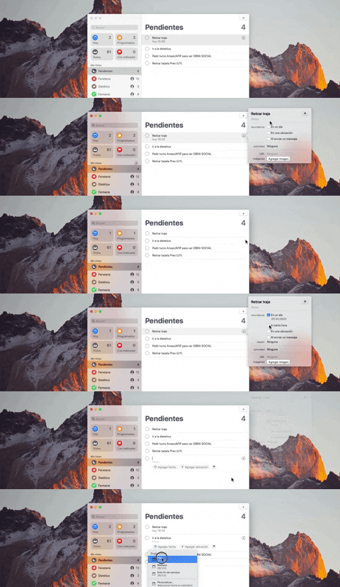
290. Floating Popover on Click
This pattern reveals a floating popover on click, providing immediate, context-specific information or actions without navigating away from the current view.
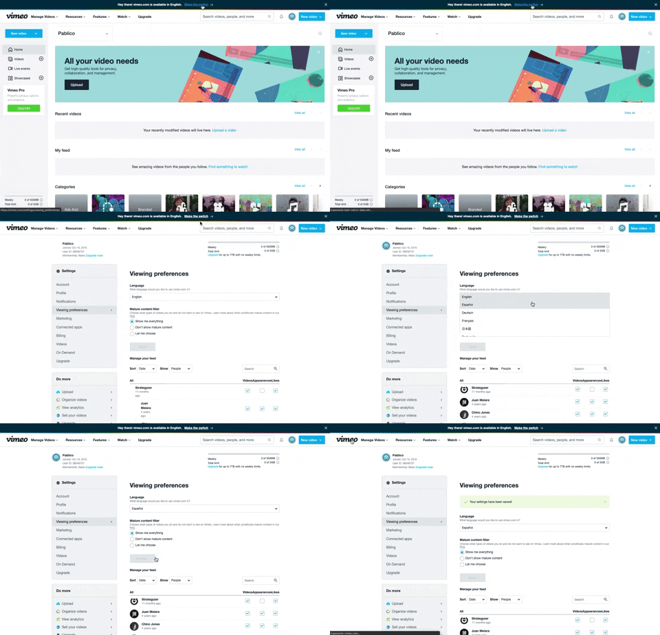
288. Vimeo - Topbar Language Switching
Users can quickly switch the site's display language via a prominent top bar link, enhancing accessibility and personalizing their experience.

286. Background Animation on Scroll
This pattern uses a fixed background image that animates and shifts as the user scrolls, creating a dynamic and engaging visual experience.
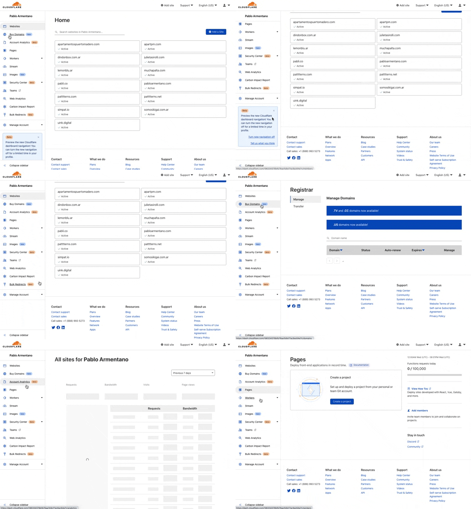
285. Cloudflare - Sidebar with Scroll
This pattern provides a persistent, scrollable sidebar for navigation, ensuring users can always access key sections and maintain context within complex applications.
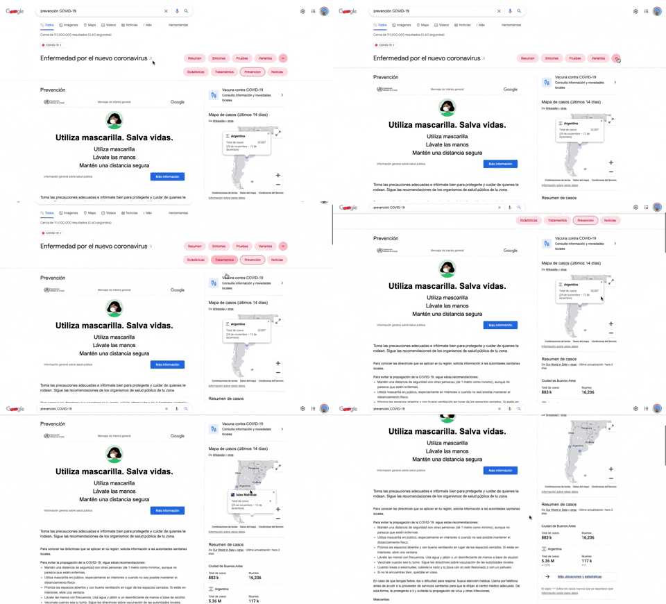
284. Emergency Information Map
This pattern provides users with critical, localized emergency information and actionable advice through an interactive map, enhancing awareness and guiding safe behavior.
284. Top Tooltip on Link Hover
Displays a tooltip above a link when the user hovers over it, providing additional context or information without navigating away from the current page.
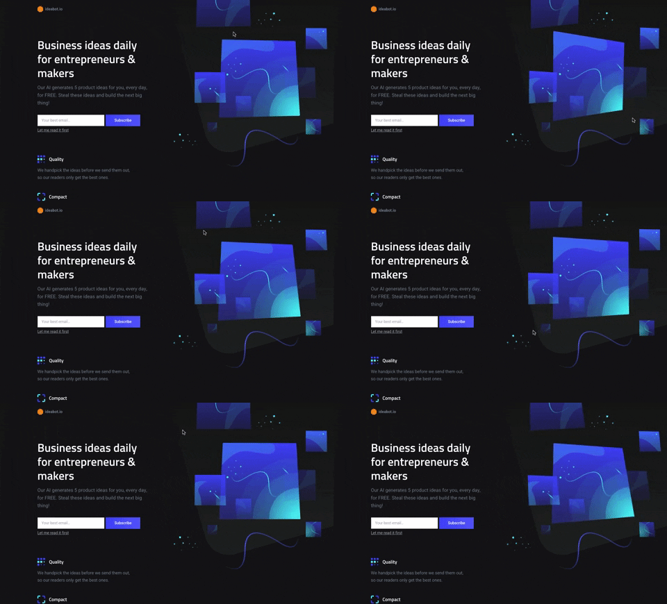
281. Background Animation (on Mouse Move)
This pattern uses subtle background animations that react to mouse movement, creating an engaging and dynamic visual experience for users.

147. Linked Settings for User Permissions
This pattern allows users to quickly understand and modify granular permissions for a selected user, ensuring precise control over access levels.

116. User Feedback on Web Content
This pattern allows users to provide feedback on web content, enabling them to report issues or suggest improvements directly within the interface.

117. Side Status Notification
This pattern provides a persistent, non-intrusive notification in a sidebar, informing users of available updates and offering a direct call to action.

173. Share Invitation to Live Movie
Users can invite up to six friends to a synchronized viewing experience, fostering shared enjoyment and social interaction around media content.
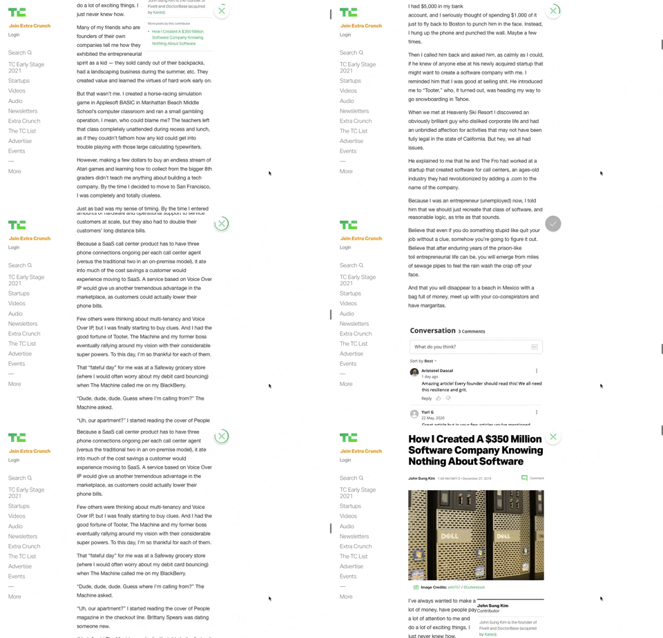
91. Bubble Status Reading
This pattern provides a fixed, animated bubble that indicates reading progress, helping users understand their position within long articles and enhancing content appreciation.
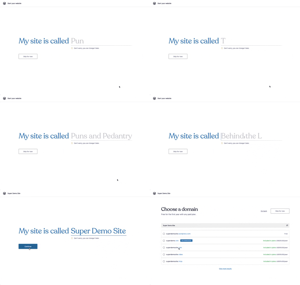
176. Wordpress.com - Natural Inputs with Suggestions
This pattern guides users to quickly name their site by offering real-time suggestions as they type, streamlining the initial setup process.

133. Website-Browser Notification Reminder
This pattern reminds users that they can enable desktop notifications by clicking the lock icon in the browser's address bar.

55. Contextual Form Input Errors
This pattern provides immediate, contextual feedback for form input errors, guiding users to correct mistakes efficiently and complete their tasks without frustration.

83. Rewards Notification on Topbar
This pattern uses a notification badge on the top bar to alert users to new rewards, which can be viewed in a dropdown menu for easy access and appreciation.
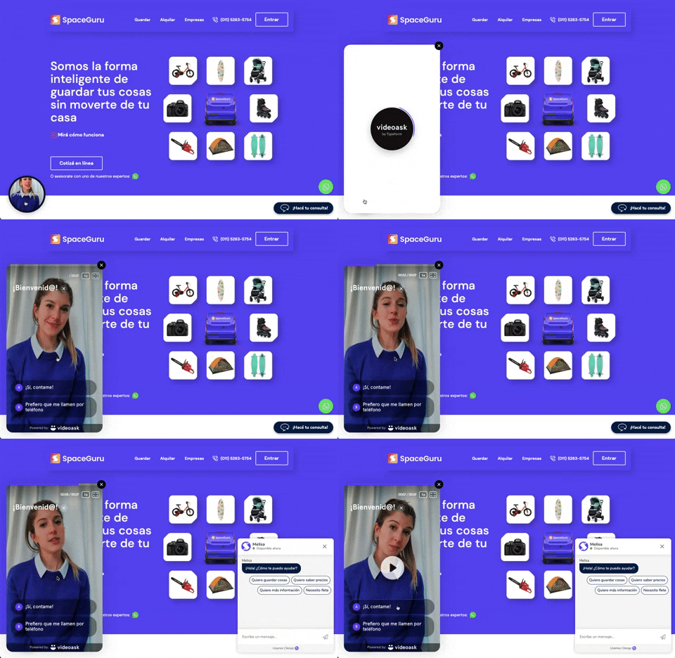
196. Video Story on Website
A floating video story provides users with a dynamic, engaging explanation of a product or service, enhancing understanding and encouraging further interaction.

39. Youtube - Dismissed Bottom Popup
This dismissible bottom-anchored popup informs users about critical information, offering options to dismiss or learn more without disrupting primary content viewing.

66. Actionable Empty State
This empty state provides a clear call to action, guiding users to initiate content creation and overcome initial blank canvas paralysis.

38. Youtube - Video Statusbar
The video status bar provides crucial playback controls and time information, enabling users to precisely navigate and manage their viewing experience.

80. Input Validation Status
This pattern provides immediate feedback on user input, guiding them to correct errors and successfully complete forms or tasks.

42. Modal for Tags Editing
This pattern allows users to efficiently manage and organize their content by editing, adding, or removing tags through a dedicated modal interface.

37. Branded Illustrations for Reinforcement
This pattern uses a branded illustration within a modal to reinforce a user's action, providing a moment of delight and confirmation before a critical step.

105. Floating Tooltip Blackout
This pattern presents a floating tooltip with a dim overlay, guiding users to initiate or schedule a meeting with clear options and keyboard shortcuts for efficiency.

29. General Form Errors Banner
This banner provides a clear, concise message to users, offering an alternative action to streamline the process of adding multiple subscribers.

50. Food Order Receipt
This pattern provides a clear, detailed summary of a food order, including items, prices, and delivery information, ensuring users have a complete record of their purchase.
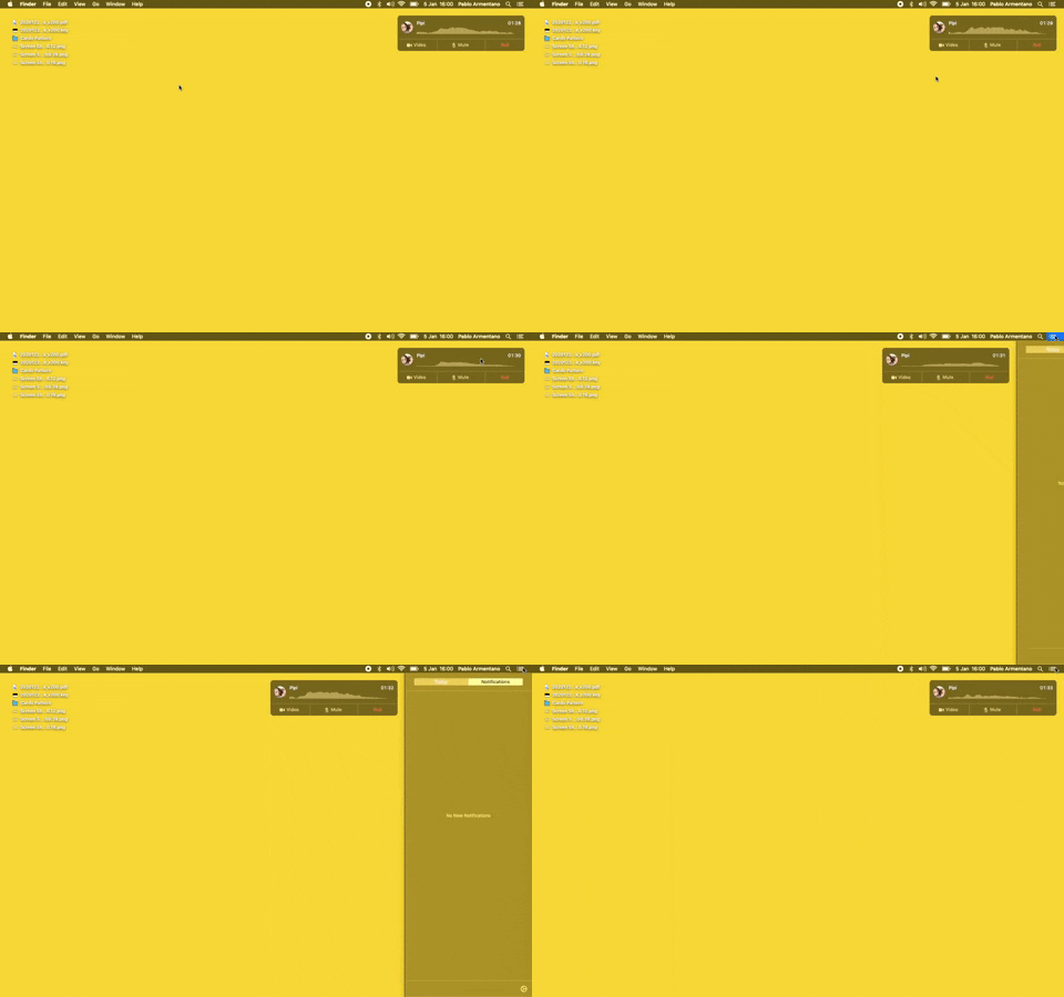
23. Floating Voice Widget with Actions
This floating voice widget provides persistent awareness of an active call, allowing users to quickly mute, unmute, or end the conversation without interrupting their workflow.
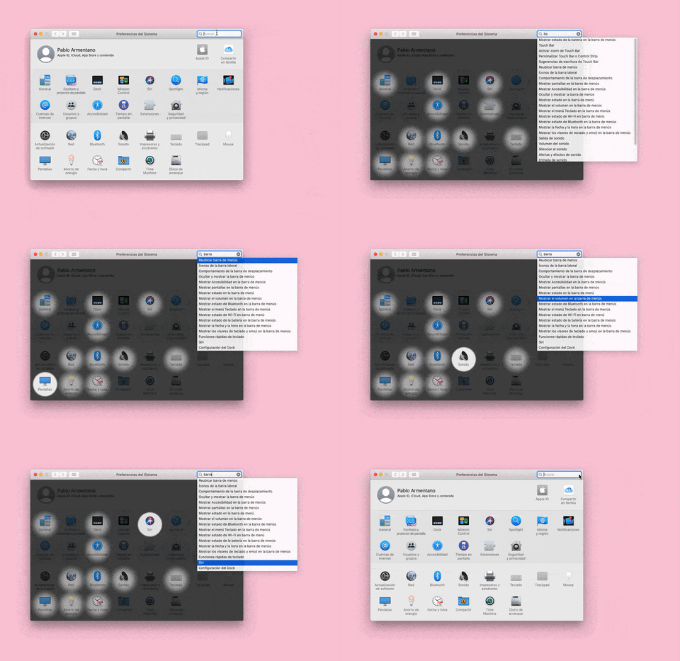
155. Menu Search Highlighting
This pattern highlights matching items within a dropdown menu as a user types into an associated search input, aiding in quick pathfinding and user selection.

4. Floating Status Banner
A floating status banner presents non-blocking, transient messages to users, typically positioned at the top or bottom of the viewport. It delivers immediate feedback or critical updates without interrupting the user's primary workflow.

6. Modal Blackout w/ Form
This modal prompts users to log in with an existing account, offering clear options to proceed or use an alternative, ensuring a smooth authentication flow.

10. Dedicated Screen for Action Confirmation
This dedicated screen ensures users explicitly confirm or deny third-party access to their LinkedIn data, promoting transparency and control over personal information.