Patterns for Call to Action
- Desktop (76)
- Tablet (1)
- Mobile (13)

393. Colored Checkboxes
Users can easily select multiple communication preferences with visually distinct, colored checkboxes that provide immediate feedback on their choices.

390. Icon Software Landing Page
This landing page effectively guides users to download icon management software by showcasing its intuitive interface and customization features.

389. Text Edit Inline Input
Users can directly edit text content in place, providing a seamless and efficient way to update information without navigating away.

388. Drag & Drop and Checkbox to Select Multiple Item
Users can efficiently organize multiple items by dragging and dropping them into a target category, enhancing content management and task completion.

378. Modal Blackout w/ Animation
This pattern uses an animated blackout modal to focus user attention on critical information or actions, ensuring clear decision-making.
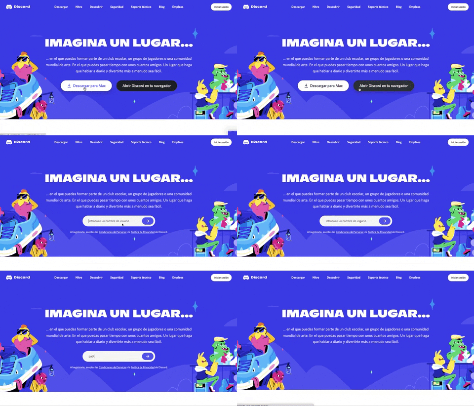
359. Discord - Button to Input Transition
This pattern allows users to seamlessly transition from a clear call-to-action button to an input field, streamlining the path to engagement.
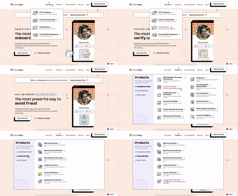
356. MetaMap - Multi-Layout Topbar Menu
This topbar menu uses a dropdown to reveal categorized links, enabling users to quickly navigate to relevant sections and understand the product's diverse offerings.
Uink Digital Agency
Specilist on building and launching digital products. Let's talk!
355. Jira - Feature Presentation Tooltip
A feature presentation tooltip, as seen in Jira, guides users through new functionalities or important updates. It often appears during onboarding or to raise awareness, utilizing tooltips with hypertext links and pagination for multi-step tours on both desktop and web interfaces.
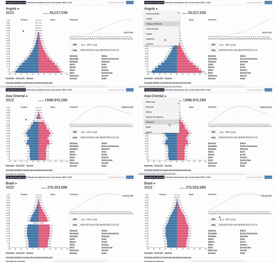
353. Population Pyramid - Visualizations with live filters
Users can dynamically filter population data by country and year, enabling quick comparisons and insights into demographic trends.
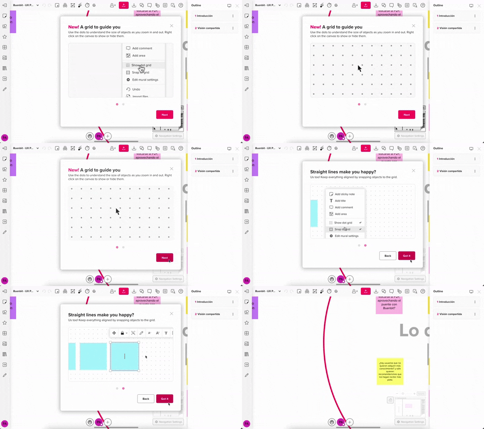
357. Modal w/ Steps & Animation (No blackout)
This modal guides users through multi-step processes with clear instructions and animated transitions, enhancing awareness without obscuring the underlying content.
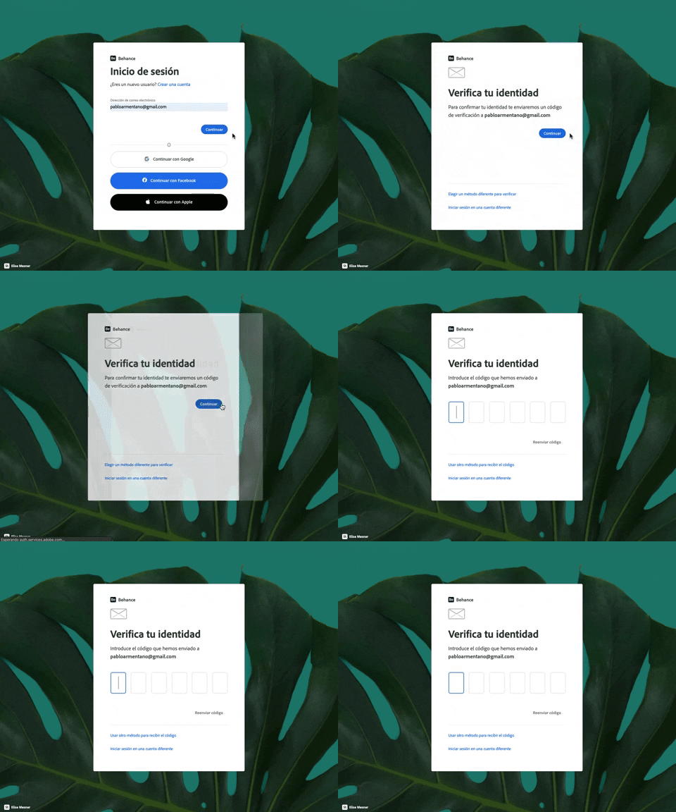
343. Behance - Login with Code Validation
Users input their email for login, then receive and enter a validation code to securely access their account.
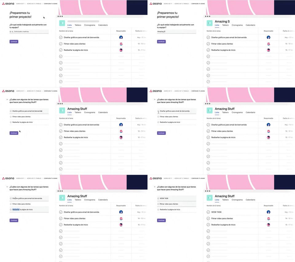
339. Asana - Platform Onboarding Simulator
This pattern guides users through initial setup by simulating product features, allowing them to visualize outcomes and make informed decisions before committing.
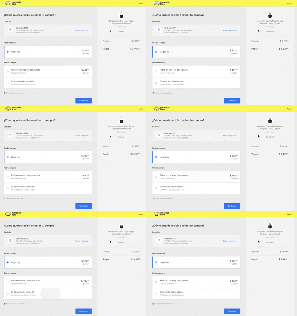
334. MercadoLibre - Call to Action Trigger Effect
This pattern uses a subtle, pulsing animation on the primary call to action to draw user attention and encourage progression through the flow.
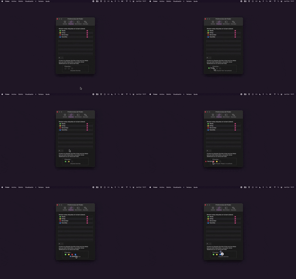
325. Drag & Drop Tag Colors to Slots
Users can intuitively assign color-coded tags to designated slots via drag-and-drop, enhancing organization and quick visual identification of items.
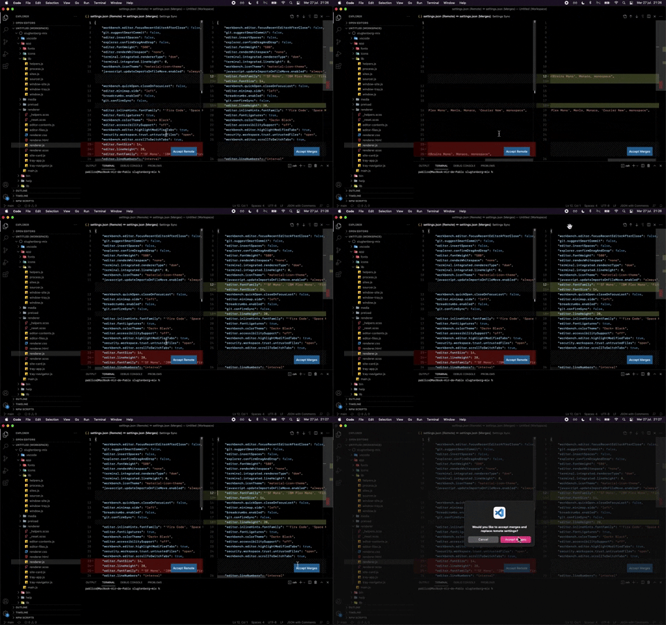
324. Visual Studio Code - Dual View Scroll Sync
This pattern allows users to efficiently compare and resolve differences between two versions of a file by synchronizing their scroll positions.
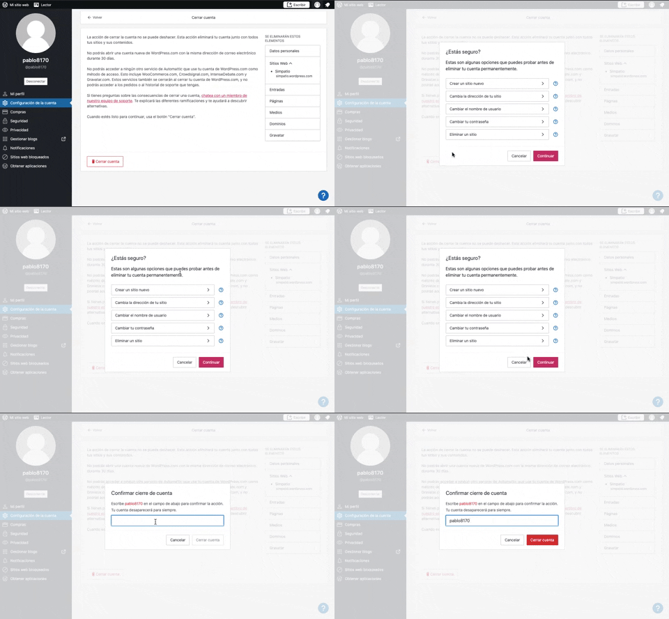
319. Modal Blackout w/ Multiple Choice
This pattern uses a modal blackout to confirm a user's intent to close an account, ensuring they understand the irreversible consequences before proceeding.
318. Binance - Tooltip on Features
A tooltip pattern used to provide contextual information or explanations for features, commonly activated on hover or focus, enhancing user understanding and decision-making in web and desktop applications.
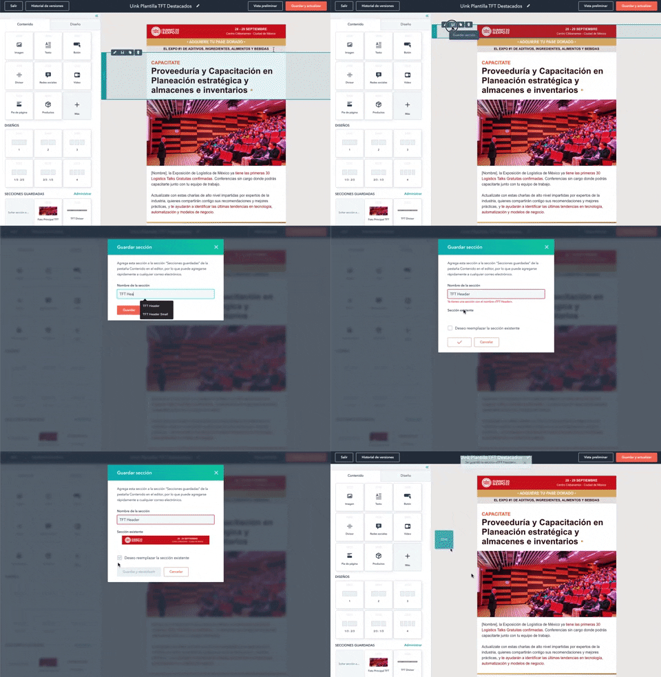
316. Modal Blackout for Delete Confirmation
This pattern uses a modal blackout to confirm a delete action, ensuring users are fully aware and can prevent accidental data loss.
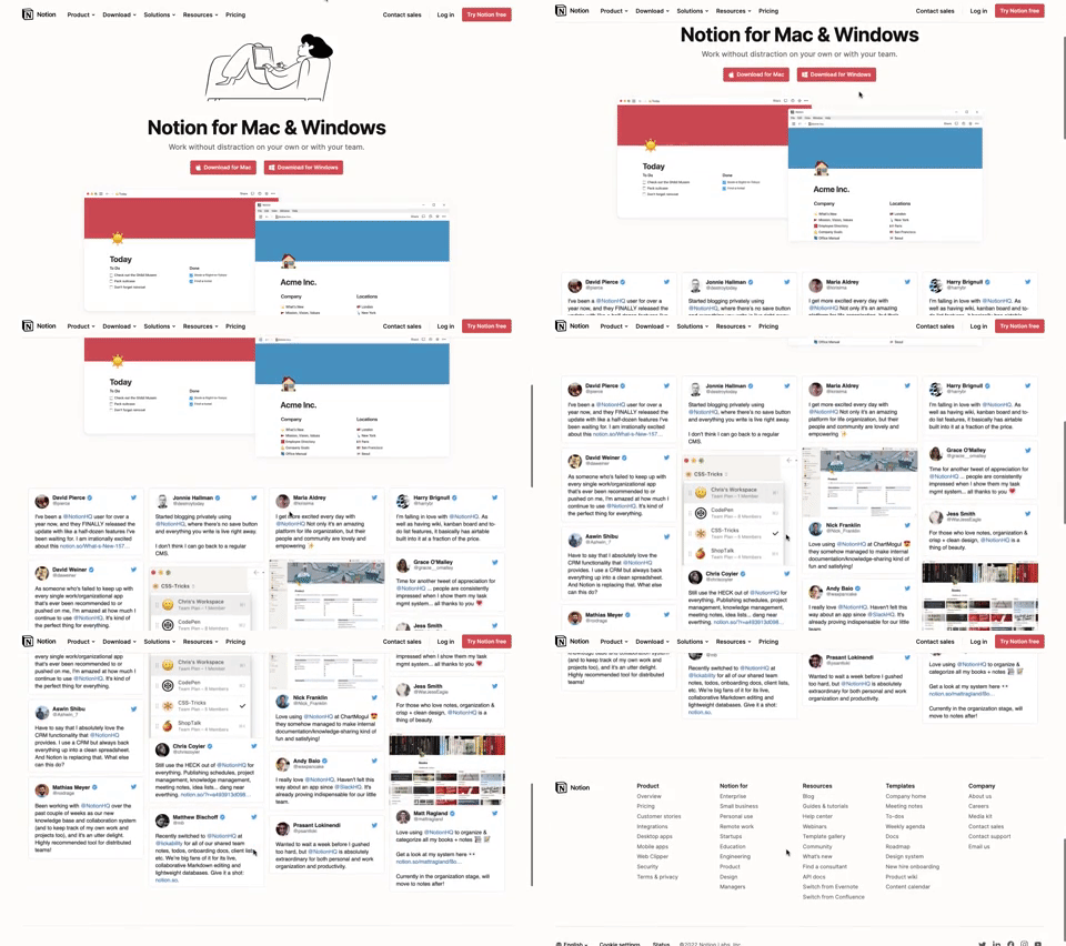
311. Landing Page for App Download
This landing page guides users to download the application for their specific operating system, simplifying the installation process.
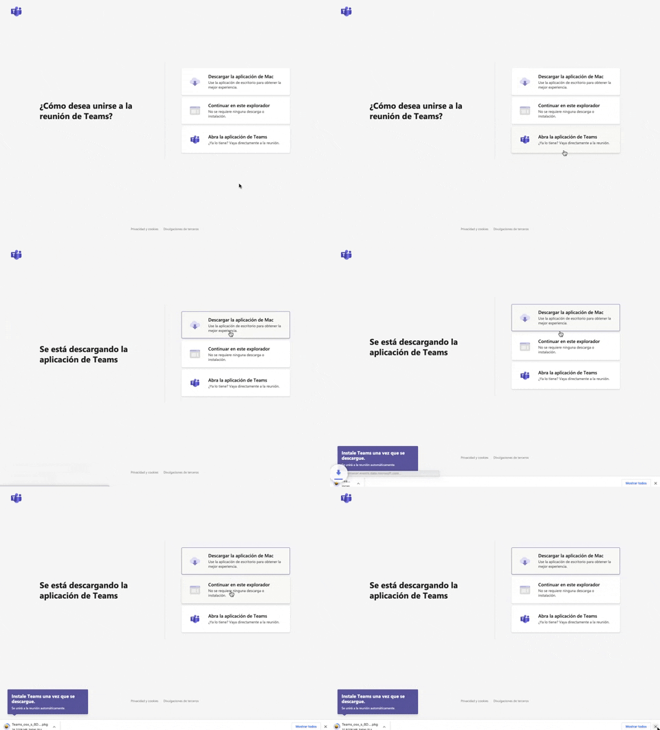
305. Button Combo for App Download
This pattern offers users clear choices to join a meeting, enabling them to download the app, continue in the browser, or open the existing application for optimal experience.
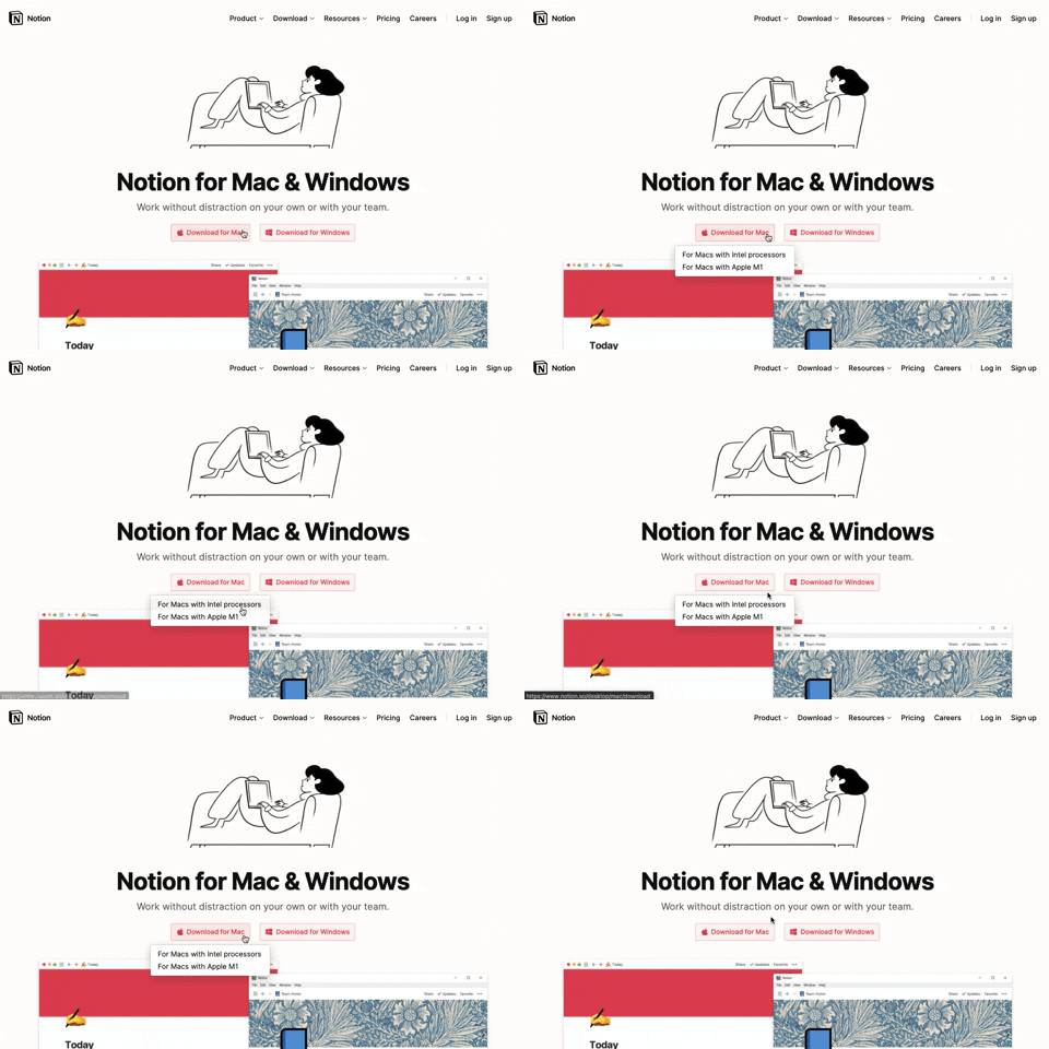
291. Action Menu from Button
Users can click a button to reveal a contextual menu of related actions, streamlining decision-making and guiding them to their desired outcome.

290. Floating Popover on Click
This pattern reveals a floating popover on click, providing immediate, context-specific information or actions without navigating away from the current view.
_07.10.33_p._m..png?table=block&id=1b4e4bae-3d76-8055-baf9-d28c23cd351f&cache=v2&width=960&quality=80)
275. Popover on Hover
A popover on hover reveals contextual information or actions in a temporary overlay, enhancing user awareness without disrupting the main workflow.
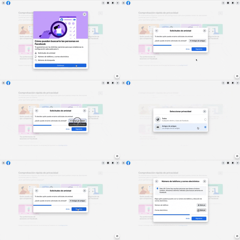
256. Modal Blackout w/ Forms & Steps
This modal blackout pattern guides users through multi-step forms, ensuring focused input and clear progression for critical decisions.
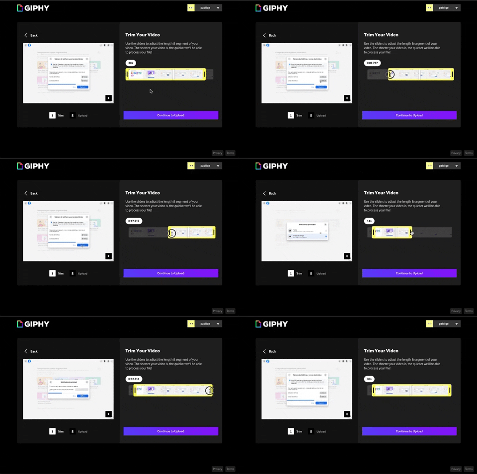
243. Trim Video Slicer
Users can precisely trim video segments using a draggable timeline with visual thumbnails, enabling efficient content selection and faster processing.
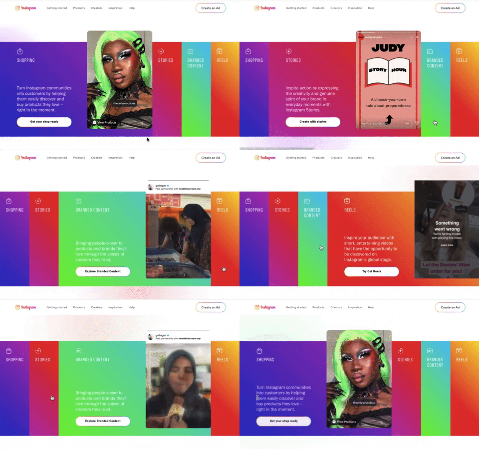
240. Instagram - Horizontal Accordion
This horizontal accordion allows users to explore distinct content categories by expanding a selected panel, revealing detailed information and relevant calls to action.

235. Background Animation (on Mouse Hover)
This pattern uses a subtle background animation on hover to provide visual feedback, guiding users to interactive elements and enhancing discoverability.
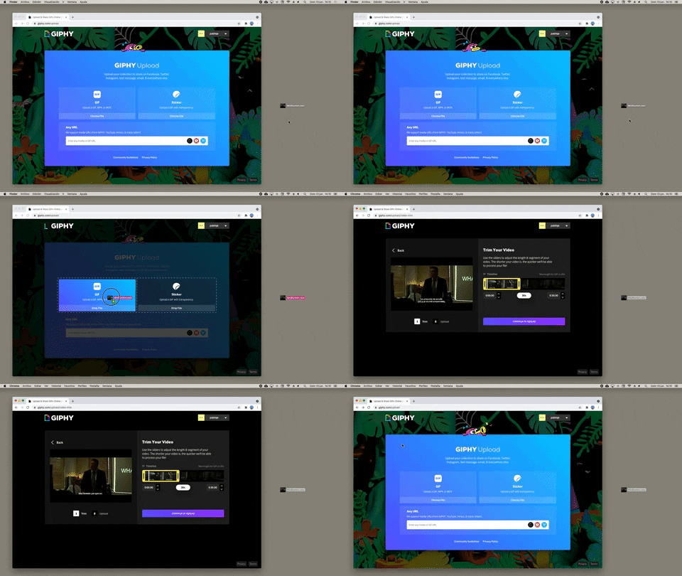
232. Drag & Drop to Browser
Users can effortlessly upload files by dragging them from their desktop directly into a browser window, streamlining the content submission process.
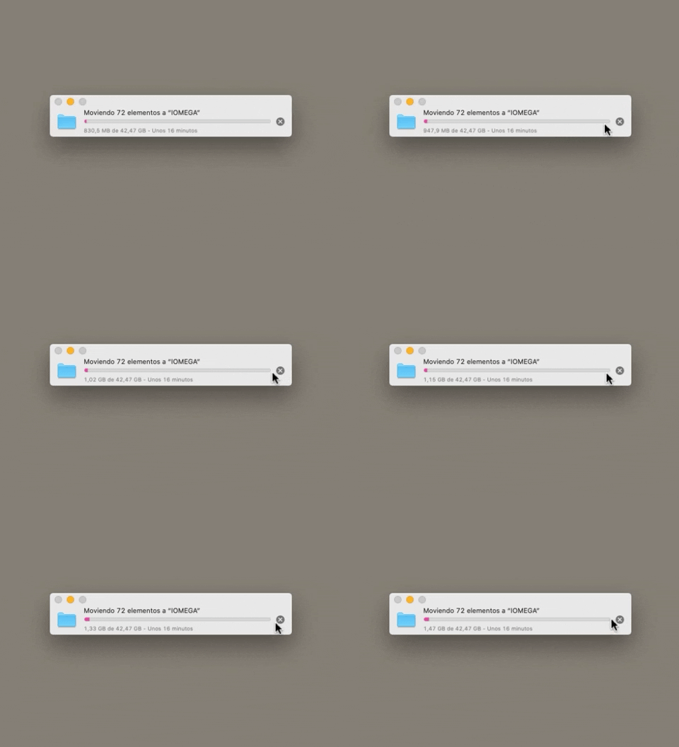
223. Stop Operation Progress
This pattern allows users to cancel an ongoing operation, like a file transfer, by clicking a clear "X" icon, providing immediate control over system processes.
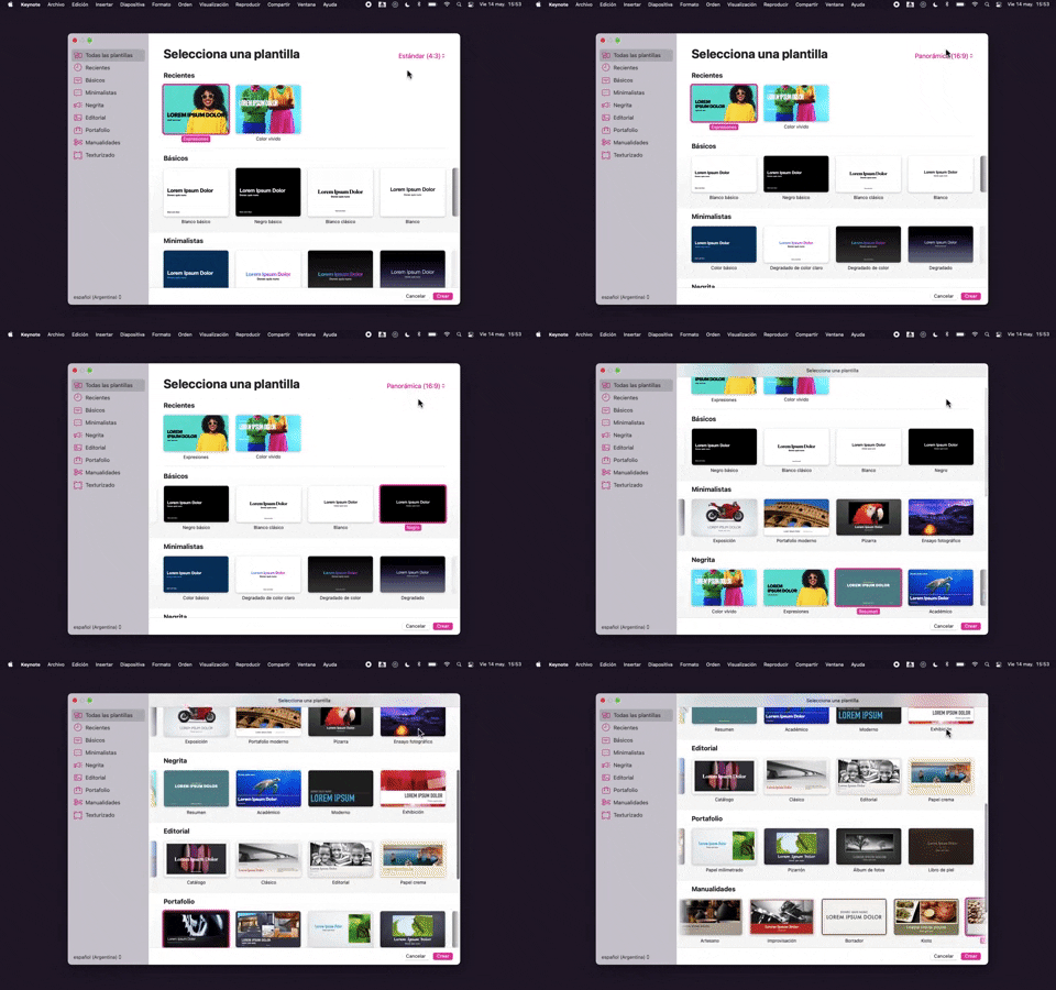
218. Apple Keynote - Template Format Selection
Users efficiently select a presentation template and aspect ratio from categorized options, streamlining the creation of new projects.
_16.00.46.png?table=block&id=64a4f84d-2f69-4a08-86e4-8fa4fe9dcdf7&cache=v2&width=960&quality=80)
222. Floating Banner on User Input
This pattern displays a floating banner over existing content, allowing users to compose new input without losing context of the underlying page.
212. Automatic Background Animation (on Load)
Desktop, Decision Making, Awareness, Web, English, Animation, Loader, Hypertext Links
_00.32.31.png?table=block&id=99d40e79-c293-4cc7-a954-2f94c0c543a9&cache=v2&width=960&quality=80)
172. PedidosYa - Search Results Recommendation
This pattern uses a tooltip to highlight "Top Recommended Restaurants," informing users that the displayed selection is personalized based on proximity, order history, and ratings.

203. Two-step Download Flow
This pattern offers users a clear, two-step download process, first presenting a prominent "Download" button and then a secondary, fixed-on-scroll button for consistent access.

201. Modal Blackout w/ Actions
This modal blackout pattern informs users about enhanced ad privacy, offering clear choices to manage settings or accept changes with distinct action buttons.

111. Magazine Subscription
This pattern allows users to compare subscription tiers and their benefits side-by-side, enabling an informed decision before committing to a purchase.

181. Plan Upgrade Flow
This pattern guides users through a personalized plan upgrade flow by asking about their intent, offering tailored recommendations, and allowing them to view all options.
_15.24.08.png?table=block&id=33d25cdf-9074-40e9-817e-0fe0cb963998&cache=v2&width=960&quality=80)
144. Meeting Guest Warning
This pattern provides a host with immediate control over who joins a meeting, enhancing security and ensuring only authorized participants can enter.
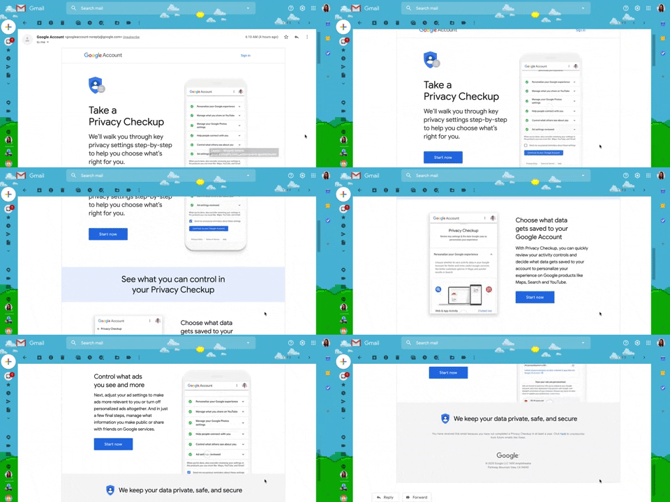
130. Animated Email Page
This pattern uses subtle animations within an email to guide users through a privacy checkup, enhancing engagement and clarity for important account actions.

198. Take action on Music Claims
This pattern allows users to review copyright claims on their videos, understand the impact, and select appropriate actions to resolve issues.
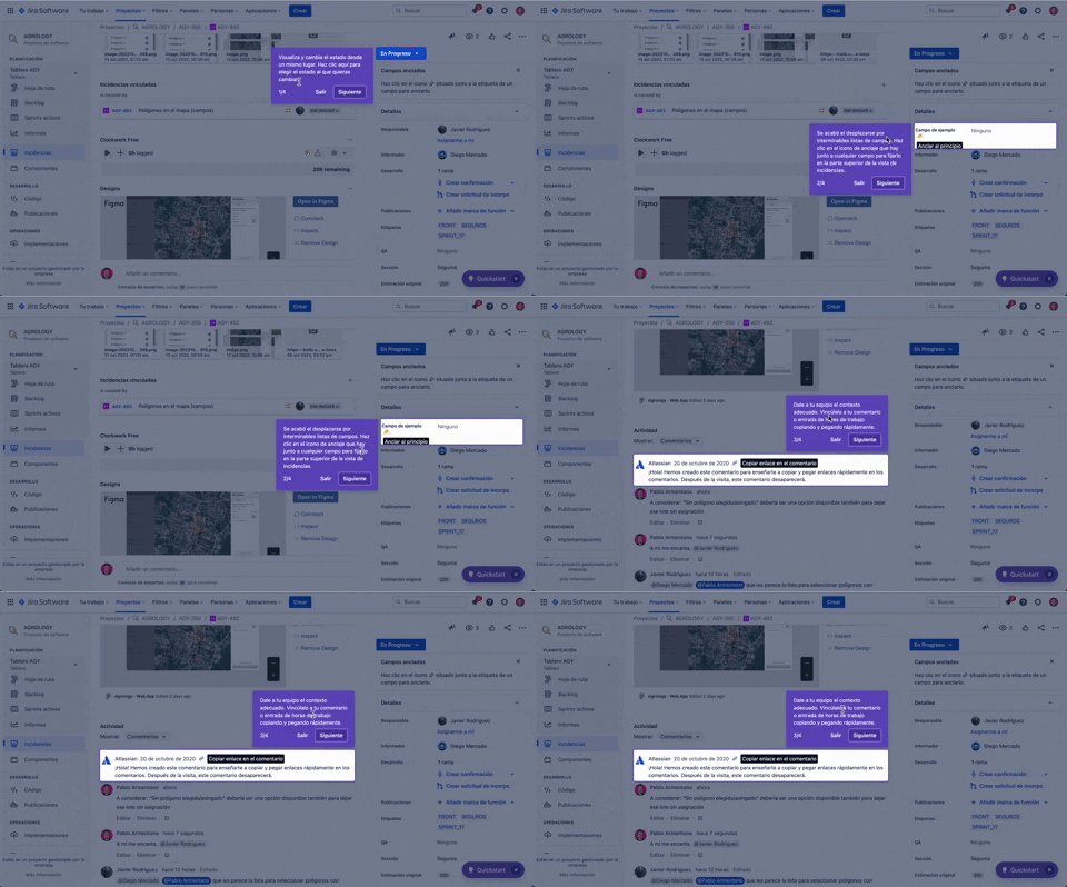
56. Floating Tooltip with Steps and Blackout
This pattern guides users through multi-step onboarding or feature discovery with a focused, sequential tooltip and a dimmed background.
_16.25.05.png?table=block&id=31dbf487-bc9b-4862-8064-5ea32910c285&cache=v2&width=960&quality=80)
146. Floating Banner for Pricing/Subscription (3-tier)
This floating banner offers a persistent, non-intrusive call to action for subscription, allowing users to easily access pricing details while browsing content.
_18.38.44.png?table=block&id=88e52727-a9bc-4fab-9da5-4119a8b8ab60&cache=v2&width=960&quality=80)
149. Security Top-banner
This top-banner informs users about security risks and prompts them to take action, enhancing account safety and providing clear options to "Get Started" or "Dismiss".
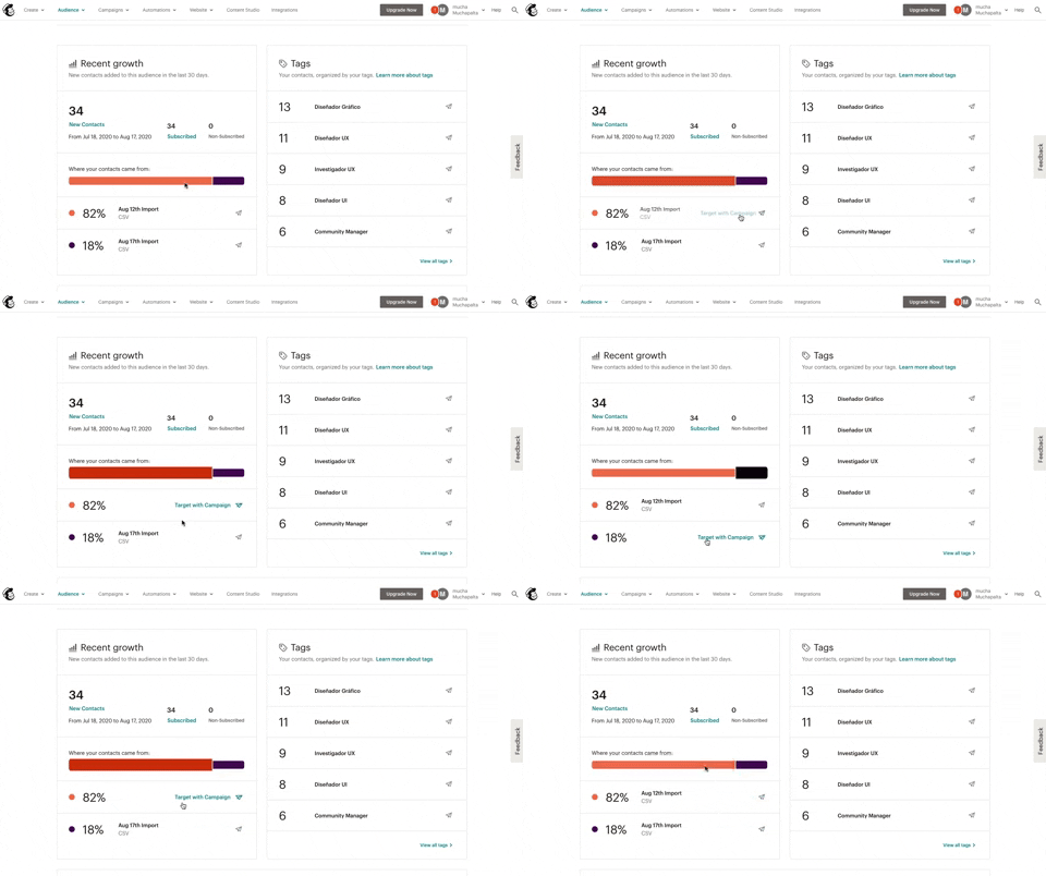
139. Synced Hover Animations
This pattern uses synchronized hover animations to highlight related data points across different UI elements, enhancing user awareness and decision-making.
_12.02.51_p._m..png?table=block&id=ce267a8c-8ace-4ab6-882b-06f11fcdbe92&cache=v2&width=960&quality=80)
131. Free Audiobook Trial
Presents a promotional offer for a free trial of an audiobook service, designed to encourage user sign-up or subscription.

103. Subscription Reminder
This pattern prompts users to subscribe to a newsletter via a modal, appearing after they've consumed a certain amount of free content, encouraging continued engagement.
_07.31.59_p._m..png?table=block&id=e74f3c3c-8aa0-4154-8183-1f7591c51a47&cache=v2&width=960&quality=80)
10. Background Ads
Background ads leverage the entire viewport to display engaging, full-screen advertisements, often featuring high-quality imagery or video, to capture user attention.
_04.18.47_p._m..png?table=block&id=dcba685e-5075-431e-a7b3-93d8a5bff51c&cache=v2&width=960&quality=80)
36. Contact Segmentation
Users select target audience segments from predefined categories, enabling personalized content delivery and streamlined lead qualification.
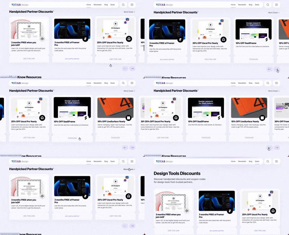
411. Ticket Carrousel (TOOOLS.design)
Users can browse a curated selection of offers by clicking pagination arrows, enabling efficient discovery and decision-making.

409. Customize Toolbar (2-pane interaction)
Users can personalize their toolbar by toggling specific buttons on or off, enhancing workflow efficiency and tailoring the interface to their needs.

404. Sidebar Backdrop Menu
This pattern provides a full-height, animated sidebar menu that slides in from the left, offering clear navigation options while dimming the main content for focused interaction.

402. Transition: Zoom-to-Dock for Minimize
This transition visually guides the user as a window minimizes, smoothly shrinking and moving to its new location in the dock, enhancing spatial awareness and system feedback.

397. Modal w/ Card Options
This modal presents users with clear, card-based options to initiate a task, guiding them efficiently through initial decision-making.
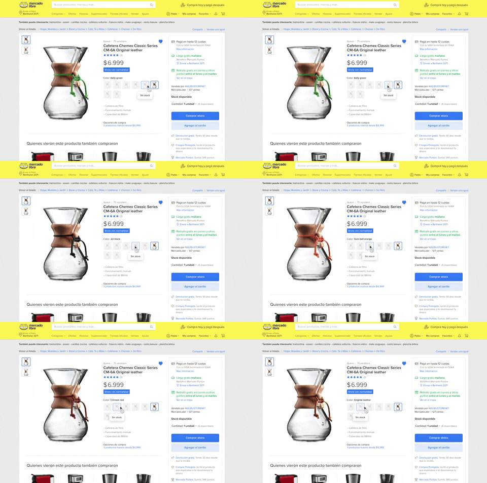
137. Product Color Selector
Users can effortlessly browse and select product variations by color, with immediate visual feedback and clear stock availability, streamlining their purchasing decision.

96. Encouraging Allowing Ads
This pattern respectfully requests users to disable their ad blocker, explaining that the service is free to use but relies on ads for operation.

129. PDF Show & Download
This pattern allows users to preview a PDF document directly within the interface and offers a clear option to download it for offline access or detailed review.

190. Ask Email for Playing Video
This pattern allows users to watch a free video episode, encouraging engagement and potential subscription by offering a taste of premium content.

79. Out of downloads
This pattern informs guest users they've reached their daily download limit, prompting them to register or log in to continue accessing resources.
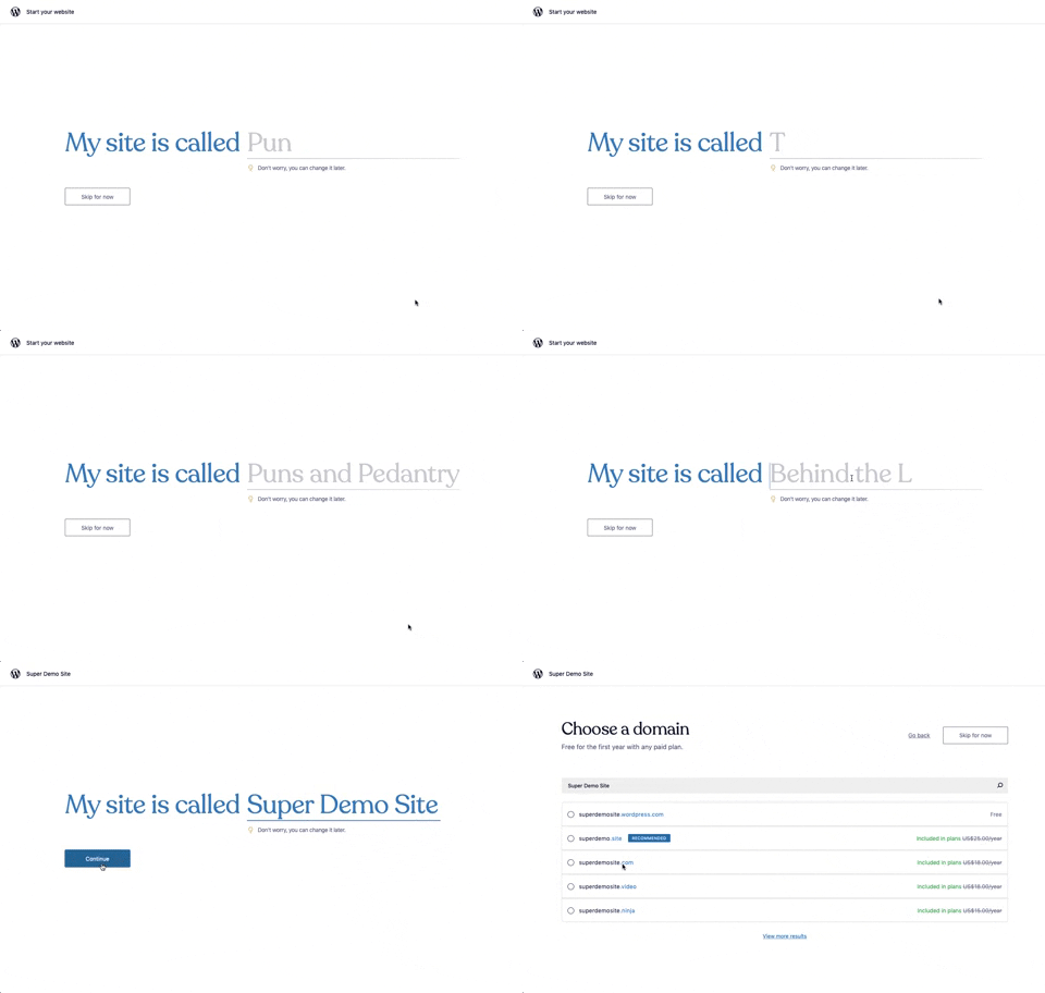
176. Wordpress.com - Natural Inputs with Suggestions
This pattern guides users to quickly name their site by offering real-time suggestions as they type, streamlining the initial setup process.

98. Features on Signing-up
This pattern showcases key product features and social proof alongside clear sign-up options, helping users quickly understand value and commit.

57. IDF - Encouraging Newsletter Sign-up
This pattern uses a modal dialog to offer a free ebook in exchange for an email address, encouraging newsletter sign-ups and lead generation.

77. Sign Up Flow with Pricing Step
This pattern guides users through a multi-step signup process, including a clear pricing selection, to onboard them efficiently and transparently.
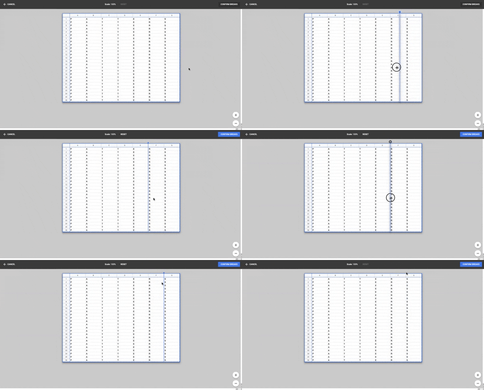
86. Table Column Slicer
Users can precisely define column breaks within a data table, enabling flexible data organization and improved readability for complex datasets.

23. Suscription gimmicks
This pattern helps users choose a subscription plan by clearly comparing features and pricing, often leveraging social proof to build trust and encourage conversion.
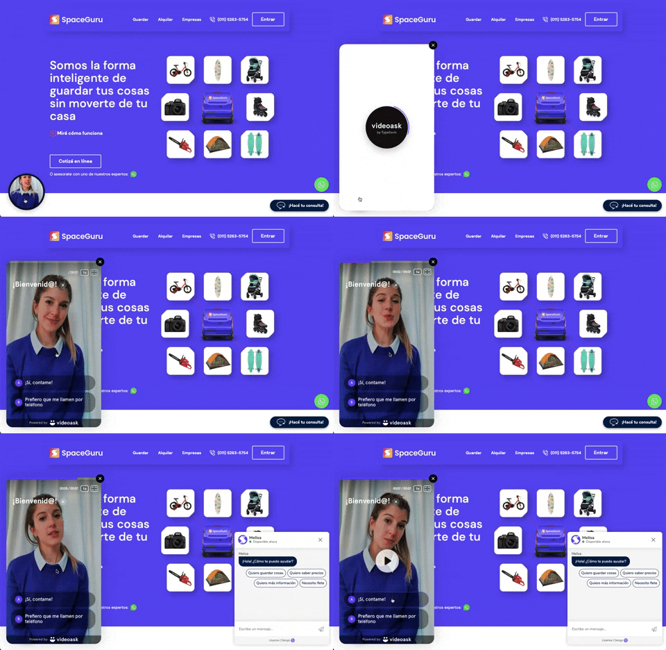
196. Video Story on Website
A floating video story provides users with a dynamic, engaging explanation of a product or service, enhancing understanding and encouraging further interaction.

63. Window Maximize Options (on Right Click)
Users can right-click the maximize button to access a dropdown menu, enabling quick window arrangement options like full screen or tiling to the left or right.

126. WeTransfer - In-front Site Terms
This pattern presents a prominent, in-front modal to users, requiring explicit acceptance of terms and conditions before they can proceed with site interaction.

172. Contextual Popup for Service Upgrade
This contextual popup allows users to manage task details and offers a clear call to action for upgrading to unlock advanced features.

35. Do Not Leave Popup
This pattern presents a modal dialog to users, highlighting the potential negative impact of an action to encourage reconsideration and prevent unintended consequences.

34. Premium gimmicks
This pattern entices users to upgrade to a premium subscription by blurring out valuable content, like profile viewers, and offering a free trial to unlock it.

12. Pricing Comparison (3-tier)
This pattern helps users compare three distinct pricing tiers, highlighting features and costs to facilitate an informed subscription decision.

143. Platform Sign-in/up
This pattern enables users to quickly create a new account or sign in to an existing one, streamlining access to platform features.
16. Incremental pricing
Incremental pricing presents cost adjustments based on user selections or progression through steps. Users make decisions via toggle fields and buttons, influencing the final price.
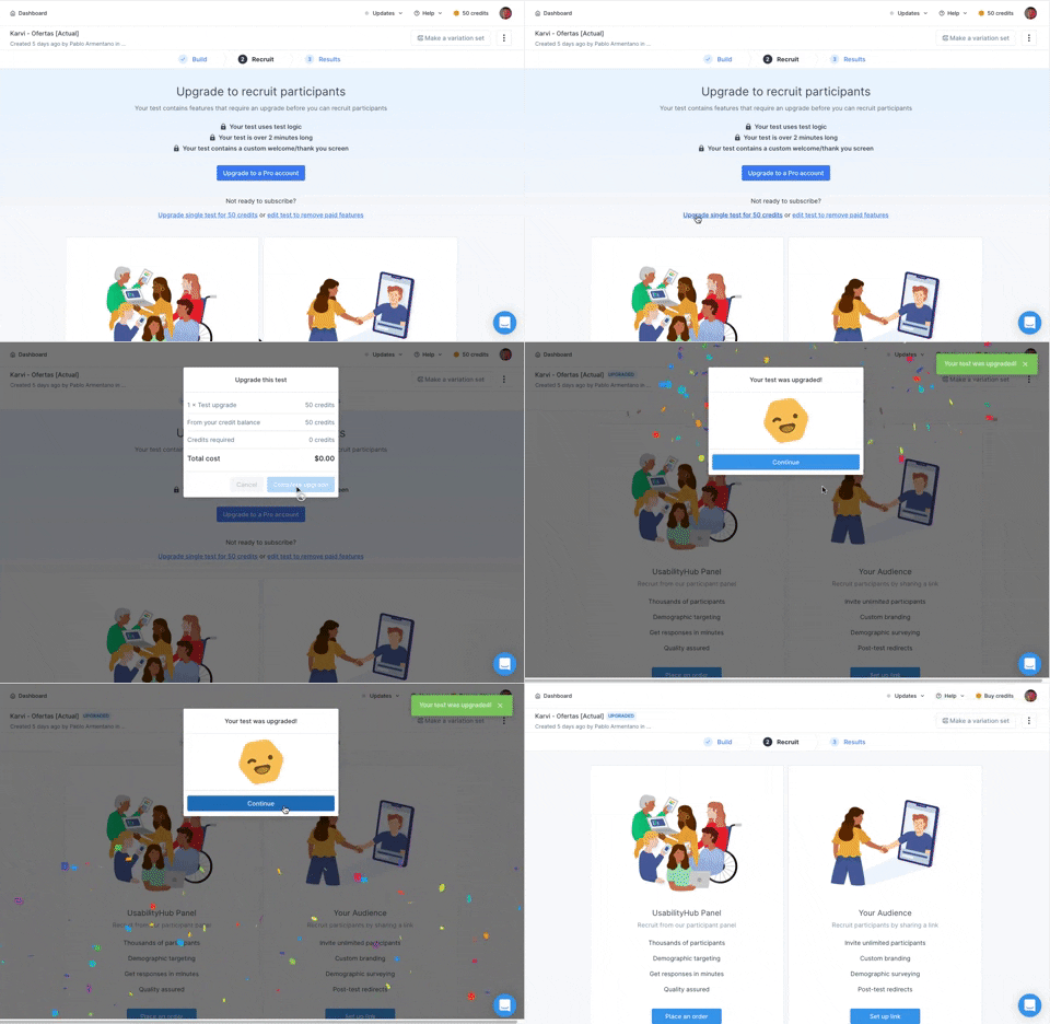
166. Generated Effect: Confetti Explosion
A celebratory confetti explosion visually confirms successful user actions, enhancing positive reinforcement and delight.

16. Double Account Entrance
This pattern offers users a clear choice between creating a new account or signing in, streamlining access and reducing decision fatigue.

10. Dedicated Screen for Action Confirmation
This dedicated screen ensures users explicitly confirm or deny third-party access to their LinkedIn data, promoting transparency and control over personal information.