Patterns for Onboarding
- Desktop (48)
- Tablet (1)
- Mobile (6)
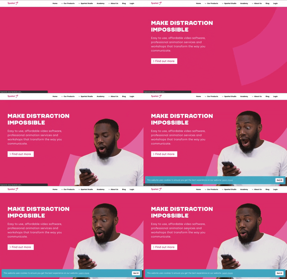
303. Background Animation (on Load)
A dynamic background animation on page load engages users immediately, providing visual interest and a sense of activity while content renders.
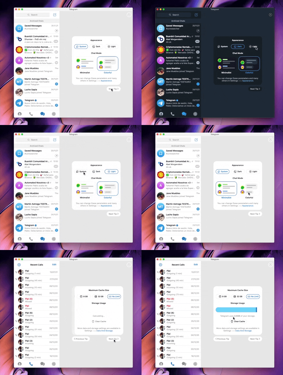
282. Telegram - Chat Setup Wizard
This wizard guides users through initial setup choices like appearance and chat mode, ensuring a personalized experience from the start.

280. Slack - Workspace Creation Wizard
This wizard guides users through creating a new workspace, ensuring a smooth onboarding experience by collecting essential information step-by-step.
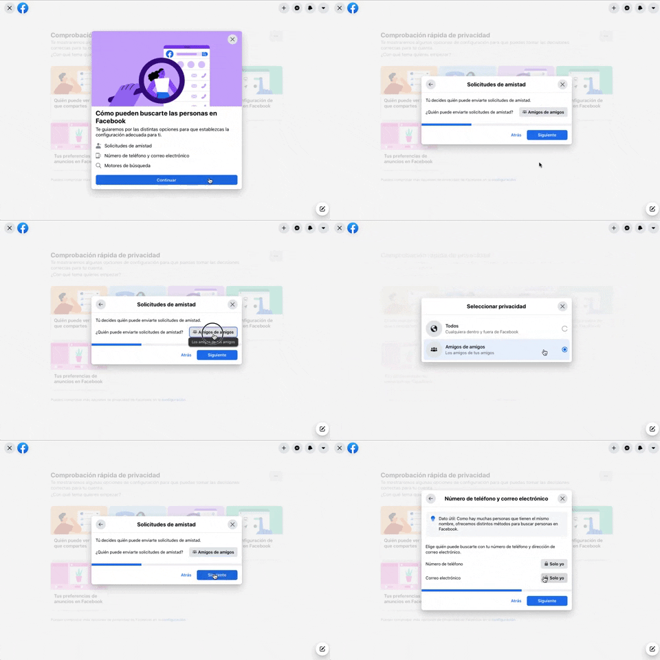
256. Modal Blackout w/ Forms & Steps
This modal blackout pattern guides users through multi-step forms, ensuring focused input and clear progression for critical decisions.
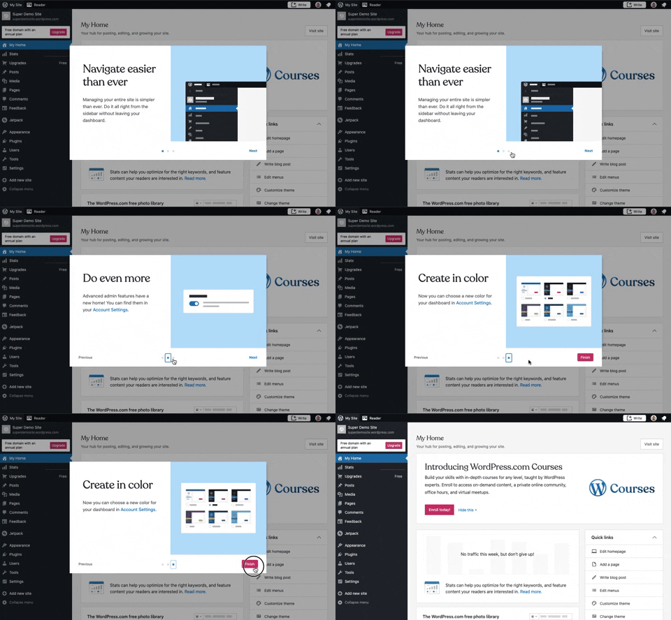
241. Modal Blackout w/ Steps
This multi-step modal guides users through key features with clear explanations and visual cues, ensuring a smooth onboarding experience.
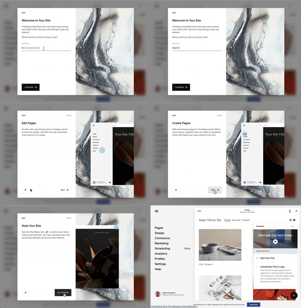
218. Modal Blackout w/ Steps, Forms and Animations
This multi-step modal guides users through an onboarding process with clear form inputs and animated transitions, ensuring focused completion of initial setup tasks.
_23.27.14.png?table=block&id=bf025abf-95bb-4aef-8c5c-fbba4df15c67&cache=v2&width=960&quality=80)
208. Checkbox for User Confirmation
A checkbox provides clear visual confirmation of a completed step, guiding users through onboarding or multi-stage processes with immediate feedback.
Uink Digital Agency
Specilist on building and launching digital products. Let's talk!
_22.41.58.png?table=block&id=230850ed-d5a6-4973-aa55-1576bc51cd42&cache=v2&width=960&quality=80)
145. Communication Preferences on Sign Up Flow
This pattern gathers essential user contact information, including first name, surname, and email address, to facilitate account creation and future communication.
_19.04.51.png?table=block&id=c9b88fac-62bb-47ff-966c-7ff44c98dbdd&cache=v2&width=960&quality=80)
66. Actionable Empty State
This empty state provides a clear call to action, guiding users to initiate content creation and overcome initial blank canvas paralysis.
_12.03.02.png?table=block&id=308eebf9-c4aa-4879-a6b9-62970b2cc7d2&cache=v2&width=960&quality=80)
199. Sidebar Emptystate
This sidebar empty state introduces new features with a clear illustration and call to action, guiding users to discover and adopt new functionalities.
_17.34.19.png?table=block&id=bb480019-2512-4680-a973-55a0f95a7000&cache=v2&width=960&quality=80)
148. Half-page Illustration Slider
This pattern uses a prominent, half-page illustration with a slider to visually guide users through key features or benefits during onboarding.

173. Share Invitation to Live Movie
Users can invite up to six friends to a synchronized viewing experience, fostering shared enjoyment and social interaction around media content.

173. Toggl - Onboarding Action Tooltip
This onboarding action tooltip guides users to sign in with Google, streamlining the login process and reducing friction for new or returning users.
_00.32.31.png?table=block&id=99d40e79-c293-4cc7-a954-2f94c0c543a9&cache=v2&width=960&quality=80)
172. PedidosYa - Search Results Recommendation
This pattern uses a tooltip to highlight "Top Recommended Restaurants," informing users that the displayed selection is personalized based on proximity, order history, and ratings.

171. Slack - Multi-browser Sign In
This pattern streamlines desktop app sign-in by redirecting users to a web browser for authentication, then seamlessly returning them to the application.

203. Two-step Download Flow
This pattern offers users a clear, two-step download process, first presenting a prominent "Download" button and then a secondary, fixed-on-scroll button for consistent access.
_13.07.18.png?table=block&id=7884be75-bca0-427f-a45b-07538147c10d&cache=v2&width=960&quality=80)
161. Apple - Two-Factor Validation (2FA)
This pattern allows users to securely log in to their iCloud account by entering their Apple ID, with an option to stay signed in for convenience.

159. Wix - Natural Language Form
This pattern describes a form interface that allows users to input information using natural language, often seen in onboarding flows on web and desktop platforms. Notable behavior: Natural language input; Form submission; Input validation.
158. Automatic Tooltip Blackout (2)
This pattern automatically displays a tooltip, often accompanied by a dimmed background, to guide users or highlight new features. It's commonly used in onboarding flows to draw attention to specific UI elements and provide contextual information.
132. Amazon - Store Tooltip Reminders
This pattern uses tooltips to provide reminders or onboarding information within a store context, often including hypertext links for further action or navigation. It is primarily designed for desktop web environments to enhance user awareness.
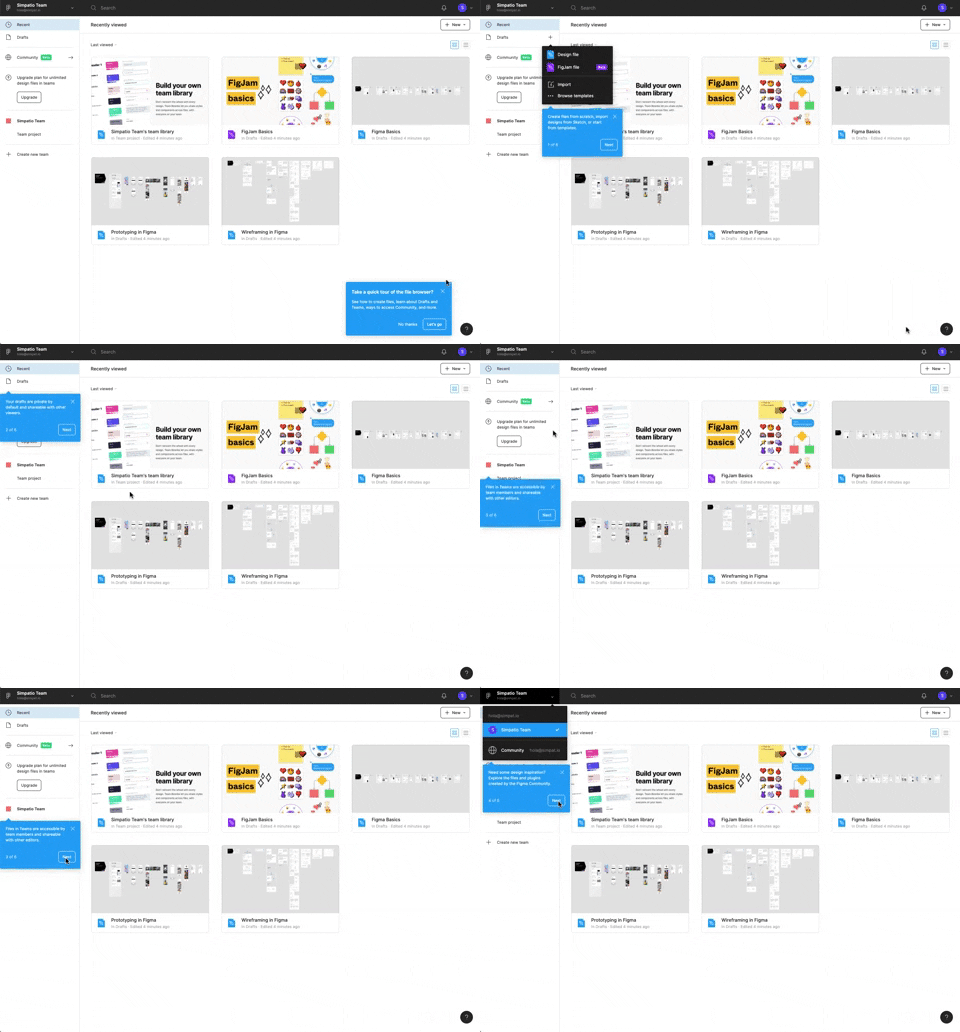
122. Automatic Popover with Steps
This pattern guides users through key features with a multi-step popover, ensuring a smooth onboarding experience and quick feature discovery.

77. Sign Up Flow with Pricing Step
This pattern guides users through a multi-step signup process, including a clear pricing selection, to onboard them efficiently and transparently.

115. Buffer - Hover Instructions
This pattern uses a placeholder text field to prompt users to share content, enhancing discoverability and guiding their initial interaction.

104. Slack - Creating & Customization Workspace
Users input their company or team name into a text field, with a character counter providing real-time feedback and ensuring compliance with length requirements.

81. MercadoLibre - Saving Favourites as Guest
Users can easily save items to a favorites list by clicking a heart icon, even as a guest, promoting future engagement and purchases.
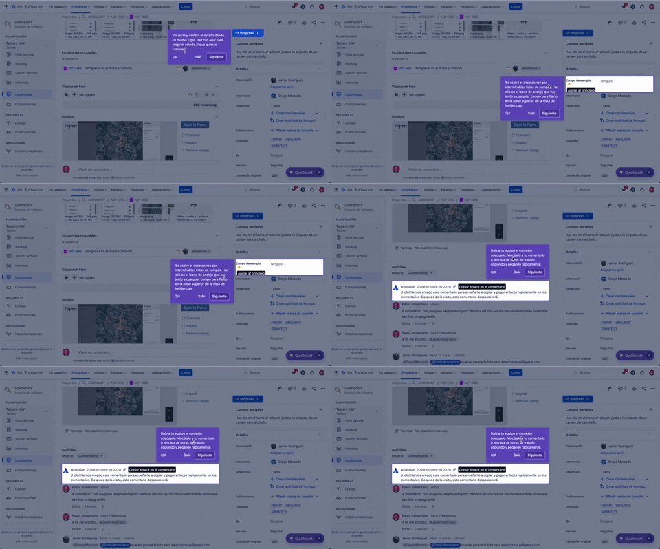
56. Floating Tooltip with Steps and Blackout
This pattern guides users through multi-step onboarding or feature discovery with a focused, sequential tooltip and a dimmed background.

47. Notion - Workspace Types
Users select their intended use case from distinct options, streamlining their onboarding experience with tailored content and features.
46. Dribbble - Posting Graphics Online
This pattern outlines the user experience for posting graphics online, focusing on the initial onboarding flow for new users on a web-based desktop platform, similar to how Dribbble handles content submission. It encompasses the steps and interactions required to upload, describe, and publish visual content, guiding users through their first contribution. Notable behavior: File Upload; Form Submission; Uploading (progress).

29. About.me - Wizard Generation Profile
This wizard guides users through a series of choices, enabling them to quickly define the purpose and desired interactions for their personal profile page.

28. Slack - Find your Workspace
Users enter their email to receive a confirmation link, enabling them to quickly find and join existing Slack workspaces or create new ones.

93. Welcome Screen with Background
This welcome screen uses a captivating background image to introduce new features, guiding users to engage with updated content immediately.

22. Mailchimp - First Mailing Campaign
This onboarding flow guides new users through initial profile setup, collecting essential personal details to personalize their experience and facilitate future interactions.

19. Twitter - Email Validation on Sign Up
This pattern enables users to create an account by providing their name and email, with real-time validation ensuring data accuracy and a smooth onboarding experience.
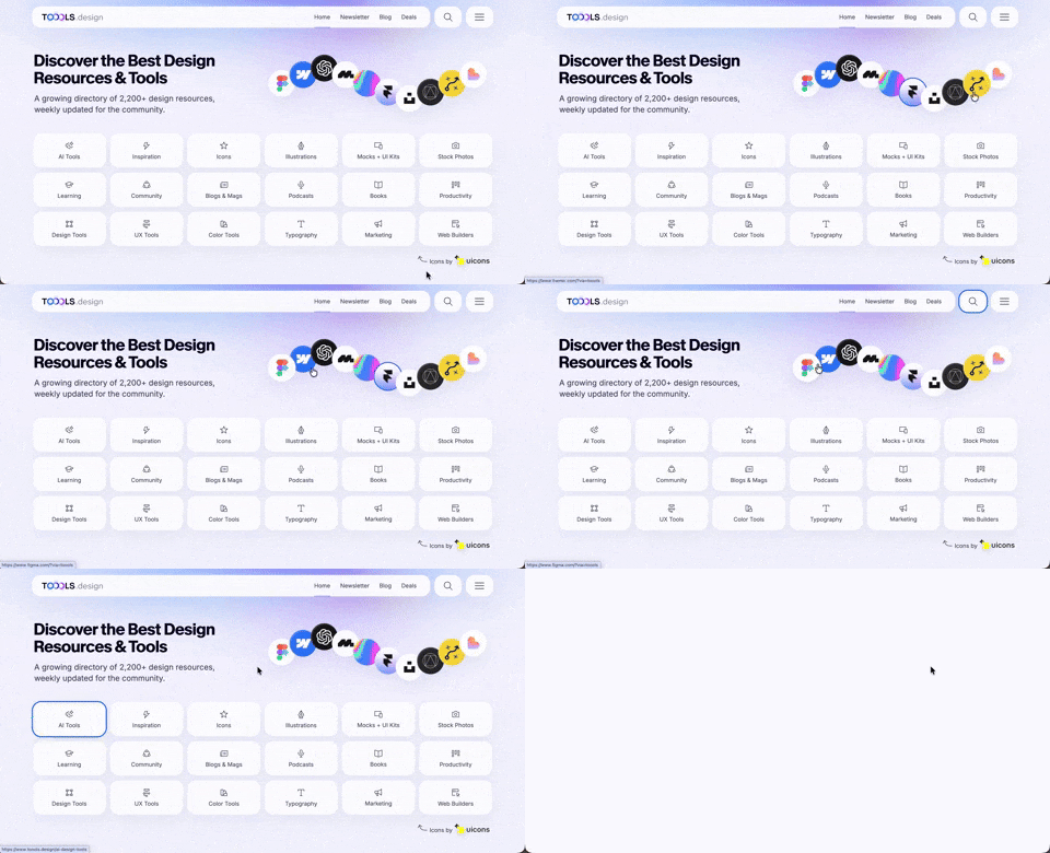
410. Hero Interactive Background (TOOOLS.design)
This pattern uses an animated, interactive background to engage users and visually highlight featured content, enhancing initial appreciation and pathfinding.

406. Fixed Bottom-Right Chat Bubble
Offers always-available, AI-powered guidance and support through a fixed bottom-right chat

403. File Upload and Background Loader
Users can easily upload files or paste URLs, receiving clear visual feedback and background loading indicators for a seamless experience.

397. Modal w/ Card Options
This modal presents users with clear, card-based options to initiate a task, guiding them efficiently through initial decision-making.

386. Skeleton Loader
This pattern uses skeleton screens to progressively load content, providing immediate visual feedback and reducing perceived wait times for users.
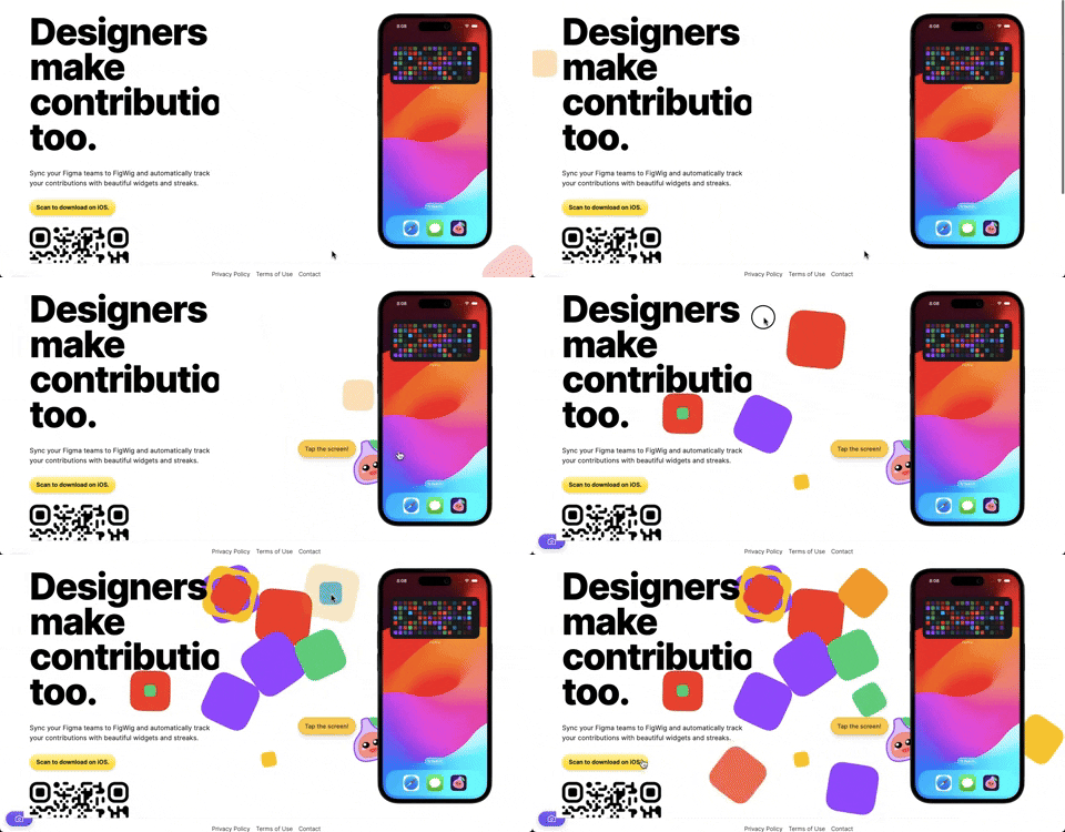
382. Interactive Background Animation
This pattern uses subtle, interactive background animations to engage users and provide dynamic visual feedback as they scroll or interact with the page.

378. Modal Blackout w/ Animation
This pattern uses an animated blackout modal to focus user attention on critical information or actions, ensuring clear decision-making.
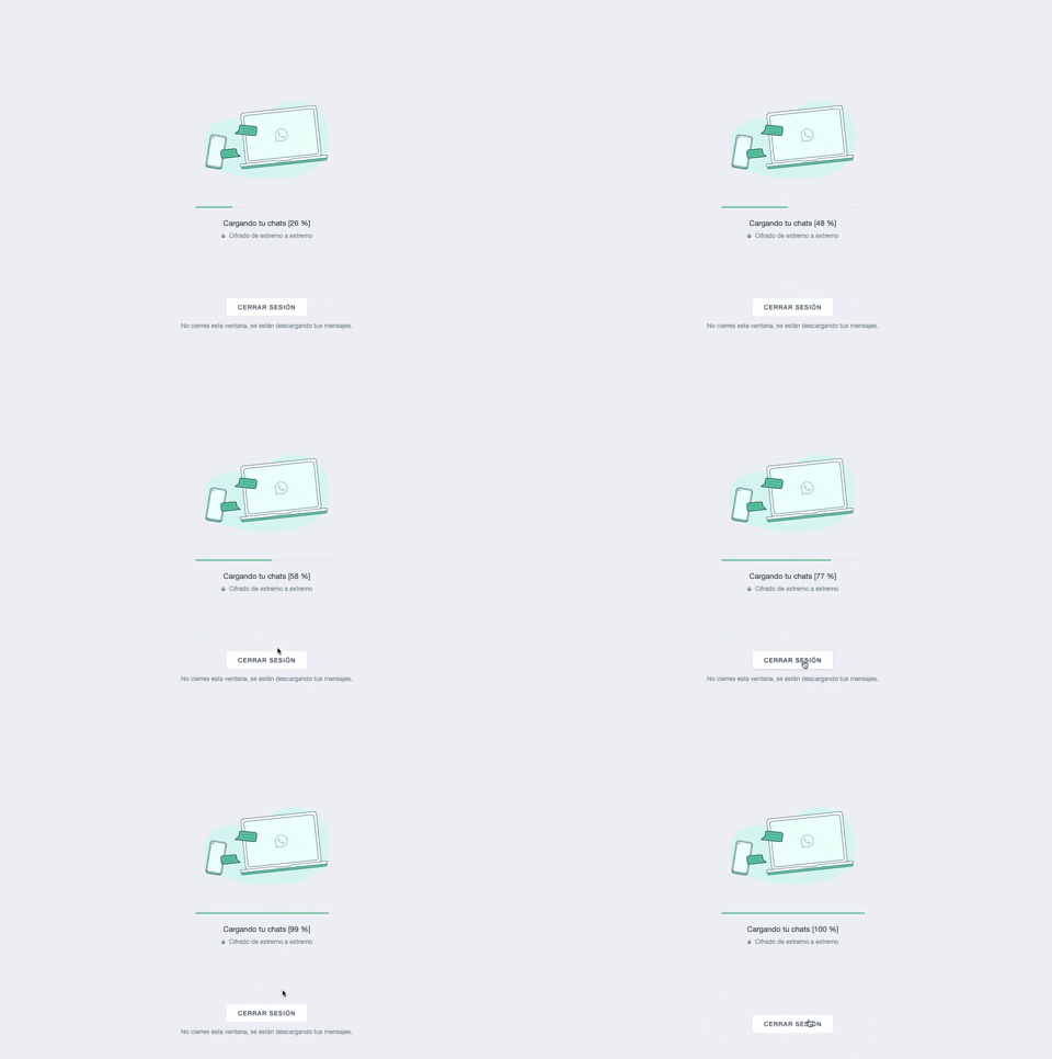
361. WhatsApp - Progress Bar Loading
This progress bar visually informs users about the loading status of their chats, providing a clear percentage to manage expectations during data synchronization.
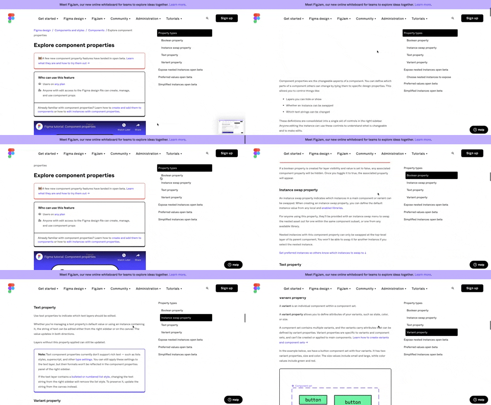
360. Page Outline Menu
This menu provides an interactive outline of page content, allowing users to quickly navigate to specific sections and understand the page structure at a glance.
355. Jira - Feature Presentation Tooltip
A feature presentation tooltip, as seen in Jira, guides users through new functionalities or important updates. It often appears during onboarding or to raise awareness, utilizing tooltips with hypertext links and pagination for multi-step tours on both desktop and web interfaces.

359. Toggle List/Grid View
Users can switch between list and grid views to optimize content display for their preference, enhancing readability and navigation.
333. Static Tooltip with Steps
A non-dismissible tooltip presenting a sequence of steps, commonly employed for user onboarding or guiding through multi-stage workflows, enhancing user awareness and pathfinding.
329. Postman - Onboarding Tooltips
Onboarding tooltips guide users through a new application or feature, highlighting key UI elements and functionalities. They typically appear sequentially to introduce core concepts and actions, improving initial user engagement and understanding within a desktop environment. Notable behavior: Hover; Click (to advance/dismiss); Visible.
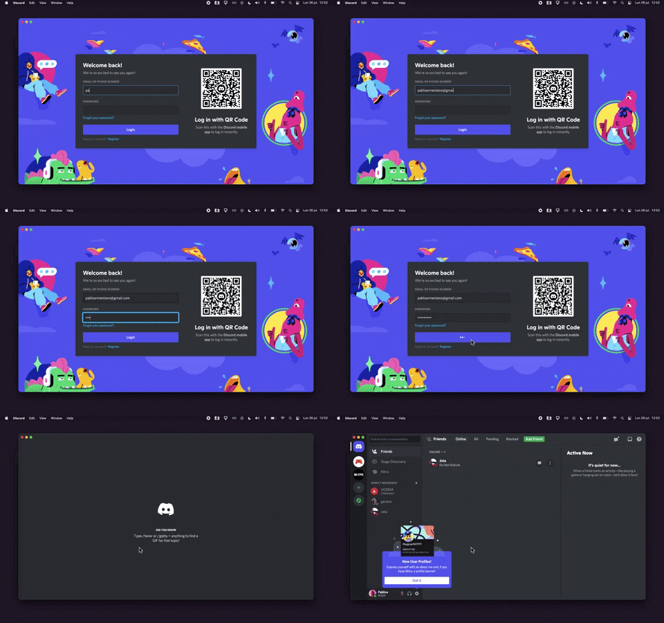
320. Discord - Sign In with Loading Tips
This sign-in pattern offers both traditional email/password input and a convenient QR code scan, enhancing user flexibility and reducing login friction with engaging loading tips.
318. Binance - Tooltip on Features
A tooltip pattern used to provide contextual information or explanations for features, commonly activated on hover or focus, enhancing user understanding and decision-making in web and desktop applications.