Patterns for Search & Navigation
- Desktop (97)
- Tablet (3)
- Mobile (32)
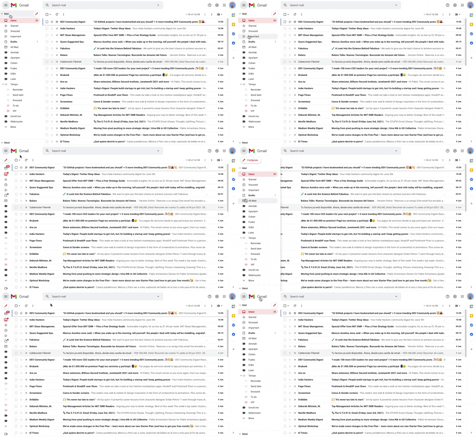
293. Collapsable Sidebar Menu
This collapsible sidebar menu allows users to expand or hide navigation options, optimizing screen real estate while maintaining easy access to key sections.
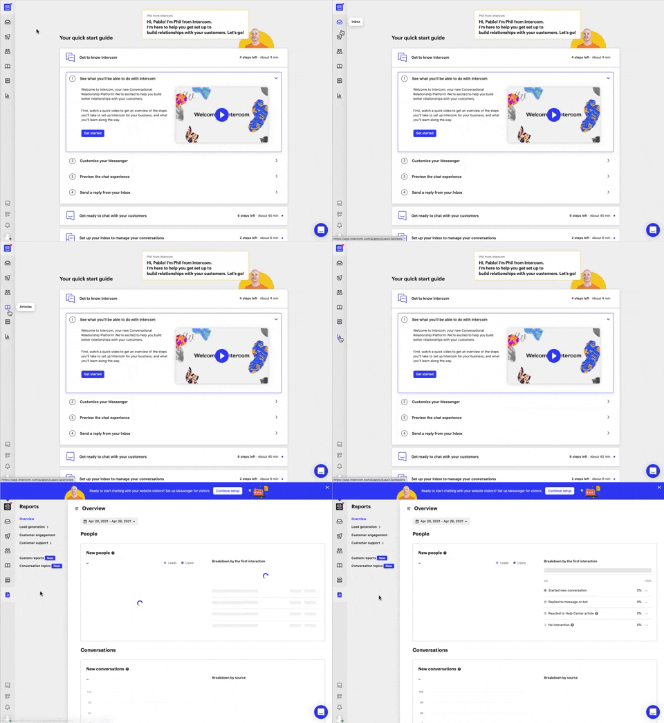
292. Vertical Icon Menu
This vertical icon menu provides quick access to key sections, revealing descriptive tooltips on hover to aid navigation and improve user pathfinding.
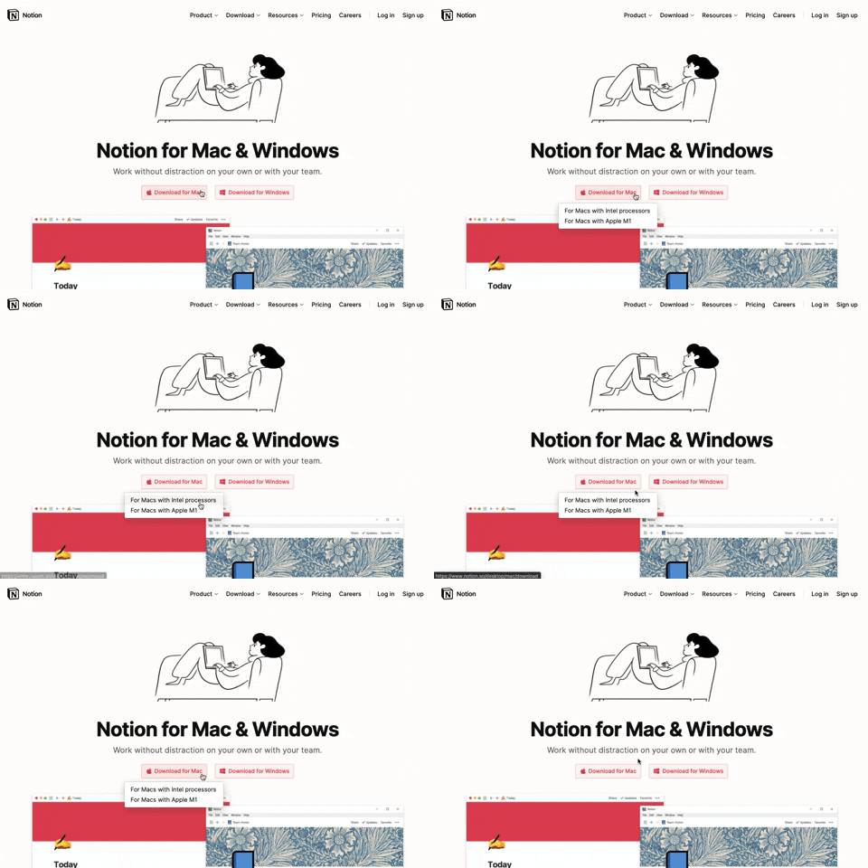
291. Action Menu from Button
Users can click a button to reveal a contextual menu of related actions, streamlining decision-making and guiding them to their desired outcome.

286. Background Animation on Scroll
This pattern uses a fixed background image that animates and shifts as the user scrolls, creating a dynamic and engaging visual experience.
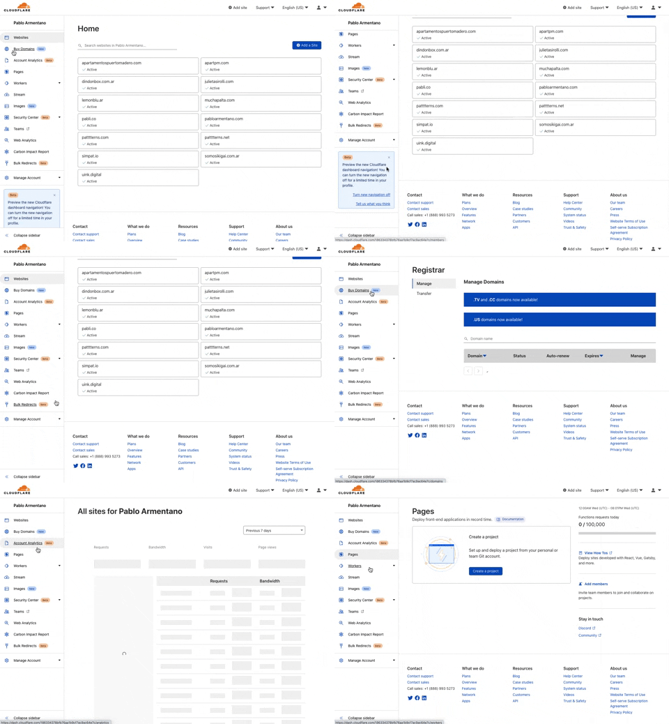
285. Cloudflare - Sidebar with Scroll
This pattern provides a persistent, scrollable sidebar for navigation, ensuring users can always access key sections and maintain context within complex applications.
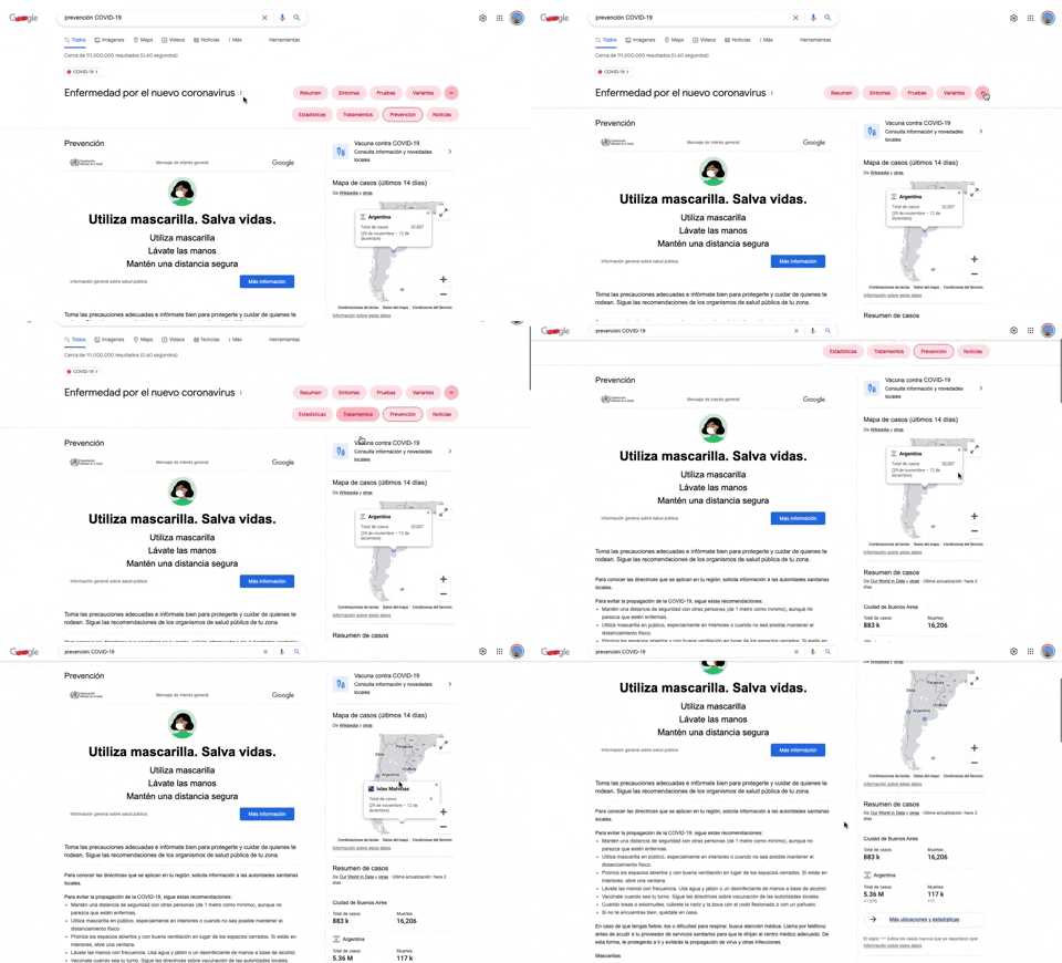
284. Emergency Information Map
This pattern provides users with critical, localized emergency information and actionable advice through an interactive map, enhancing awareness and guiding safe behavior.
284. Top Tooltip on Link Hover
Displays a tooltip above a link when the user hovers over it, providing additional context or information without navigating away from the current page.
Uink Digital Agency
Specilist on building and launching digital products. Let's talk!
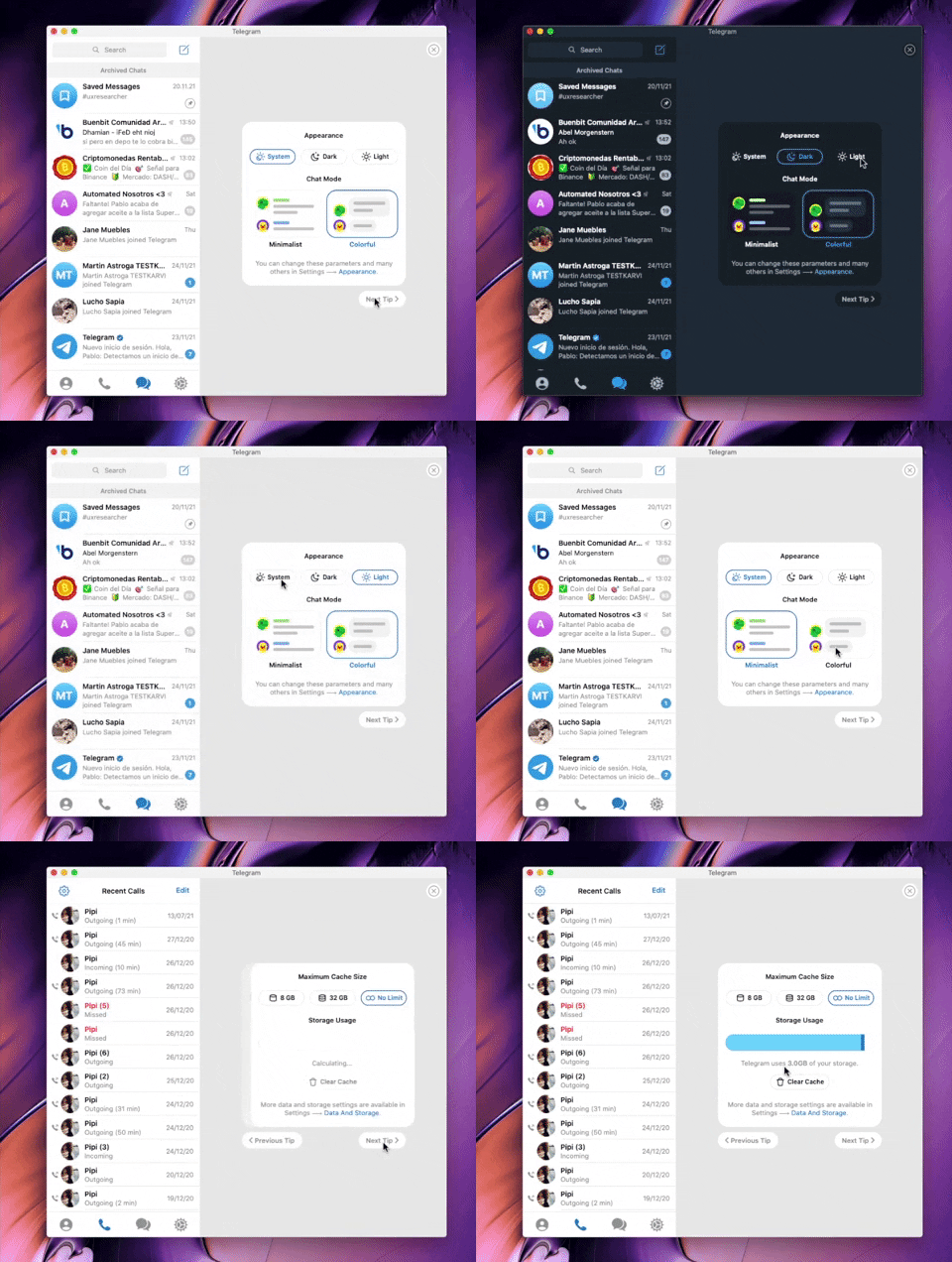
282. Telegram - Chat Setup Wizard
This wizard guides users through initial setup choices like appearance and chat mode, ensuring a personalized experience from the start.

279. Collapsable Layout Sidebars
Users can collapse and expand layout sidebars to optimize screen space, enhancing focus on primary content while maintaining quick access to navigation.

278. Search Menu Dropdown from Input Text
This pattern allows users to quickly find and select desired options from a dynamic, filtered list that appears as they type into an input field.
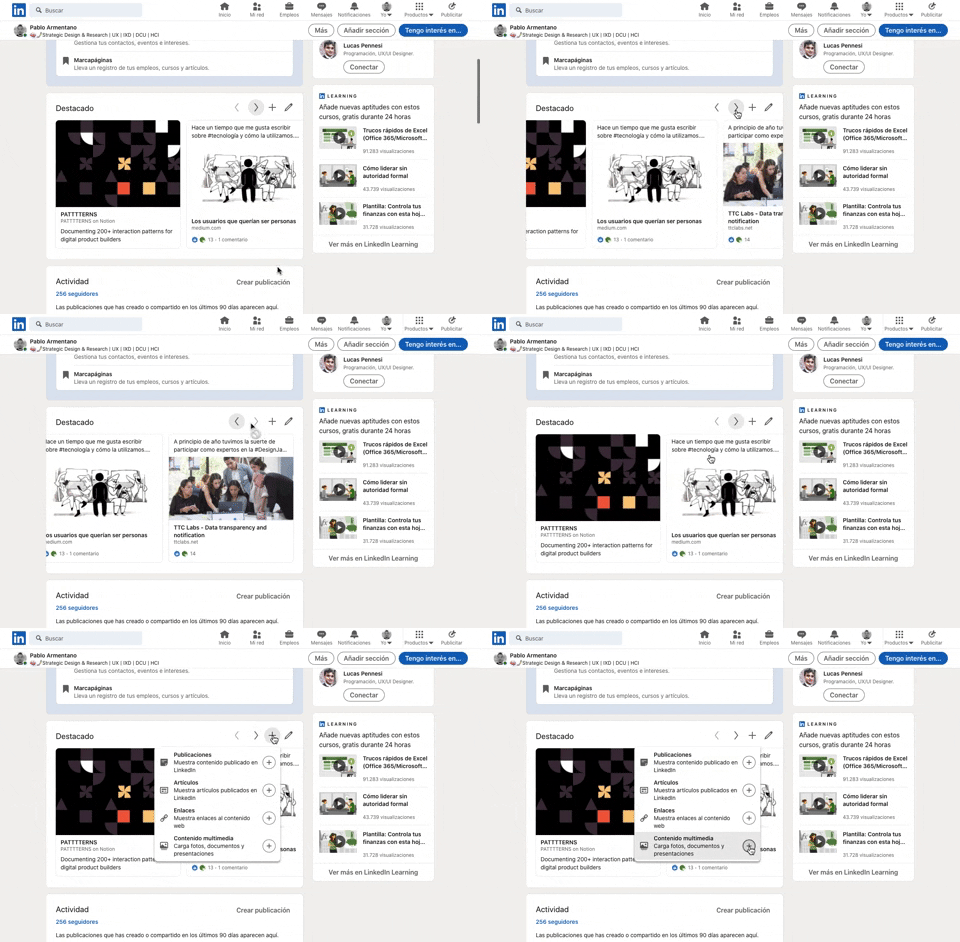
277. Horizontal Card Slider with Actions
This pattern allows users to efficiently browse a curated collection of content cards, with clear navigation and editing options for personalized interaction.

268. Drag & Drop to Upload File
Users can effortlessly upload files by dragging them from their desktop directly into a designated drop zone within the application.

274. Interactive Background Animation
This pattern uses an interactive background animation to engage users and provide visual feedback as they navigate or interact with elements on the page.
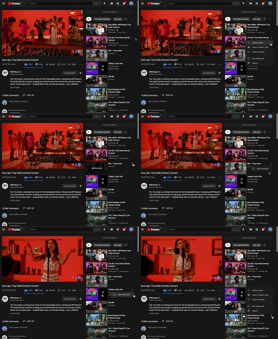
265. Youtube - Hidden Options Menu (Dots)
A common UI pattern where additional options or actions related to a specific item are initially hidden to conserve space. These options are revealed upon user interaction, typically by clicking or tapping a 'dots' (ellipsis) icon, presenting a contextual menu or dropdown.
264. Interactive Background Animation
Desktop, Pathfinding, Apple OS, English, Animation, Click Event, Image / Illustration, Vectors, Figma
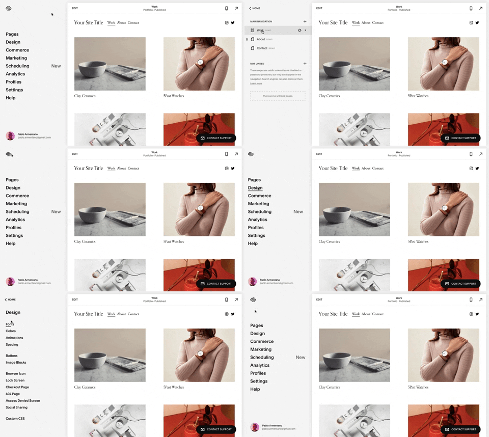
259. Multi-depth Sidebar Navigation
This multi-depth sidebar navigation allows users to quickly traverse complex information hierarchies, improving discoverability and reducing cognitive load.
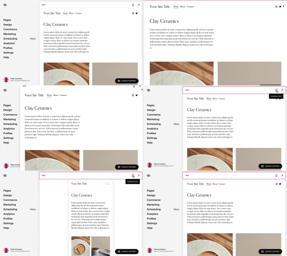
258. Squarespace - Adaptable Viewport Size
Users can dynamically adjust the content preview area, allowing them to visualize their website across various screen sizes for optimal responsiveness and design fidelity.

254. Toggle/Hide Sidebar Menu (Mouse)
Users can toggle the sidebar menu to hide or reveal navigation, optimizing screen space for content focus or quick pathfinding.
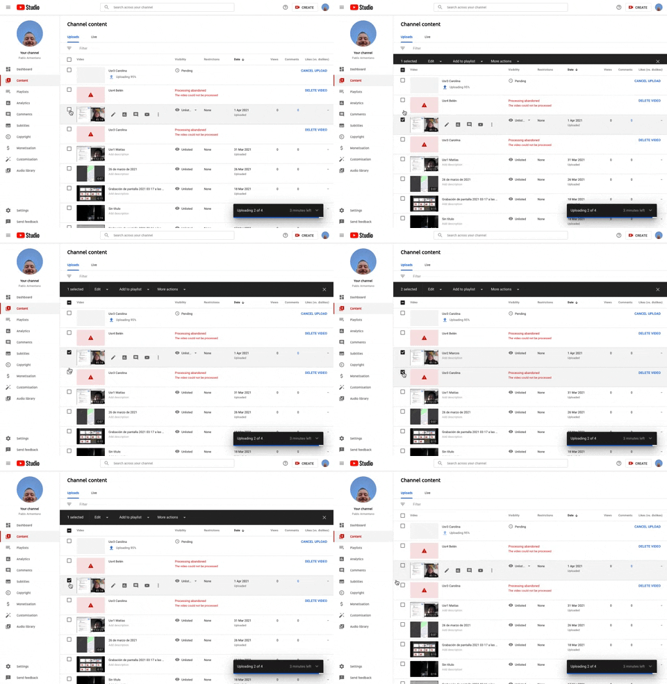
253. Youtube - Table Row Selector
Users can efficiently select multiple table rows by clicking checkboxes, enabling bulk actions and streamlining content management workflows.
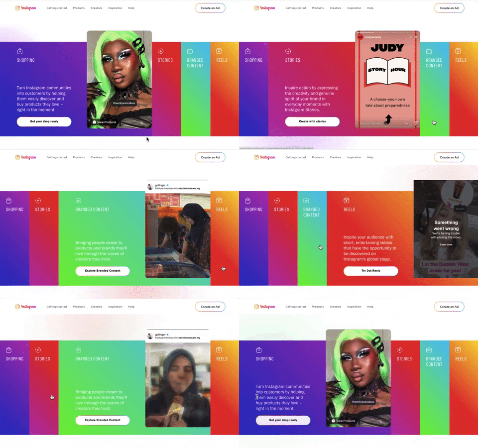
240. Instagram - Horizontal Accordion
This horizontal accordion allows users to explore distinct content categories by expanding a selected panel, revealing detailed information and relevant calls to action.
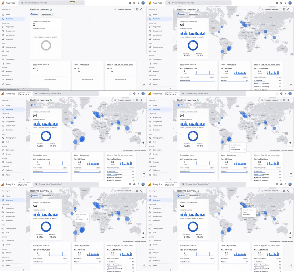
251. Progressive Layout Loader
This pattern provides immediate visual feedback during page loads, progressively revealing content to reassure users that the system is actively processing their request.

235. Background Animation (on Mouse Hover)
This pattern uses a subtle background animation on hover to provide visual feedback, guiding users to interactive elements and enhancing discoverability.
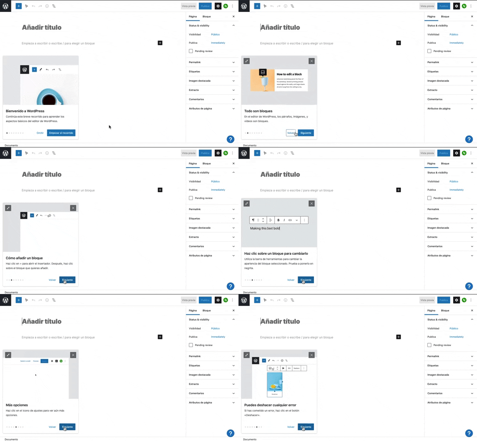
231. Floating Dialog Popover w/ Steps
This pattern guides users through a multi-step onboarding or feature tour with a dismissible, paginated floating dialog, enhancing discoverability and adoption.
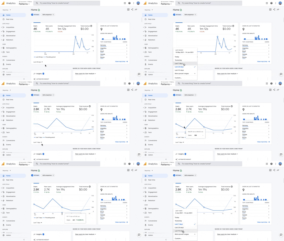
236. Horizontal Graph with Time Ranges
Users can easily compare data trends over customizable time ranges within a horizontal graph, enabling quick insights into performance changes.
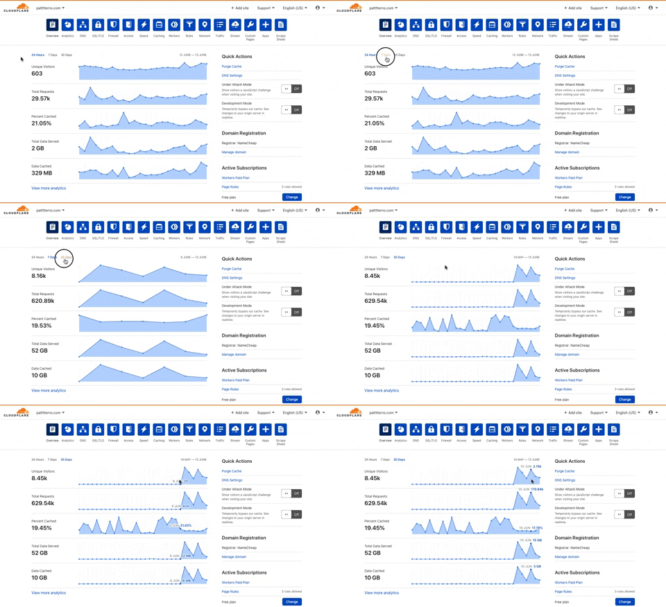
225. Cloudflare - Multiple Graphs by Time Ranges
This pattern allows users to quickly switch between predefined time ranges to view multiple related data graphs, enabling efficient analysis of performance trends.
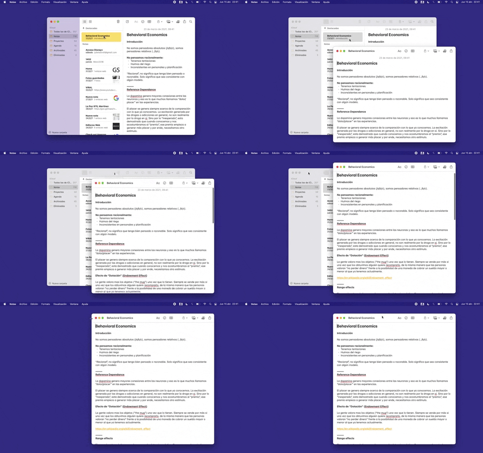
228. Open in New Window (Doble Click)
Users can double-click an item to open its content in a new, independent window, enabling parallel viewing and enhanced multitasking.
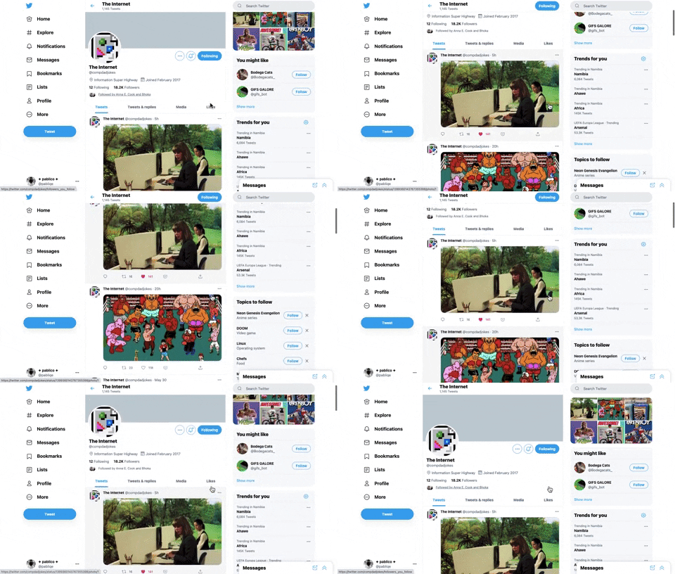
221. Stacked Action Button
This pattern keeps primary actions readily accessible by stacking them vertically, ensuring users can quickly initiate key tasks without scrolling.
217. Vertical Icon Menu (duplicated)
Desktop, Pathfinding, Web, English, Side Panel, Transition, Image / Illustration, Tooltip, Hover Event, Intercom
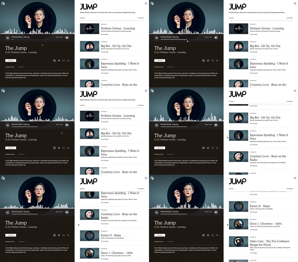
121. 2-pane Audio Navigation
This pattern allows users to browse a list of audio episodes while simultaneously playing and controlling a selected episode.
175. Tab Preview on Hover State
Displays a preview of a tab's content when the user hovers over the tab, enabling quick content assessment without requiring a full click or navigation.
_18.38.50.png?table=block&id=c651e204-8edb-4bd8-96cb-760d7955b0bd&cache=v2&width=960&quality=80)
148. Search Bar Fade-out
This pattern allows users to quickly search their content with a prominent search bar that reveals recent searches and relevant suggestions upon interaction.
_09.27.02_p._m..png?table=block&id=83aa4527-ffe4-4c56-8e77-d6fe1f74f5b1&cache=v2&width=960&quality=80)
114. News Swiper
This pattern allows users to effortlessly browse a carousel of news or definition cards, providing quick access to multiple content pieces with clear navigation.
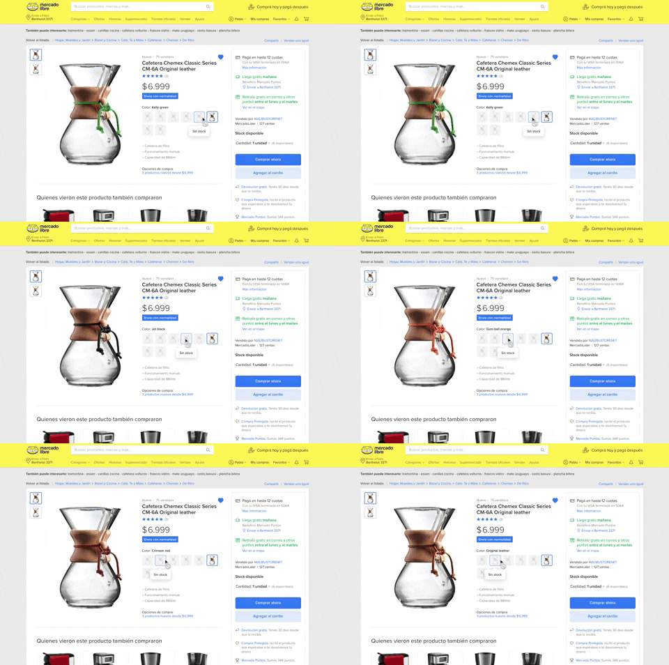
137. Product Color Selector
Users can effortlessly browse and select product variations by color, with immediate visual feedback and clear stock availability, streamlining their purchasing decision.

411. Ticket Carrousel (TOOOLS.design)
Users can browse a curated selection of offers by clicking pagination arrows, enabling efficient discovery and decision-making.
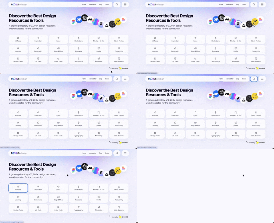
410. Hero Interactive Background (TOOOLS.design)
This pattern uses an animated, interactive background to engage users and visually highlight featured content, enhancing initial appreciation and pathfinding.
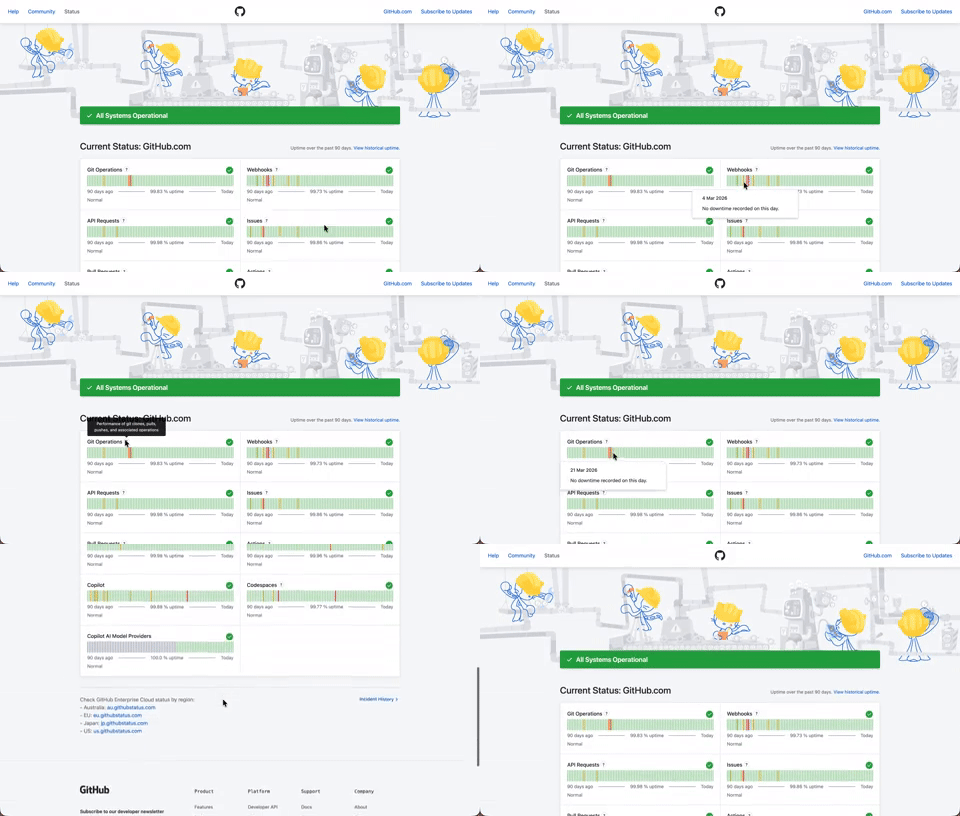
408. Status Page per Hour Indicators
Users can quickly assess system health over time via color-coded hourly indicators, revealing operational status and outage events at a glance.

406. Fixed Bottom-Right Chat Bubble
Offers always-available, AI-powered guidance and support through a fixed bottom-right chat

404. Sidebar Backdrop Menu
This pattern provides a full-height, animated sidebar menu that slides in from the left, offering clear navigation options while dimming the main content for focused interaction.

400. 3D Button Shadow
This pattern uses a subtle 3D shadow animation on hover to provide clear visual feedback, enhancing user awareness and guiding interaction.

397. Modal w/ Card Options
This modal presents users with clear, card-based options to initiate a task, guiding them efficiently through initial decision-making.

379. Dropdown Filters
Dropdown filters enable users to quickly refine content views by selecting specific criteria from a compact, accessible menu.
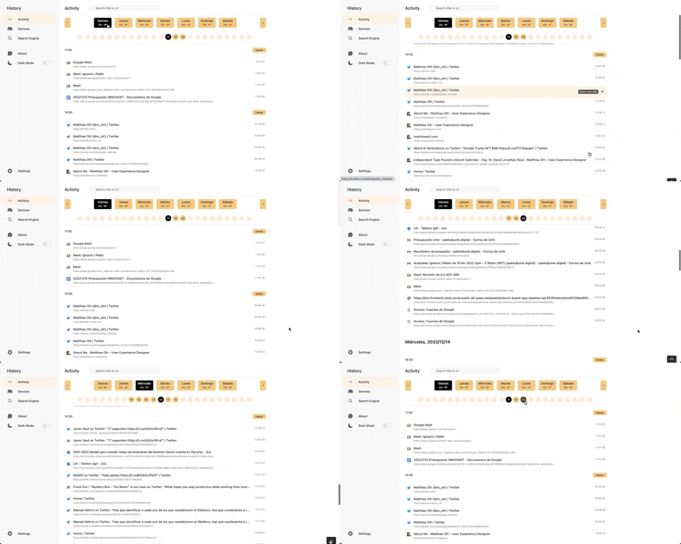
363. Better History - Back to Top on scroll
This pattern allows users to quickly navigate to the top of a long list by clicking a fixed "Back to Top" button that appears on scroll.
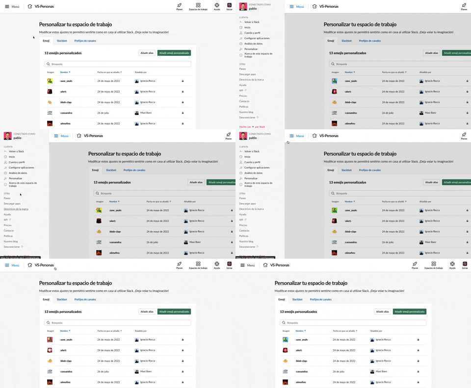
375. Toggle/Show Sidebar Menu
Users can toggle a persistent sidebar menu to reveal or hide navigation options, optimizing screen space while maintaining easy access to key features.
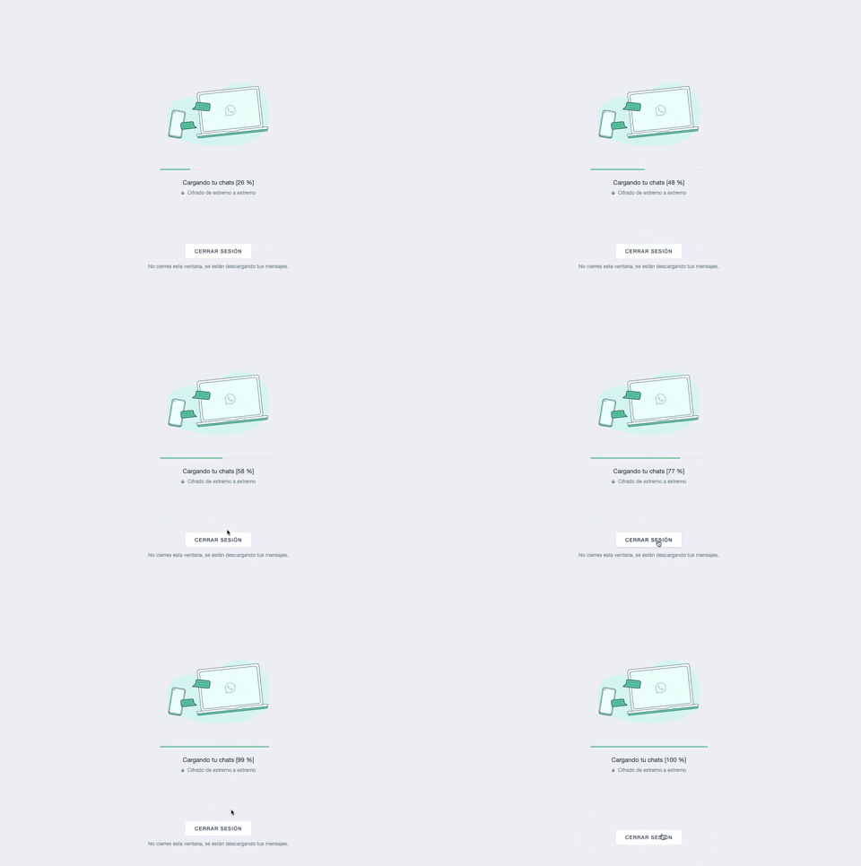
361. WhatsApp - Progress Bar Loading
This progress bar visually informs users about the loading status of their chats, providing a clear percentage to manage expectations during data synchronization.
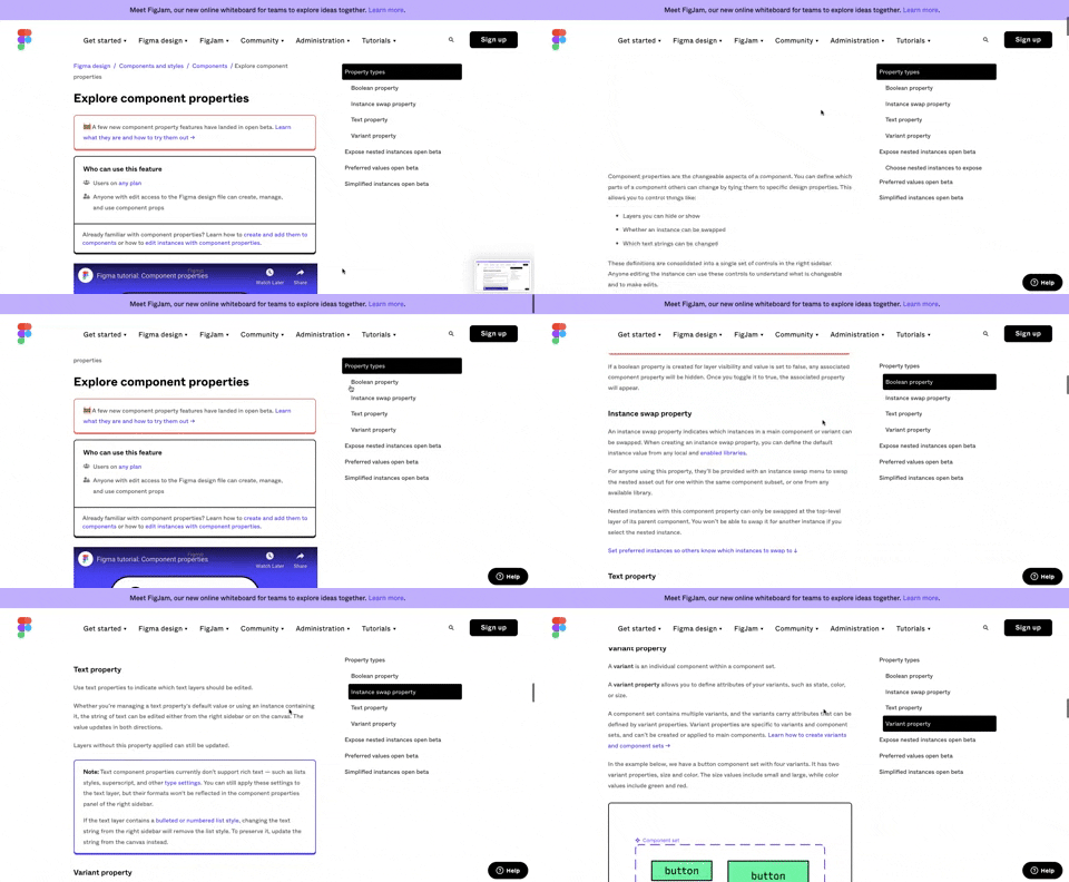
360. Page Outline Menu
This menu provides an interactive outline of page content, allowing users to quickly navigate to specific sections and understand the page structure at a glance.
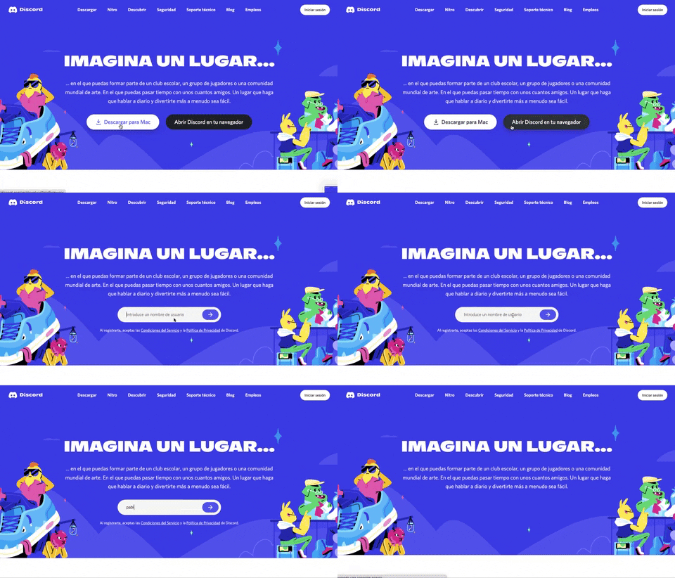
359. Discord - Button to Input Transition
This pattern allows users to seamlessly transition from a clear call-to-action button to an input field, streamlining the path to engagement.
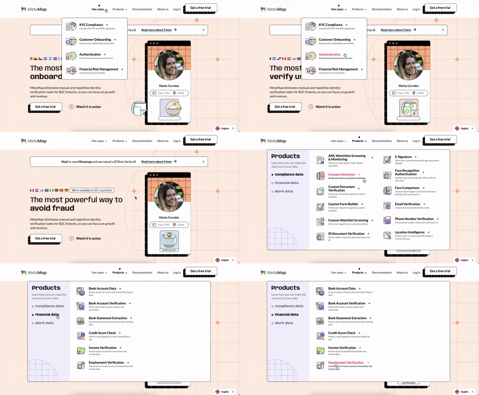
356. MetaMap - Multi-Layout Topbar Menu
This topbar menu uses a dropdown to reveal categorized links, enabling users to quickly navigate to relevant sections and understand the product's diverse offerings.
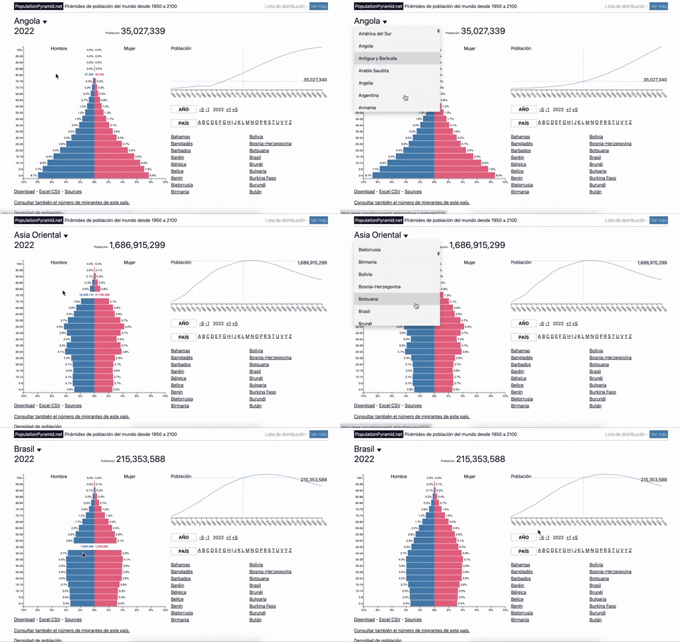
353. Population Pyramid - Visualizations with live filters
Users can dynamically filter population data by country and year, enabling quick comparisons and insights into demographic trends.
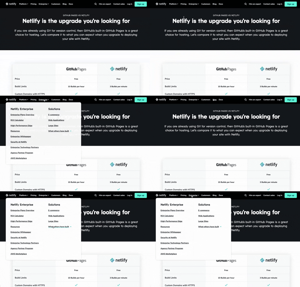
350. Netifly - Multi-layout Topbar Menu
This topbar menu dynamically adjusts its layout and content, offering users clear navigation and relevant options as they explore different sections of the site.

359. Toggle List/Grid View
Users can switch between list and grid views to optimize content display for their preference, enhancing readability and navigation.
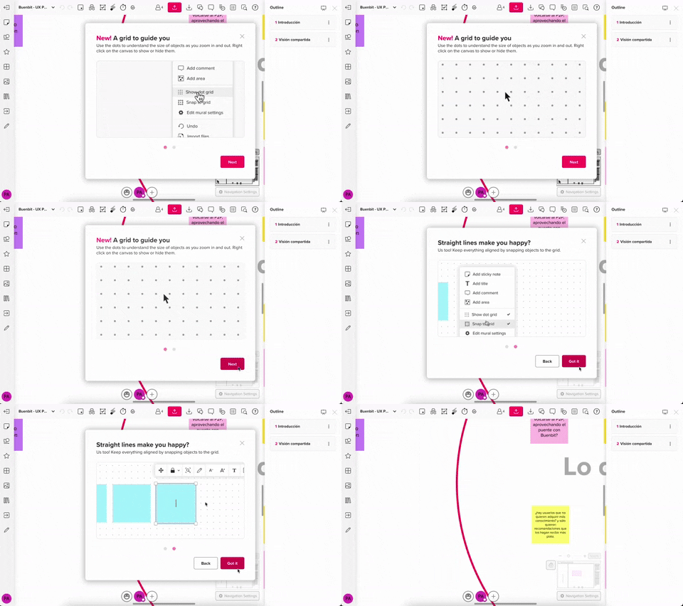
357. Modal w/ Steps & Animation (No blackout)
This modal guides users through multi-step processes with clear instructions and animated transitions, enhancing awareness without obscuring the underlying content.
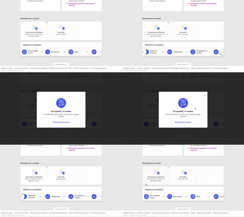
344. MercadoLibre - Horizontal Item Slider
This horizontal item slider allows users to effortlessly browse a curated selection of items, enhancing discoverability and engagement with minimal scrolling.
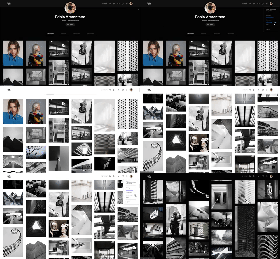
342. Savee - Light/Dark Mode Switcher
Users can instantly toggle between light and dark display modes, enhancing visual comfort and accessibility based on their preference or environment.
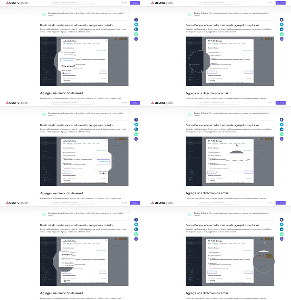
340. Asana - Zoom/Magnifier Over Image
This pattern enhances clarity by dynamically magnifying specific image regions, guiding users to key details and improving comprehension of visual instructions.
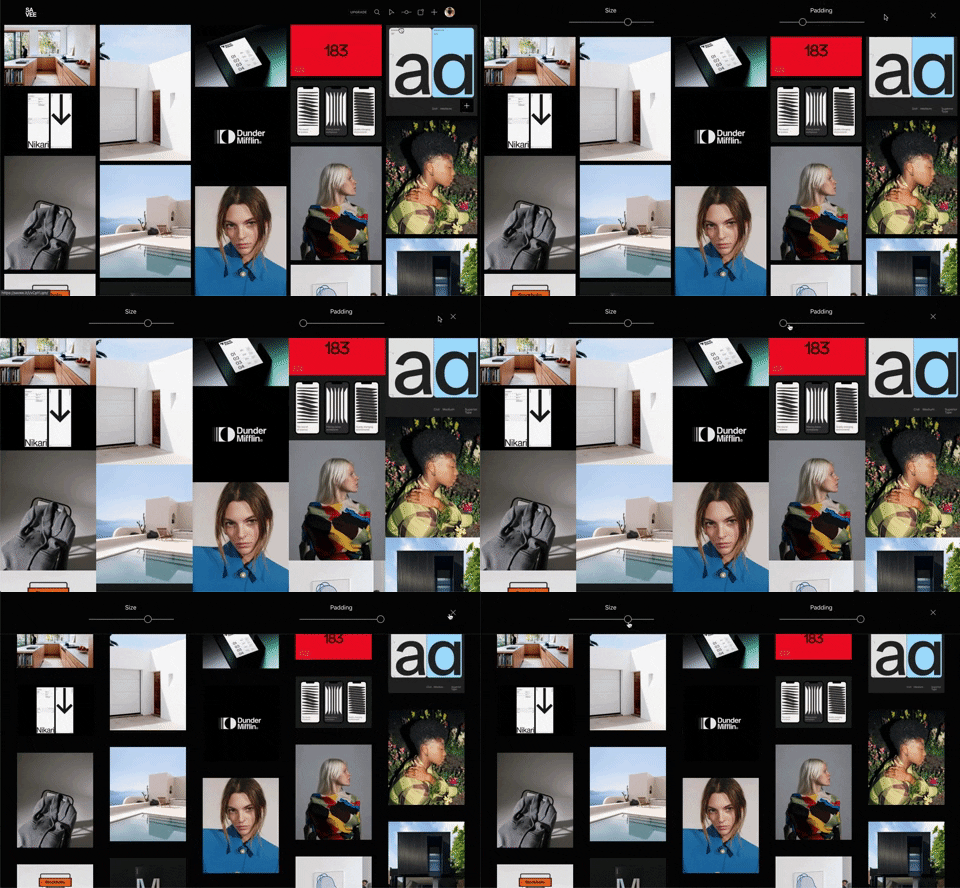
341. Image Grid Customization Sliders
Users can dynamically adjust the number of columns and spacing in an image grid using intuitive sliders, enhancing visual organization and content exploration.
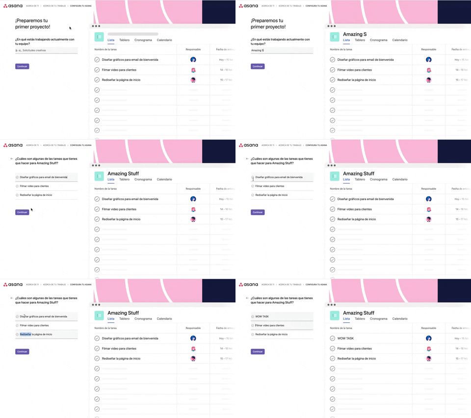
339. Asana - Platform Onboarding Simulator
This pattern guides users through initial setup by simulating product features, allowing them to visualize outcomes and make informed decisions before committing.

346. Sidebar Menu With Collapsable Items (Show More)
This sidebar menu allows users to expand and collapse sections, efficiently managing screen space while providing access to numerous navigation options.

345. Vertical Accordion for FAQs
This vertical accordion allows users to efficiently reveal or hide detailed content sections, optimizing screen space and improving navigation for FAQs or contact information.
336. Floating Popover on Click
A UI pattern where a floating popover element appears adjacent to a trigger element upon a click interaction, providing additional context or actions without navigating away.
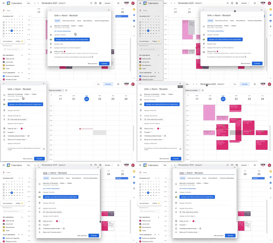
343. Modal/Dialog Drag & Drop to Fixed Position
Users can drag a modal dialog to a fixed side panel, allowing them to view and interact with underlying content without losing context.
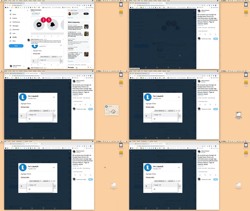
332. Drag & Drop to Create File from Web Image
Users can effortlessly create a new file on their desktop by dragging and dropping an image directly from a web browser.
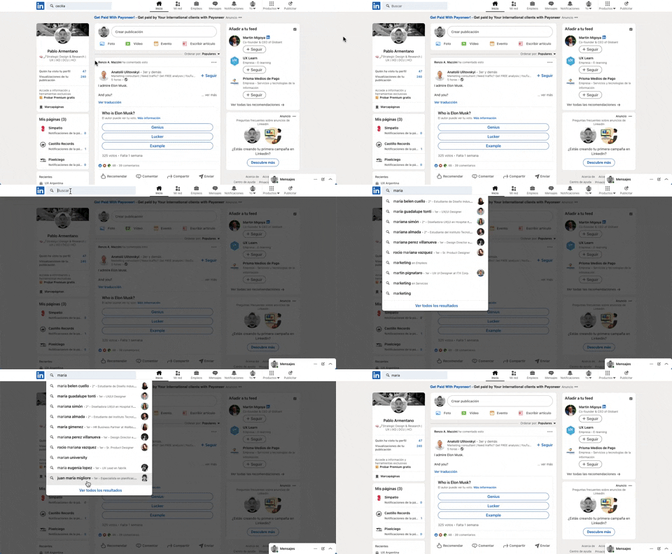
331. Linkedin - Search Bar Blackout
This pattern darkens the background and highlights the search bar, guiding users to focus on search input and results without distraction.

322. Search on Menu Items
This pattern integrates a search input directly within a menu, typically a dropdown, enabling users to quickly filter and locate specific menu items. It enhances pathfinding and awareness, commonly found in desktop applications with navigation bars. Notable behavior: Typing; Filtering; Filtered Menu Items.
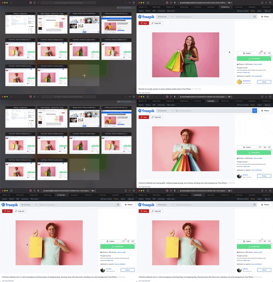
336. Transition: Zoom-In/Out for Browser Windows
This transition allows users to fluidly zoom between a grid of browser tab thumbnails and a full-screen view, enhancing navigation and context switching.
333. Static Tooltip with Steps
A non-dismissible tooltip presenting a sequence of steps, commonly employed for user onboarding or guiding through multi-stage workflows, enhancing user awareness and pathfinding.
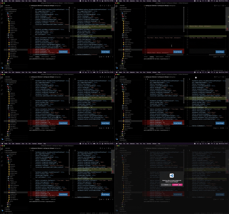
324. Visual Studio Code - Dual View Scroll Sync
This pattern allows users to efficiently compare and resolve differences between two versions of a file by synchronizing their scroll positions.
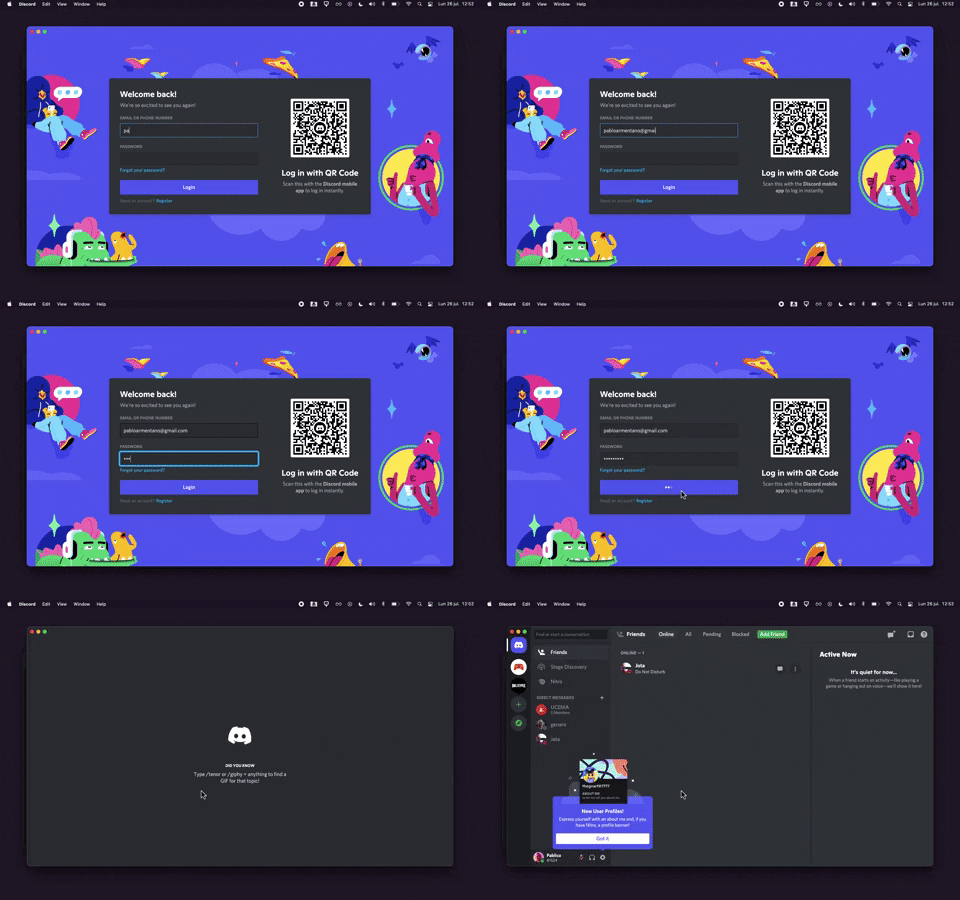
320. Discord - Sign In with Loading Tips
This sign-in pattern offers both traditional email/password input and a convenient QR code scan, enhancing user flexibility and reducing login friction with engaging loading tips.
318. Binance - Tooltip on Features
A tooltip pattern used to provide contextual information or explanations for features, commonly activated on hover or focus, enhancing user understanding and decision-making in web and desktop applications.
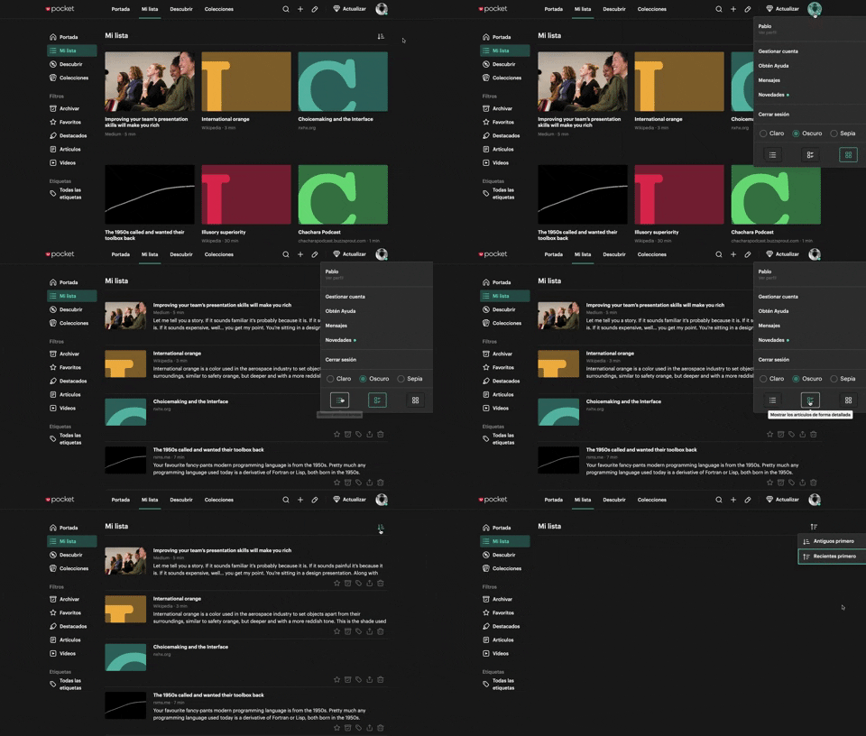
312. Pocket - View Switcher
Users can effortlessly switch between grid and list views of content, enhancing readability and personalizing their browsing experience.
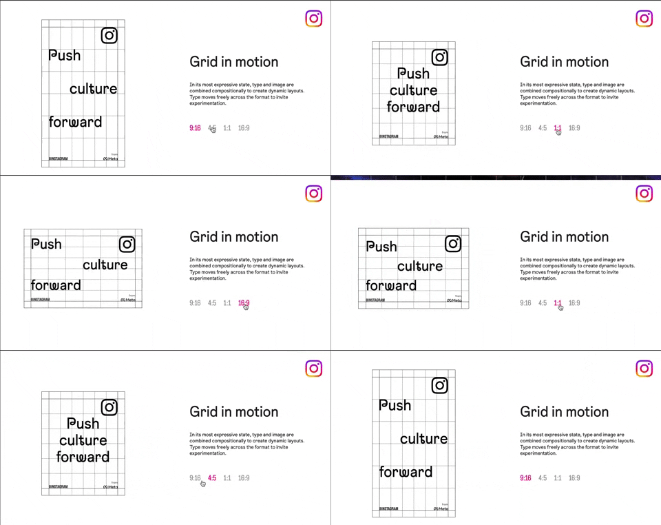
318. Instagram - Animated Illustration with Menu
Users can dynamically adjust content aspect ratios via a clickable menu, providing flexible viewing experiences and enhancing content adaptability.
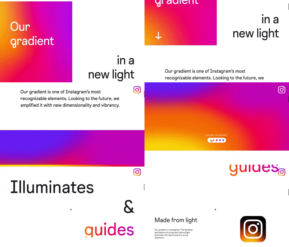
309. Instagram - Brand Gradient
This pattern uses a dynamic, animated brand gradient to visually engage users and highlight key messages as they scroll, enhancing brand recognition and content flow.
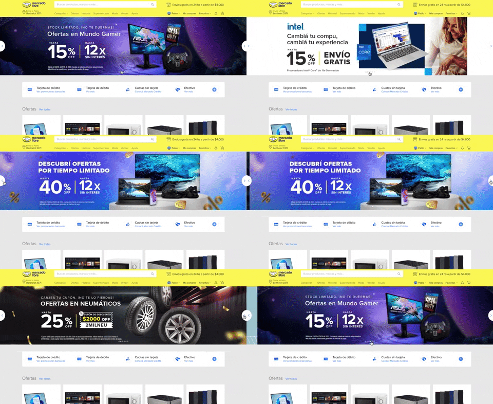
308. MercadoLibre - Hero Slider
Users can effortlessly browse featured promotions and products through a dynamic hero slider, enhancing awareness and guiding their pathfinding.
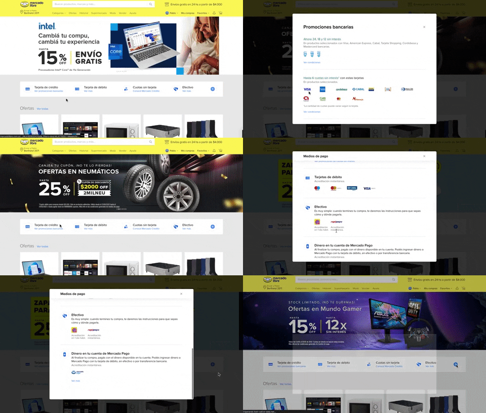
313. Modal Blackout w/ Scroll
This pattern displays a scrollable modal over a darkened background, allowing users to focus on its content while retaining context of the underlying page.

308. Spinners for Module Loading
This spinner provides visual feedback during module loading, reassuring users that the system is actively processing and preventing perceived delays.

307. Tooltip on Hover
Hovering over a truncated title reveals its full text in a tooltip, providing complete context without cluttering the interface.
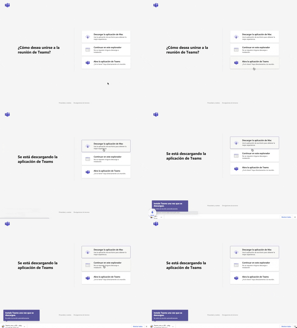
305. Button Combo for App Download
This pattern offers users clear choices to join a meeting, enabling them to download the app, continue in the browser, or open the existing application for optimal experience.
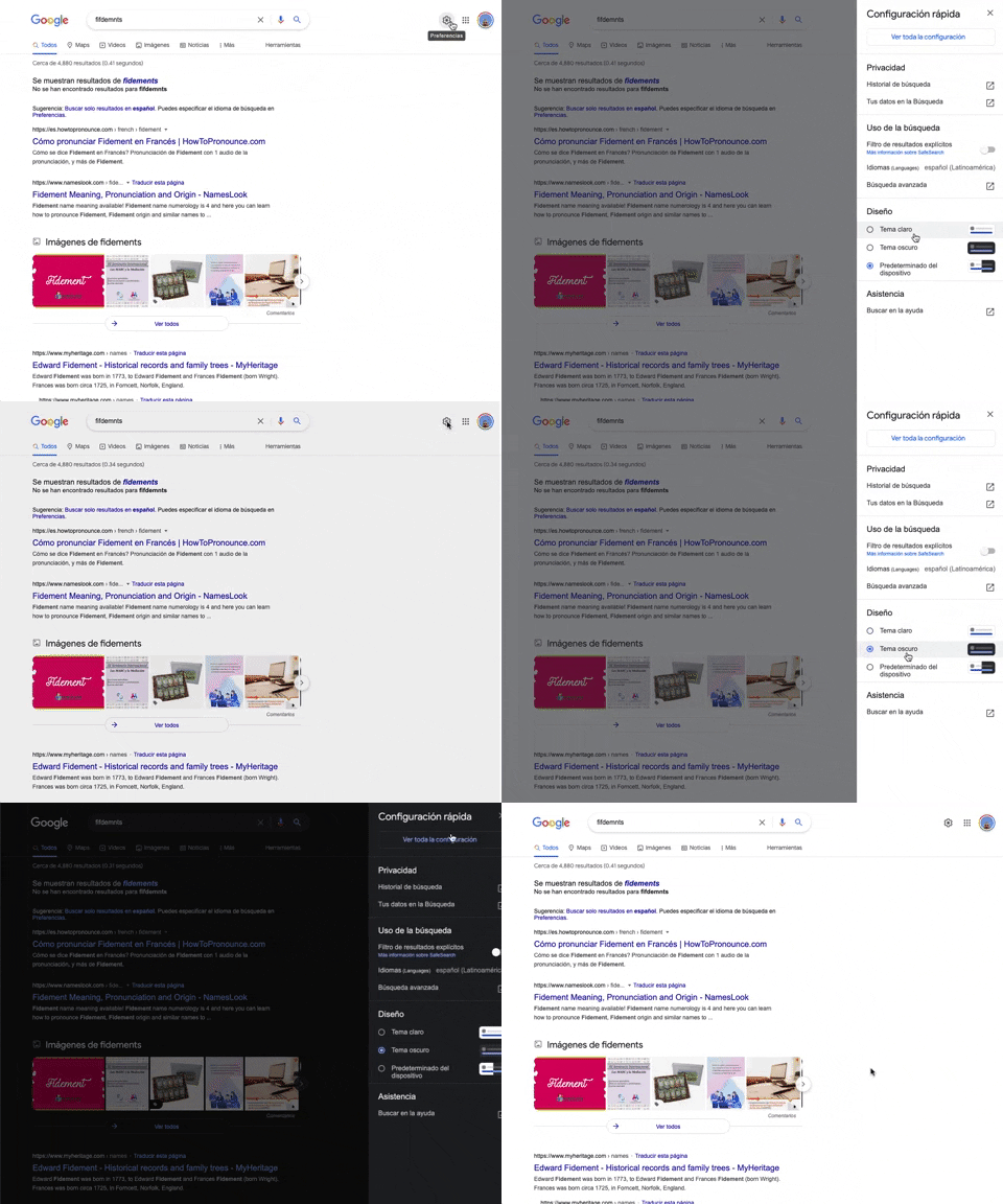
302. Theme Switcher in Side-drawer
Users can quickly toggle between light and dark themes via a side-drawer, enhancing visual comfort and accessibility without leaving the current page.
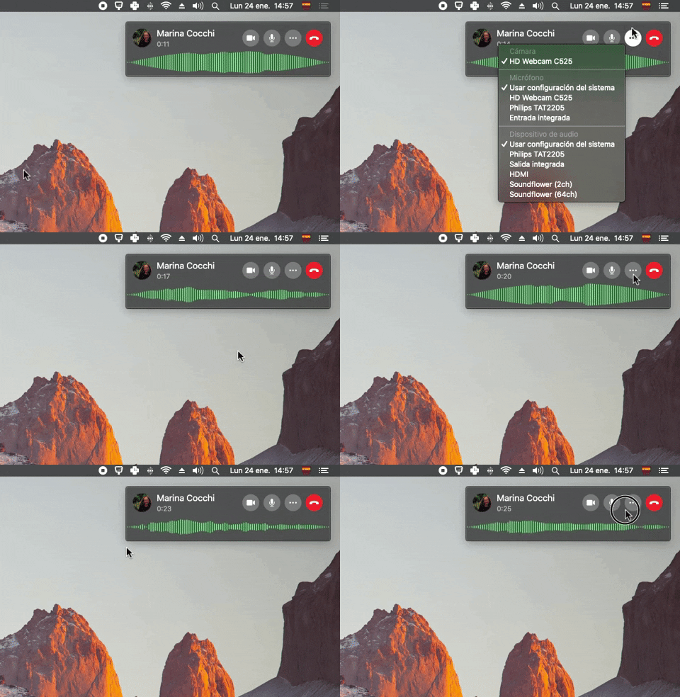
300. Sound Bars Graph
This pattern displays real-time audio levels as a dynamic graph, providing immediate visual feedback on sound input during a call.

61. Section Dropdown
Users can select a specific version of a product or guide from a dropdown menu, ensuring they access relevant, up-to-date information.
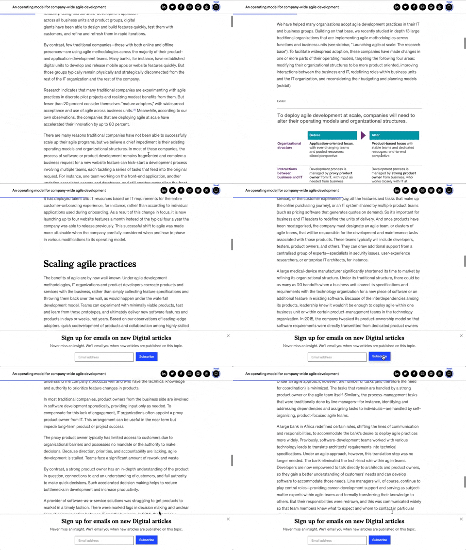
158. Bar Reading Status
A UI element, typically a bar, that visually indicates the user's reading progress or status within a document or page. Often integrated into a fixed navigation bar, it enhances awareness and helps users track their position. Notable behavior: Progress State; Fixed on Scroll.

125. Product Highlights
This pattern uses interactive hotspots on a product image to reveal key features and benefits, allowing users to explore details without leaving the main page.
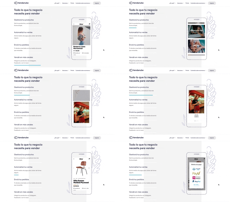
116. 2-pane Automatic Slider
This pattern automatically cycles through content in a two-pane layout, allowing users to passively discover key features or products without direct interaction.

63. GitHub - Contextual Back Navigation Bar
This pattern provides a clear, persistent navigation bar at the top of the screen, allowing users to quickly return to previous views or access key sections.

14. App Bottom Popup
This pattern provides quick access to recent activity and featured items within a compact, dismissible overlay, enhancing user efficiency.

171. Slack - Multi-browser Sign In
This pattern streamlines desktop app sign-in by redirecting users to a web browser for authentication, then seamlessly returning them to the application.

173. Share Invitation to Live Movie
Users can invite up to six friends to a synchronized viewing experience, fostering shared enjoyment and social interaction around media content.
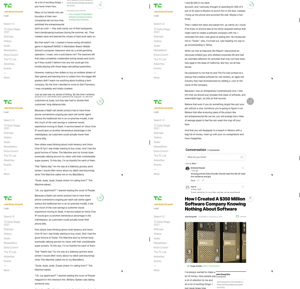
91. Bubble Status Reading
This pattern provides a fixed, animated bubble that indicates reading progress, helping users understand their position within long articles and enhancing content appreciation.
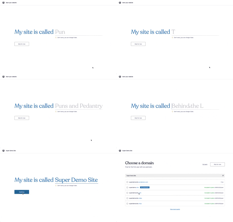
176. Wordpress.com - Natural Inputs with Suggestions
This pattern guides users to quickly name their site by offering real-time suggestions as they type, streamlining the initial setup process.

3. Apple Safari - Search Options on Focus
Upon focusing the search bar, users are presented with a curated list of favorites, frequently visited sites, and Siri suggestions, streamlining navigation and discovery.

99. Letterboxd - Topbar Dropdown Menu
Users can quickly access account-specific options and site navigation through a persistent topbar dropdown menu, enhancing pathfinding and personalization.

2. Youtube - Feed Filter Tabs
Users can quickly filter their video feed by topic using a horizontal row of clickable tabs, enhancing content discovery and personalization.
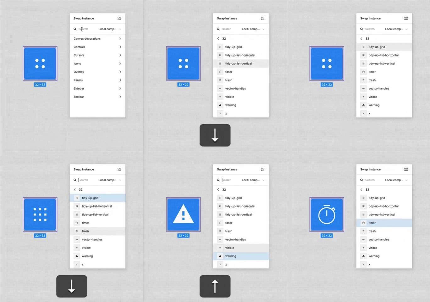
156. Figma - Keyboard Navigated Menu
This pattern enables users to efficiently navigate and select menu items using keyboard arrows, enhancing accessibility and speed for power users.

1. Steps Guidance
This pattern guides users through multi-step processes with clear, numbered instructions and corresponding visual cues for efficient task completion.

112. Share on Social Networks
This pattern enables users to effortlessly share content across popular social networks and via email, boosting content reach and engagement.
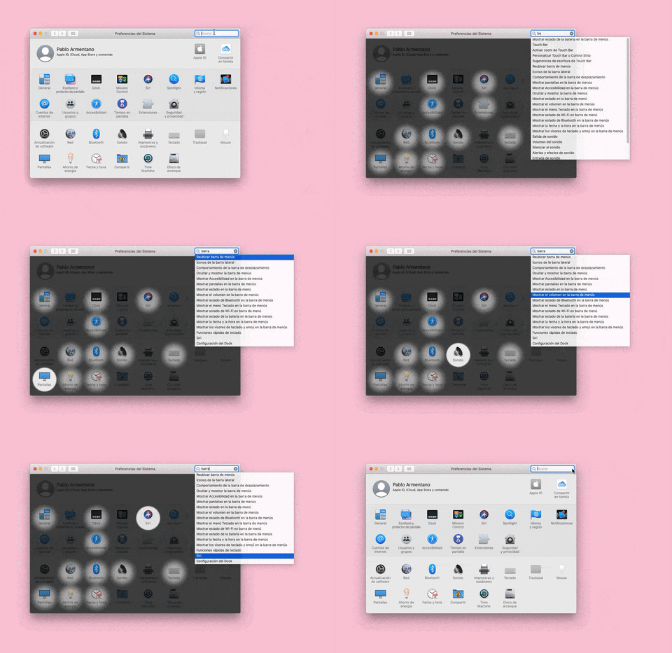
155. Menu Search Highlighting
This pattern highlights matching items within a dropdown menu as a user types into an associated search input, aiding in quick pathfinding and user selection.

160. Pocket - Content Highlighting
Users can highlight and save specific text within an article, enabling focused review and easy access to key information later.
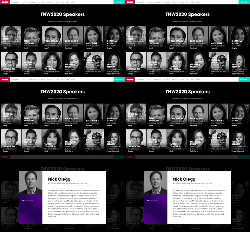
139. Transition: Zoom-Out on Hover
This transition subtly scales down an image on hover, providing visual feedback and highlighting interactive elements without obscuring content.