Modals
- Desktop (21)
- Tablet (0)
- Mobile (4)

397. Modal w/ Card Options
This modal presents users with clear, card-based options to initiate a task, guiding them efficiently through initial decision-making.

389. Text Edit Inline Input
Users can directly edit text content in place, providing a seamless and efficient way to update information without navigating away.

378. Modal Blackout w/ Animation
This pattern uses an animated blackout modal to focus user attention on critical information or actions, ensuring clear decision-making.
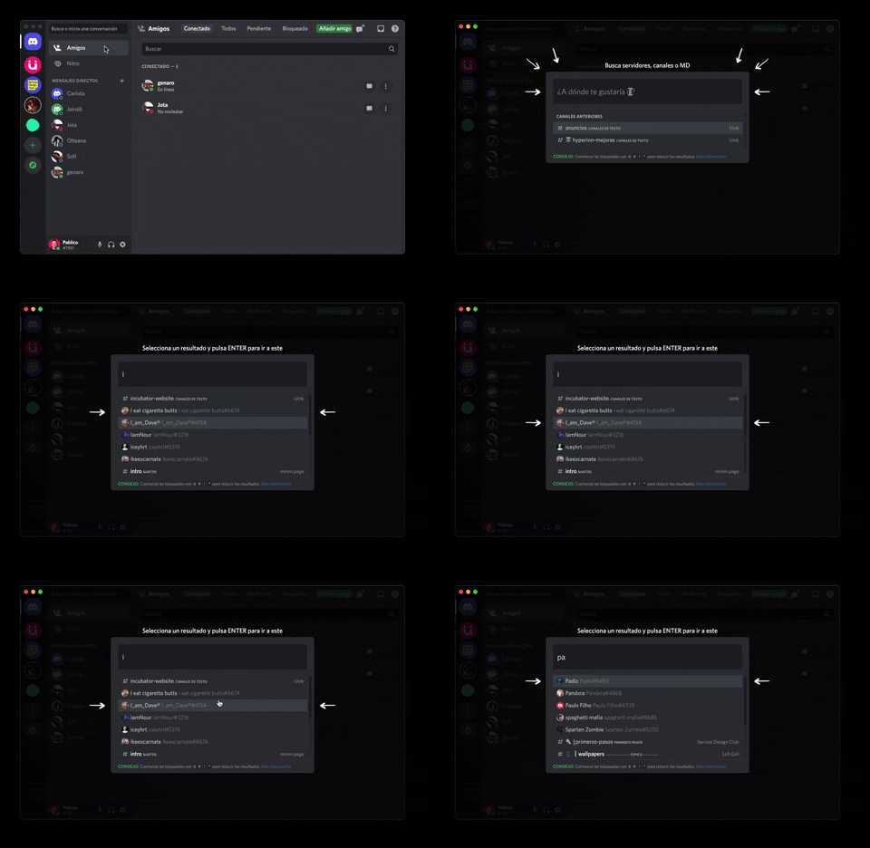
362. Modal Blackout w/ Form & Animations
A modal with a blackout overlay and animated transitions provides a focused input form, ensuring users can quickly add friends without distraction.
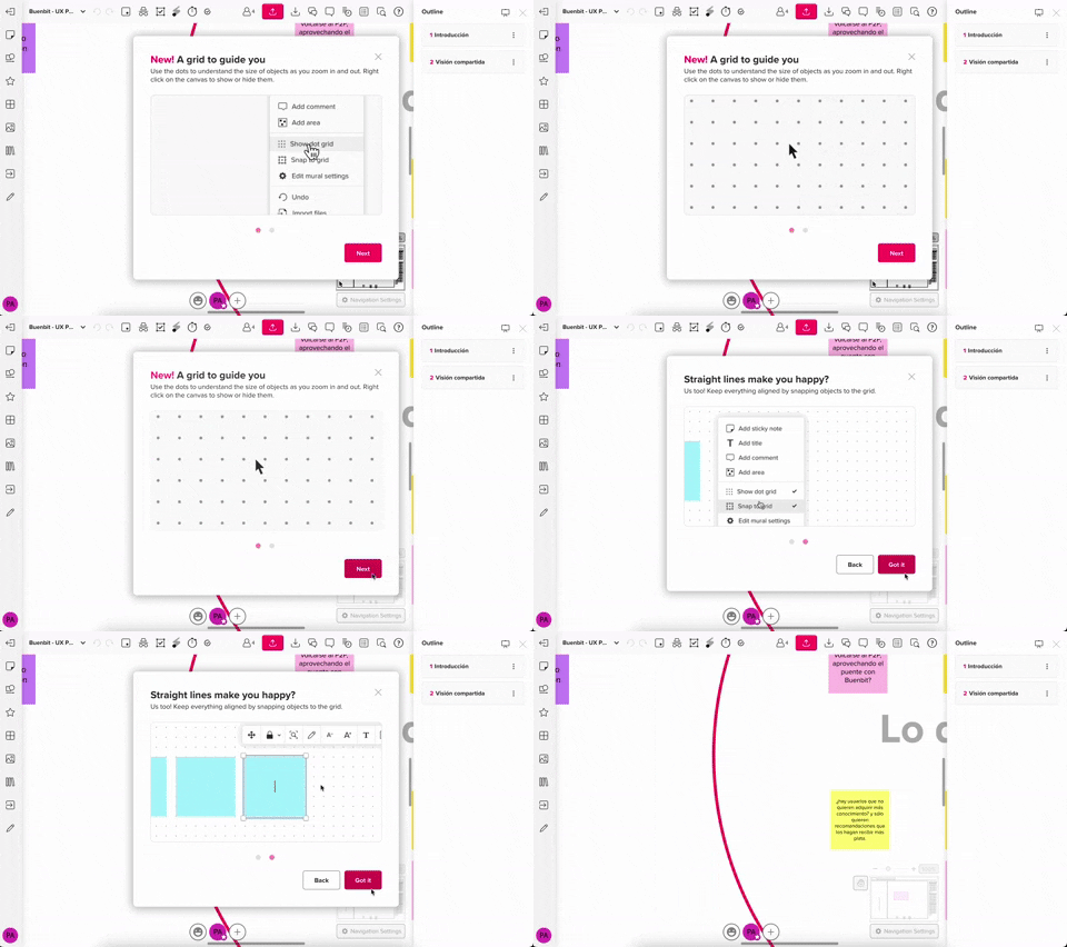
357. Modal w/ Steps & Animation (No blackout)
This modal guides users through multi-step processes with clear instructions and animated transitions, enhancing awareness without obscuring the underlying content.
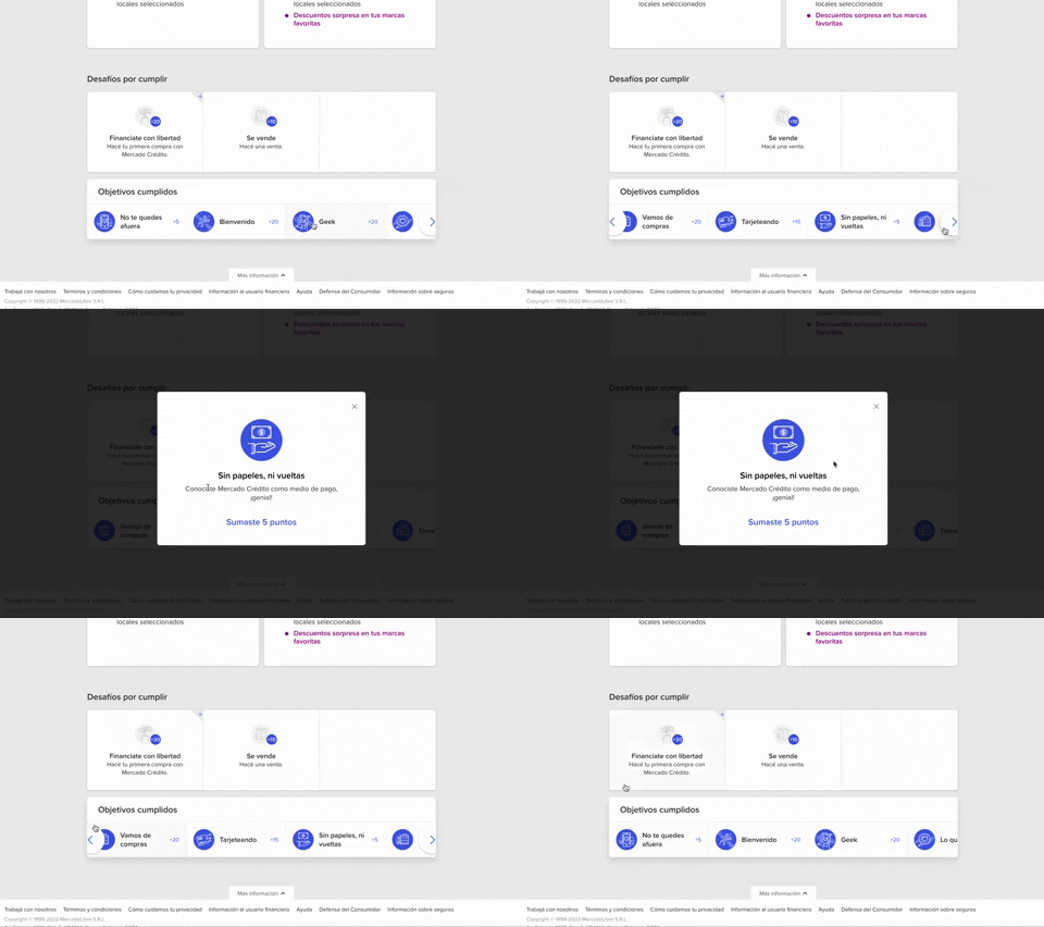
344. MercadoLibre - Horizontal Item Slider
This horizontal item slider allows users to effortlessly browse a curated selection of items, enhancing discoverability and engagement with minimal scrolling.
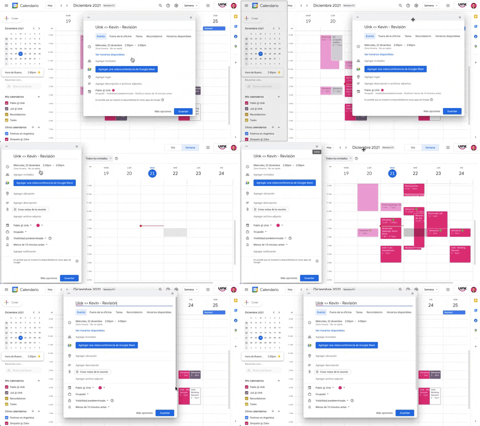
343. Modal/Dialog Drag & Drop to Fixed Position
Users can drag a modal dialog to a fixed side panel, allowing them to view and interact with underlying content without losing context.

Uink Digital Agency
Specilist on building and launching digital products. Let's talk!
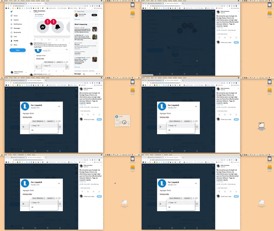
332. Drag & Drop to Create File from Web Image
Users can effortlessly create a new file on their desktop by dragging and dropping an image directly from a web browser.
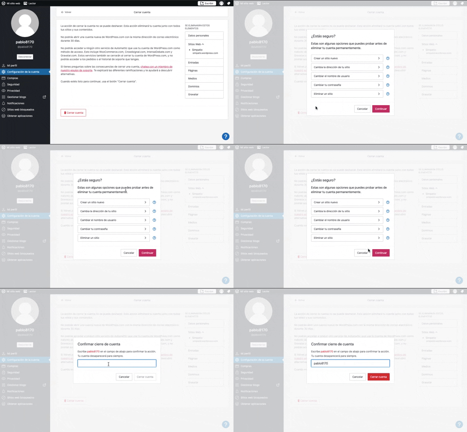
319. Modal Blackout w/ Multiple Choice
This pattern uses a modal blackout to confirm a user's intent to close an account, ensuring they understand the irreversible consequences before proceeding.

315. Signal - PIN Reminder
This pattern uses a persistent banner to remind users to verify their PIN, enhancing security and recall without interrupting core app functionality.
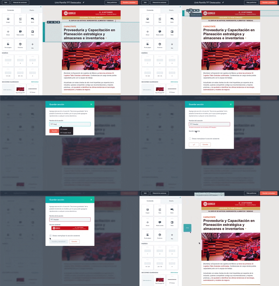
316. Modal Blackout for Delete Confirmation
This pattern uses a modal blackout to confirm a delete action, ensuring users are fully aware and can prevent accidental data loss.
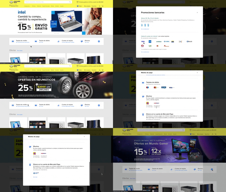
313. Modal Blackout w/ Scroll
This pattern displays a scrollable modal over a darkened background, allowing users to focus on its content while retaining context of the underlying page.
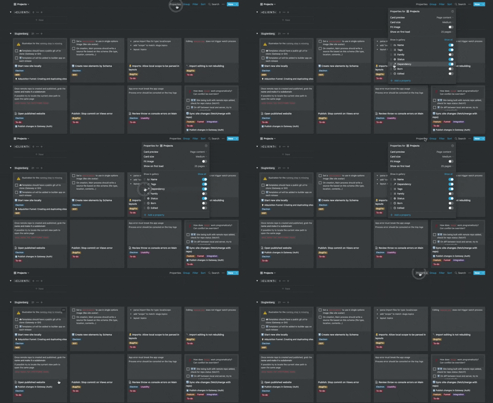
306. Drag & Drop for Reordering List Items (Mouse)
Users can intuitively reorder list items by dragging and dropping them, providing a direct and efficient way to customize their view.

268. Drag & Drop to Upload File
Users can effortlessly upload files by dragging them from their desktop directly into a designated drop zone within the application.
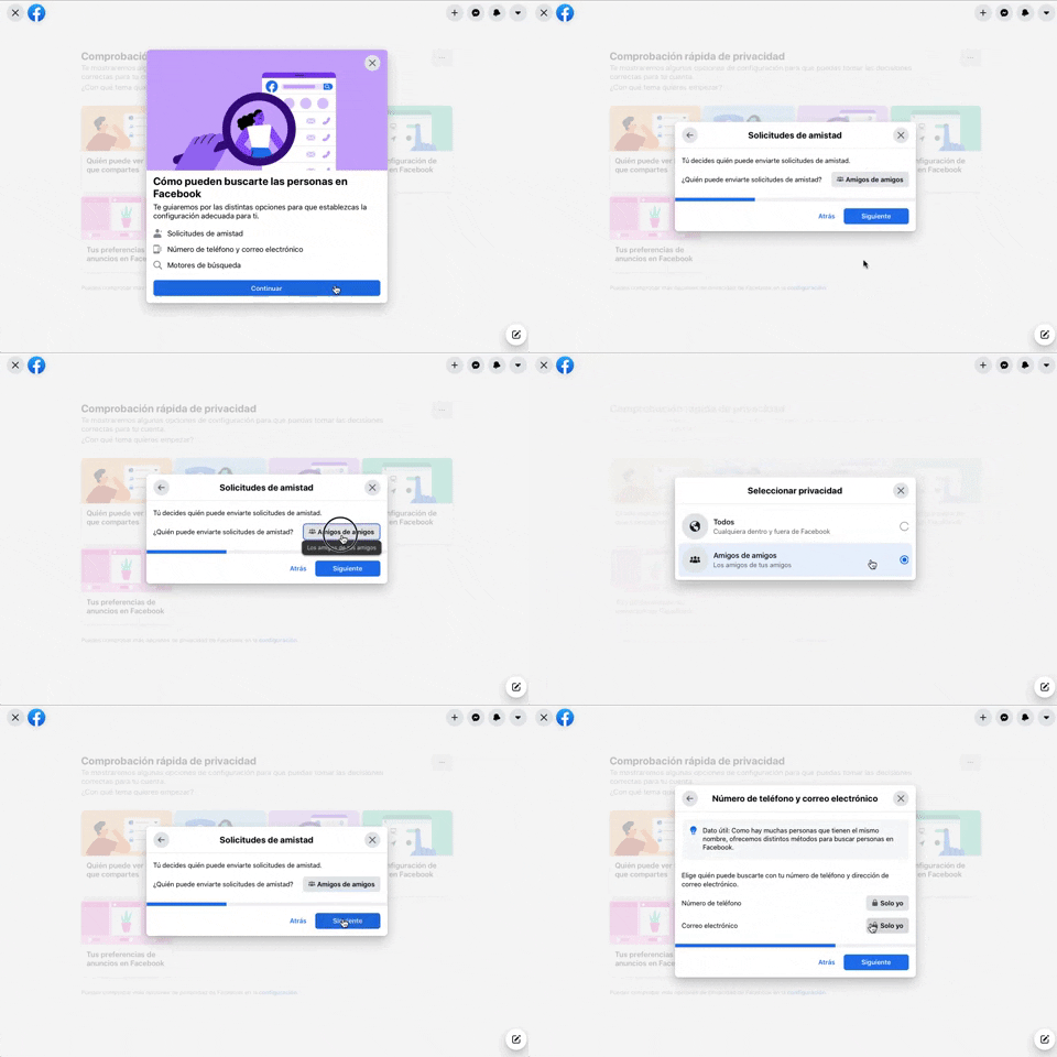
256. Modal Blackout w/ Forms & Steps
This modal blackout pattern guides users through multi-step forms, ensuring focused input and clear progression for critical decisions.
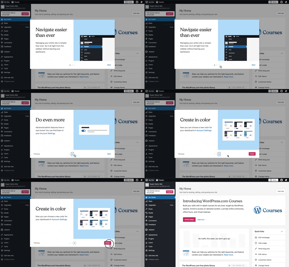
241. Modal Blackout w/ Steps
This multi-step modal guides users through key features with clear explanations and visual cues, ensuring a smooth onboarding experience.
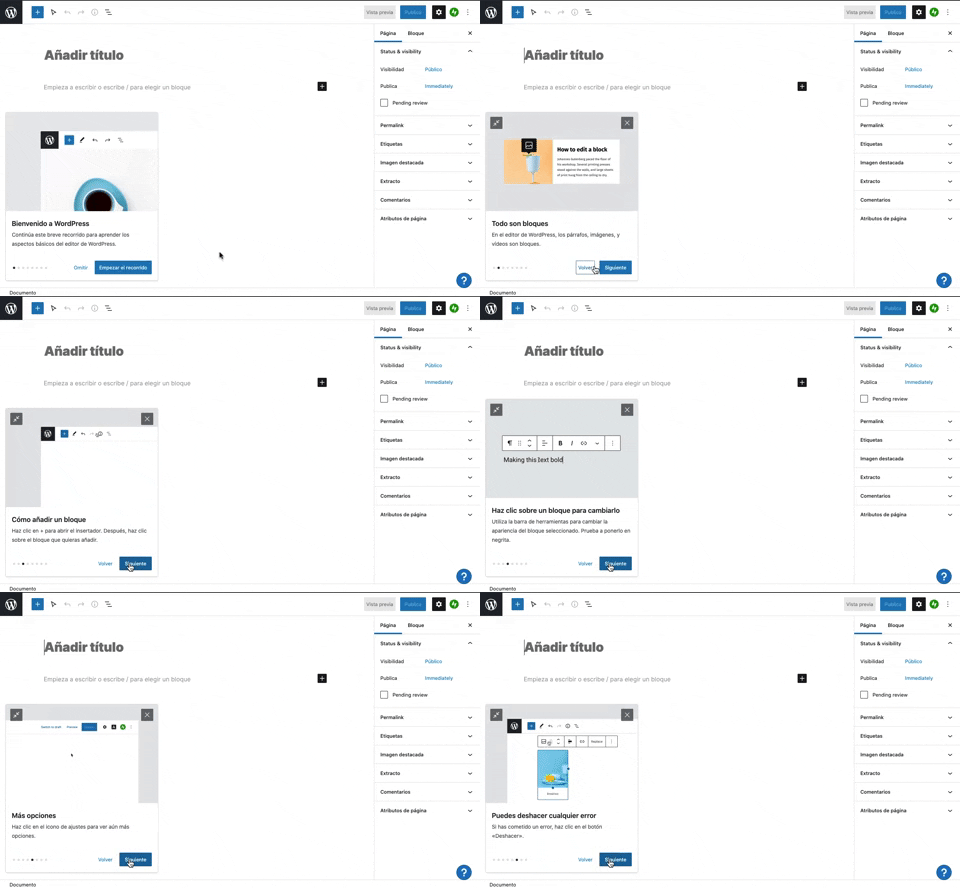
231. Floating Dialog Popover w/ Steps
This pattern guides users through a multi-step onboarding or feature tour with a dismissible, paginated floating dialog, enhancing discoverability and adoption.
190. Delete Confirmation w/ Name (moved)
A modal dialog pattern requiring the user to explicitly type the name of an item to confirm its deletion, enhancing user awareness and preventing accidental data loss. Notable behavior: Text input; Button click (confirm/cancel); Modal open.

201. Modal Blackout w/ Actions
This modal blackout pattern informs users about enhanced ad privacy, offering clear choices to manage settings or accept changes with distinct action buttons.

166. Generated Effect: Confetti Explosion
A celebratory confetti explosion visually confirms successful user actions, enhancing positive reinforcement and delight.

188. Trello - Color shapes for Colour-blind
This pattern allows users to toggle a colorblind-friendly mode, enhancing accessibility by adding distinct shapes to color labels for improved differentiation.